Introduction
Journeys of the Imagination is an exhibition designed to explore the various ways that mapmakers from the 15th century until today, have created and translated their real and imagined world views. They recorded these diverse and ever changing images on various media including paper, globes, and computer screens.
Their efforts allow us an opportunity to understand how cartographers were able to integrate the information that was well known, unknown, and still embedded in their own imaginations.
The maps in this exhibition depict the excitement of discovery and scientific investigation, the artwork, and the social, historical and cultural influences that informed the creation of these documents. We will examine these maps, not just as geographic records of the world at a particular time, but as a document that has a story to tell, both about how and why the map was created, and what the map has to say about a particular culture’s world view.
By skillfully integrating the four basic map elements of projection, orientation, scale, and symbols, mapmakers have been able to convey a variety of cartographic information to the public. This exhibition will explore the biases that inform a cartographer’s particular preferences as they express their world views.
As an endlessly fascinating record of civilization in the context of its history, geography, politics, and religion, we hope that you too are captivated by the cartographic expressions displayed in this exhibition.
Map Elements
To the casual reader, maps are regarded as scientific documents, generally used for way finding or navigational purposes. They provide a graphic representation of precisely surveyed data or carefully gathered statistical information.
However, maps also tell many stories. In order to appreciate these stories, we need to understand the editorial codes that are embedded in these complex graphic documents. Many of these codes are based on standard cartographic conventions.
Projection
In compiling maps, cartographers transfer data from a sphere or globe to a flat surface. This transformation is referred to as a projection. The resulting projection provides the framework on which geographical data is arranged, but one or more of the qualities of size, shape, distance, or direction will always be distorted.
The Mercator Projection
Originally designed for navigational purposes it grossly exaggerates the size of geographic areas, especially in the polar regions.
The Double Cordiform Projection
A complex projection reflecting the late Renaissance interest in mathematics and anatomy, it places the world in the shape of two hearts, a symbol with numerous religious and astrological connotations.
The Double Hemisphere Projection
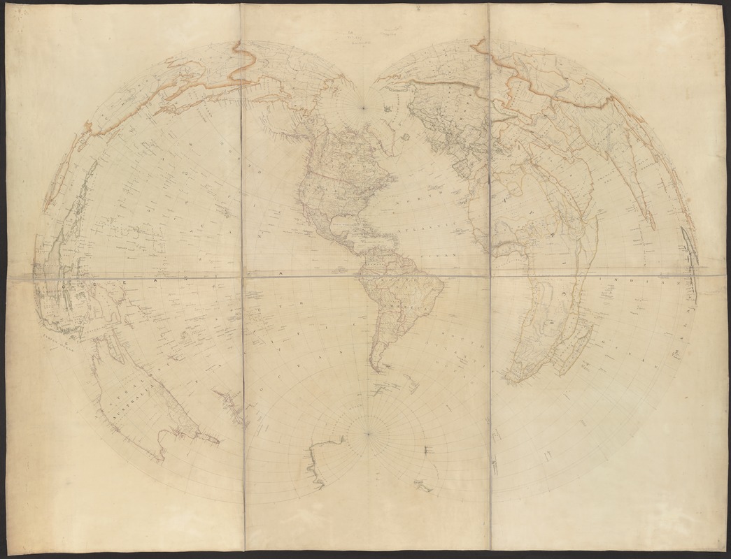
Created to give the sense of viewing the world from both sides of the globe at the same time.
The Gall or Peters Projection
Preserves the relative area of size of each geographic area throughout the entire map, but in doing so, distorts the shapes of continents and countries.
Orientation
The concept of orientation, originating from the Latin word "orient" meaning East, refers to direction and especially to which direction (North, South, East, or West) is at the top of the map. In determining how a map image is positioned on the paper, the map maker must also consider which geographical area is the center of focus.
Scale
The concept of scale is the manner by which distance is displayed on a map. A map's scale is an expression of the relationship of a designated distance on the map to the equivalent distance on the Earth's surface. Scale also provides an indication of how much detail will be shown on the map.
Symbols
Map makers generally adopt a variety of symbols to graphically represent the data that they wish to portray on the map. These symbols can range from simple lines, dots, or colors to pictorial images representing the phenomenon being mapped. Along with these pictorial symbols, map makers often enhance the map’s message with elaborate ornamentation and decoration.
Bias and Points of View
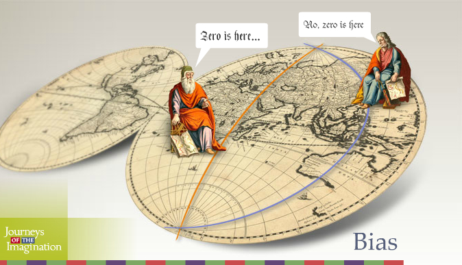
Many factors influence the cartographer’s presentation of information on a particular map. Consider if you will, that early voyages of exploration were often underwritten by a royal family, or a wealthy patron. That being the case, what was reported on a globe or a sheet of vellum was directly related to the interest of the party underwriting the venture.
After 500 years, even with the advent of new technologies, have things really changed?
If a cartographer works for a company in Australia, do you think that they want to see their country represented as “down under?” If the Prime Meridian is set in Greenwich, England, and you are British, don’t you think that Great Britain should be featured “front and center” of a world map.
Who establishes our map conventions? And who decides if placing North at the top of a map is correct, or just another bias to which we are accustomed?
As you proceed through this exhibition, we hope that it will become most evident that, in fact, there are no conventions and that the data displayed on a map is highly selective.
1482-1599
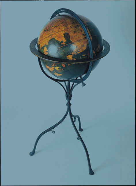
Martin Behaim (1459-1507)
Facsimile von Martin Behaim’s 1492 ‘Erdapfel’
Leipzig, 1992
On the eve of Columbus’s first voyage west across the Atlantic Ocean, Martin Behaim of Nuremberg constructed a model (globe) of a spherical earth which he called an ‘Erdapfel’ (Earth apple). It is the oldest surviving example of a terrestrial globe.
As Columbus planned his voyage, one of his nagging fears was the Medieval notion that the Earth was a flat disc and that one would likely fall off the edge by sailing west from Europe.
However, Claudius Ptolemy (2nd century A.D.), as well as other ancient and Greek scholars before him, hypothesized that the Earth was spherical in shape. These scholars were even able to estimate the Earth’s circumference, although Ptolemy’s underestimated it by about 25 per cent. Interestingly, the 3rd century B.C.E. geographer Eratosthenes had correctly estimated the Earth’s circumference at approximately 25,000 miles.
Based on what he thought were accurate perceptions, Columbus believed that he could reach the east coast of Asia by sailing west from Europe across the Atlantic Ocean.
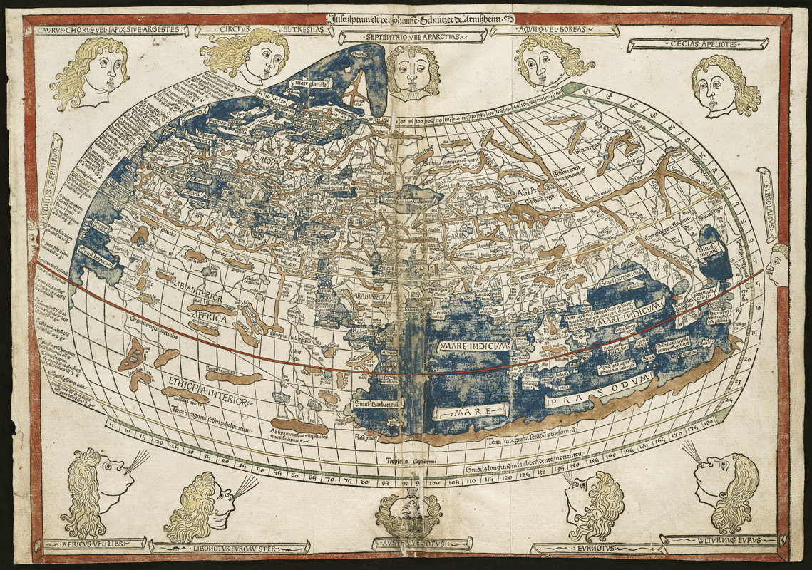
Claudius Ptolemy (c.180 - 127)
[World map]
From Geographia (Ulm, 1482)
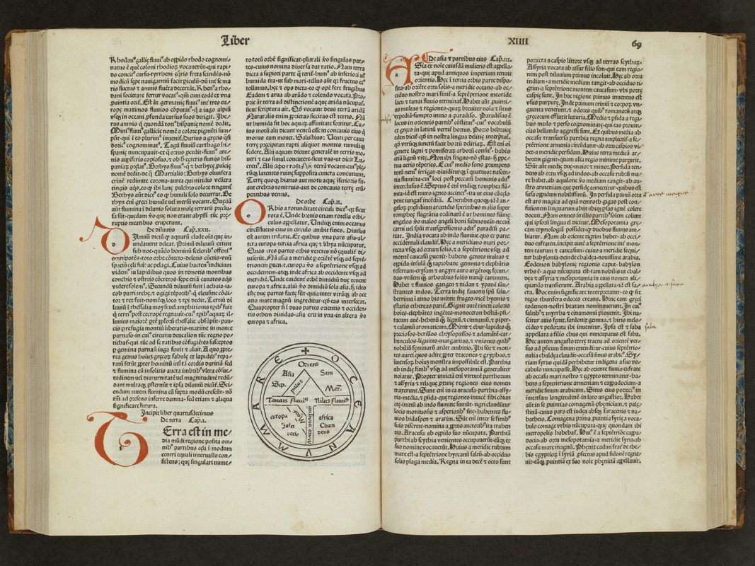
The classical Greek and Roman world view is known to us through the writings of Claudius Ptolemy, a 2nd century A.D. astronomer, mathematician, and geographer who lived in Alexandria, Egypt. Various copies of his original manuscript survived through the Middle Ages. With the advent of the printing press in the late-15th century, it was one of the first geographical texts printed.
The first printed editions of Geographia included a world map and 26 regional maps. These maps depicted the extent of the world as known to the ancient Greeks and Romans, which focused on the lands bordering the Mediterranean – Europe, northern Africa, and western and southern Asia.
Despite the disclosure of New World discoveries, such maps still had a strong influence on the Europeans’ geographical concept of the world. Unfortunately for the early explorers, this world image underestimated the Earth’s circumference and overestimated the breadth of the Eurasian land mass.
Isidore of Seville (c. 560-636)
[Unsigned and untitled T-O world map]
In Etymologiae (Venice, 1483)
Originally conceived by Isidore, Bishop of Seville, in the early 7th century, this simple map-like diagrams known as a T-O world map, reflects a medieval European world view. These simple drawings portray the Earth’s landmasses as a circle surrounded by water.
The land is separated into three parts, demarcated by a T or a Tau cross, suggesting that Christ’s head (or Jerusalem) was the center of the universe. The horizontal arms represent the Nile and Don Rivers, while the vertical arm is the Mediterranean. Oriented with East at the top, Asia occupies the top half of the circle, while Europe and Africa occupy the two bottom quarters. In addition, the continents are often, as in this example, identified with Noah’s three sons – Shem, Japeth, and Ham.
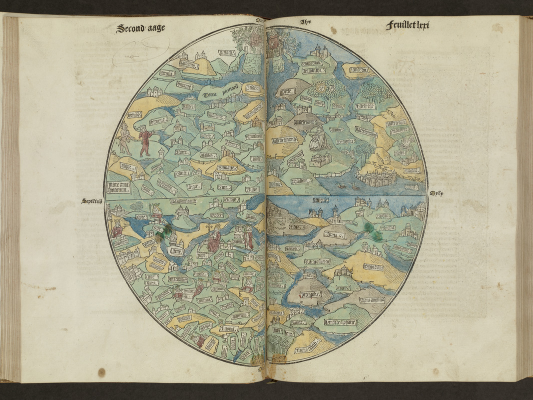
Anonymous
[Circular World Map]
In La mer des hystoires (Paris, 1488)
The circular world map that appeared in the 1475 Latin edition of Rudimentum Novitorium and its subsequent French translations, as displayed here, is considered the first printed map of the world.
Drawn in the tradition of Medieval manuscript mappa mundi and T-O world diagrams, it represents the world, oriented to the East, as a circle divided into three continents. However, it is more than a schematic diagram, since it displays more than 100 place names and geographical features positioned in relatively good spatial relationships to each other.
While the location of Jerusalem at the center of the three landmasses is implied in T-O diagrams, Judea and Palestine are clearly positioned as the map’s central focus. Interestingly, the only other map in this volume is one of the Holy Land, also the first printed map of that region.
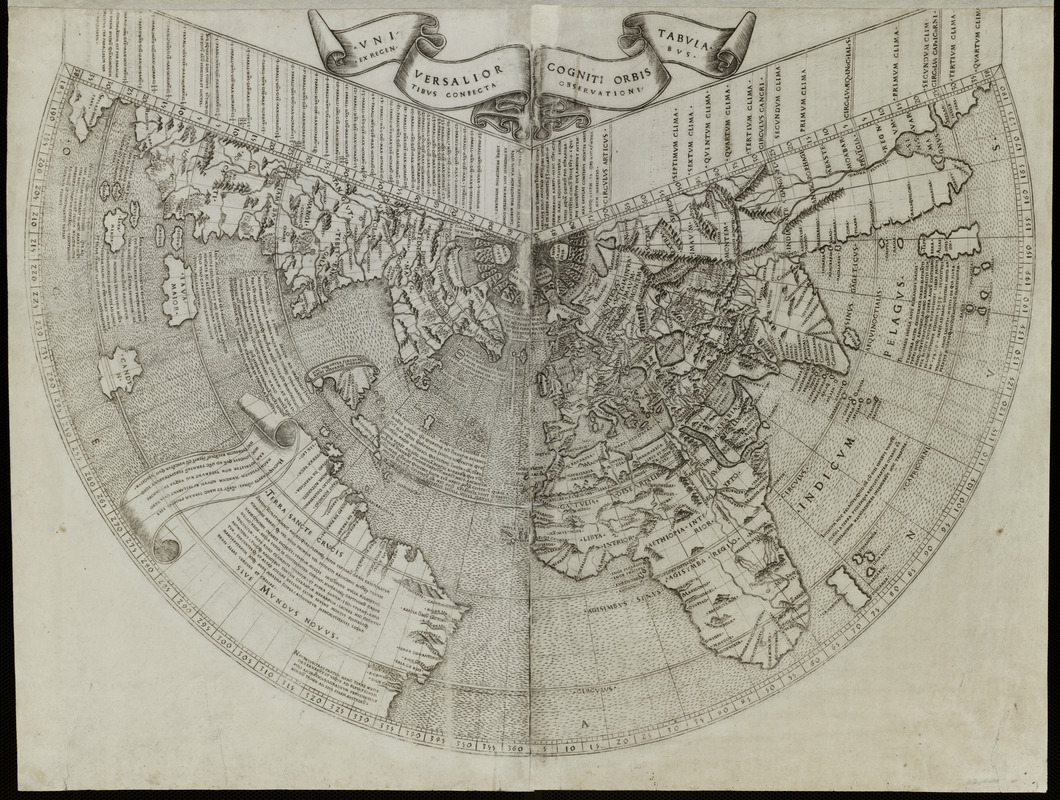
Johann Ruysch (d. c. 1533)
“Universalior Cogniti Orbis Tabula”
From Claudius Ptolemy, Geographia (Rome, 1507)
In 1507, the same year that Martin Waldseemüller issued three works announcing the existence of a new continent which he named America, a skilled cartographer named Johann Ruysch, a native of Antwerp who lived in Germany, published a totally different world map. This rendition, which supports Columbus’ hypothesis that his discoveries were islands off the coast of the Asian mainland, suggests the difficulty European cartographers were having in trying to understand accounts of the exploration of New World discoveries.
On this map, Greenland (Gruenlant) and Newfoundland (Terra Nova) are attached to the Asian mainland. Hispaniola (Spagnola) and the other Caribbean islands are depicted as islands near the Asian mainland, while the northern coast of South America is depicted as an amorphous landmass floating in the middle of the ocean. Ruysch applied the name “Mundus Novus” to these new lands.
Martin Waldseemüller (1470-1521?)
Cosmographia Introductio
Strasbourg, 1507
Martin Waldseemüller has been recognized as the first European cartographer to depict the New World discoveries as a separate continent, which he named “America.” Waldseemüller was a member of a small group of scholars gathered by René II, Duke of Lorraine, in St. Dié near Strasbourg. Their objective was to reconcile and map the geographic information observed by Europeans explorers in the New World.
In 1507, the group issued three publications – a large wall map, a set of paper segments (gores) for making a small globe, and a short treatise called Cosmographia Introductio. The latter, displayed here, explains that Amerigo Vespucci, who made several voyages to the New World subsequent to Columbus, hypothesized that these new lands were a separate continent. Consequently, the St. Dié group prepared the large wall map and globe which depicted this new continent. They named it “America” in recognition of Vespucci’s writings.
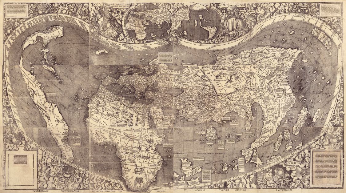
Martin Waldseemüller ( 1470-1521?)
Universalis Cosmographia Secundum Ptholomaei Traditionem et Americi Vespucii Aliorm que Lustrationes
[St. Dié, France], 1507
Reproduction courtesy of the Geography and Map Division, Library of Congress
Recognized as America’s “birth certificate,” a large wall map, measuring approximately 4 x 8 feet, was published in 1507 by Martin Waldseemüller. It was the first map to depict the New World discoveries as a separate continent, the first to use the name “America,” and the first to show separate Atlantic and Pacific oceans.
Based on research by a group of scholars in St. Dié, France, it depicts Amerigo Vespucci’s revolutionary concept that the New World discoveries were a separate continent and not islands off the Asian mainland as proposed by Columbus.
Reportedly 1,000 copies of this map were published. The only known surviving copy was recently acquired by the Library of Congress where it will be on permanent display for the American public.
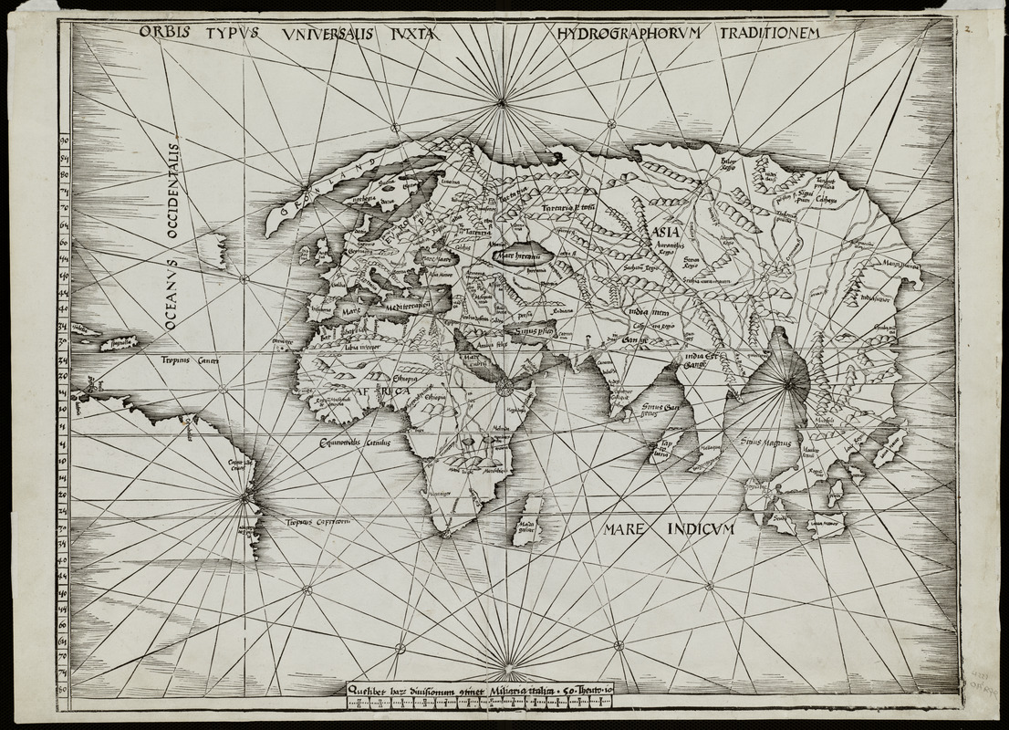
Martin Waldseemüller (1470-1521?)
Orbis Typus Universalis Iuxta Hydrographorum Traditionem
Strasbourg, 1513
Waldseemüller apparently had second thoughts about his 1507 proposal for naming the new continent “America.” In his 1513 edition of Claudius Ptolemy’s Geographia, the “modern world map” is not a reduced version of his original 1507 world map.
Waldseemüller’s 1513 map, often referred to as the “Admiral’s Map,” reflects Columbus’s interpretation of the New World discoveries. Consequently, the map focuses on the Caribbean islands and northern South America, which is placed at the map’s western margins with no indication of a western coastline. The name “America” is excluded in this “updated” world map.
On another map in this same volume, South America is labeled “Terra Incognita” (unknown land) and bears an inscription indicating that these lands were discovered by Columbus, with no indication of Amerigo Vespucci’s role in the exploration of the northern coast of South America.
Petrus Apianus (1495-1552)
[Small circular world map]
In Cosmographicus Liber
Landshut, 1524
Apianus, a noted German mathematician, astronomer and geographer, compiled several geographical publications during the first half of the 16th century. His work displayed various iterations of the American continent as originally depicted in Martin Waldseemüller’s 1507 world map.
A small and generalized version was the circular world map which was included in his astronomical and geographical text book, Cosmographicus Liber, first published in 1524. Using a stereographic projection centered on the North Pole, this circular map shows only the outlines of the known continents – Europe, Asia, Africa and America. The shape of the latter appears to be patterned after Waldseemüller’s America.
Since Apianus’s popular text book was reissued in numerous editions over the next eighty years, this generalized diagram of the continents certainly had a wide influence in spreading a new world view that encompassed four continents.
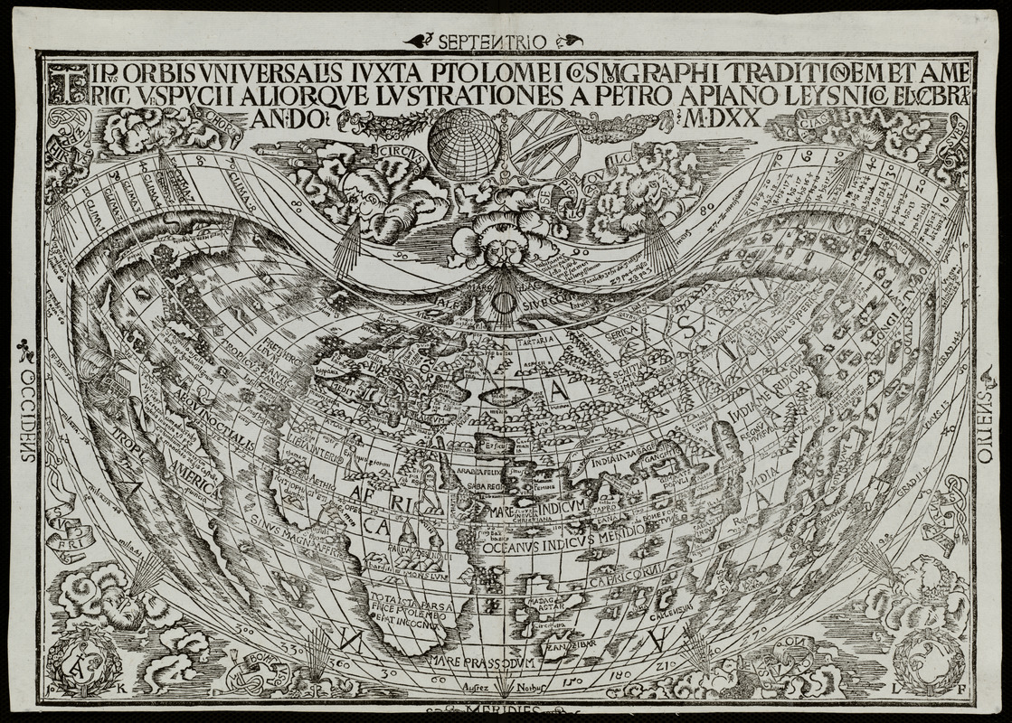
Petrus Apianus (1495-1552)
Tipus Orbis Universalis Iuxta Ptolomei Cosmographi Traditionem et Americi Vespucii Aliorque Lustrations
Vienna, 1520
Although in his later publications Waldseemüller apparently retracted his depiction of a separate continent named America, other publishers quickly accepted his initial concept and imitated the shapes and nomenclature shown on the1507 Waldseemüller map. An example of the early acceptance and adoption of Waldseemüller’s proposed new continent named America is found on the wood cut printed world map created by Apianus that appeared in Caius Julius Solinus’s Polyhistor published in 1520.
Apianus’s map is obviously a much reduced version of the 1507 map, but it retains the same cordiform (heart shaped) projection and the same narrow, elongated shape of the new continent. However, the landmasses in this map are much more boldly labeled “America.”
The clear and straightforward use of the term “America” by Apianus, a highly regarded mathematician and cartographer, contributed to the place name’s eventual immortality.
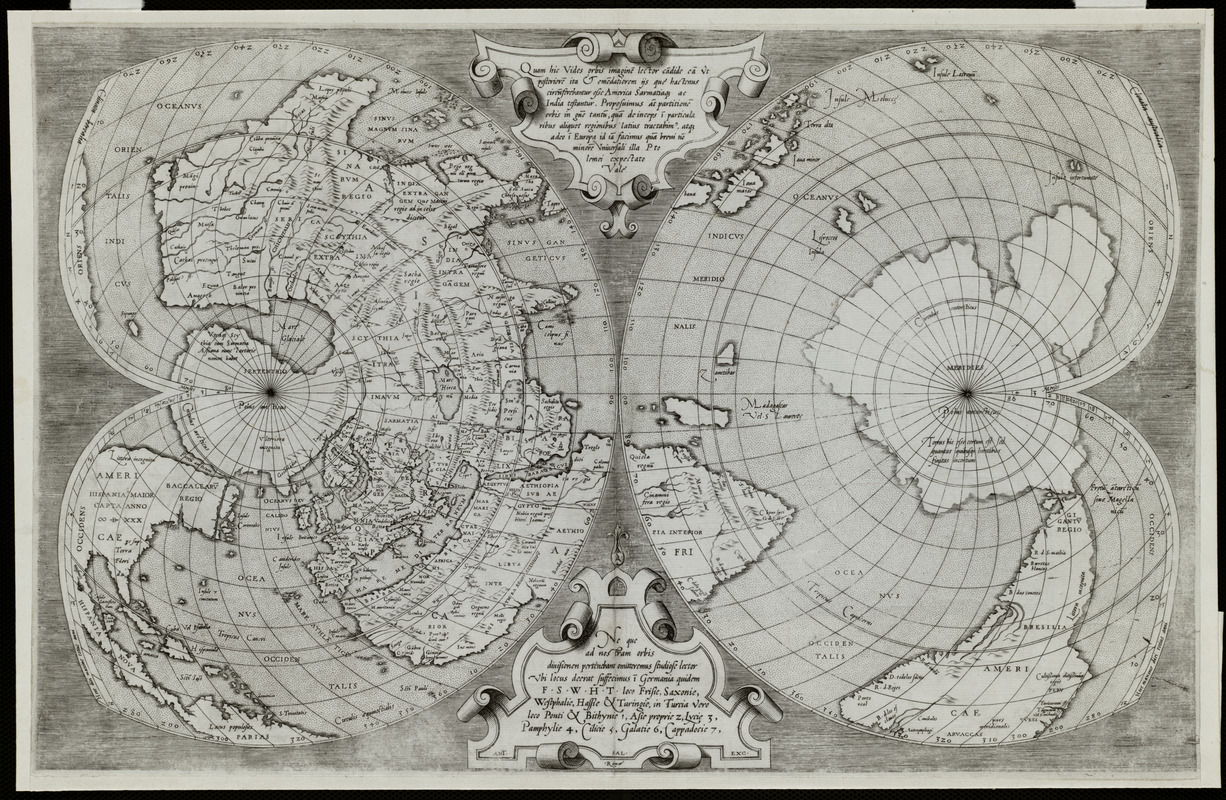
Oronce Fine (1494-1555)
“Nova et Integra Universi Orbis Descriptio”
From Johann Huttich and Simon Grynaeus, Novus Orbis Regionum (Paris, 1532)
Fine, an eminent French cartographer, utilized a double cordiform or heart shaped projection to depict the northern and southern hemispheres. The European, Asian and African continents were prominently placed in the center of the left (northern) portion of the map.
However, by splitting the New World discoveries along the left edge of the northern section of the map, it was not obvious that he had portrayed these lands as a large peninsula attached to the Asian mainland. Fine retained the name America, which appears in the southern part of South America. Based on Magellan’s voyages, Fine displayed the still speculative continent, “Terra Australis.”
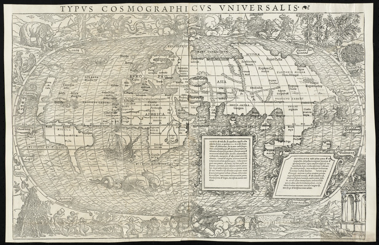
Sebastian Münster (1488-1552) and Hans Holbein (1497-1543)
“Typus Cosmographicus Universalis”
In Johann Huttich and Simon Grynaeus, Novus Orbis Regionum (Basel, 1555)
Decorated with sea monsters, mermaids, exotic animals, and cannibals, this wood cut map provides a marked contrast to the simplistic diagrams considered the earliest printed world maps. While earlier maps presented a world view based in Judeo-Christian theology, this uniquely ornamented map emphasized the strange and fanciful discoveries emanating from European explorations in America, Africa, and Asia.
Underscoring Europeans’ dilemma during the first quarter of the 16th century in rationalizing the New World discoveries, this map, most likely prepared by Sebastian Münster and decorated by the artisit Hans Holbien the Younger, followed the model of Waldseemüller and Apianus showing the New World discoveries as a separate continent named America placed between two distinctly separate oceans.
Antonio Salamanca (c.1500-1562), based on Gerard Mercator (1512-1594)
[World Map on Double Cordiform Projection]
Rome, c.1550
The Italian engraver and publisher, Antonio Salamanca, produced this finely engraved world map utilizing the double cordiform projection (heart shaped). Salamanca’s engraving was based on a 1538 map published by the noted Flemish geographer and map publisher, Gerard Mercator.
Mercator’s original map, similar to Oronce Fine’s 1532 double cordiform world map, labeled both North and South America, “America” for the first time. In addition, both parts of the New World were unambiguously linked as one landmass and no longer attached to Asia.
In 1569, Mercator published a 21-sheet wall map, which introduced the map projection that now bears his name. This projection was adopted by other contemporary map makers and continued to be used widely throughout the 19th century. Mercator also published numerous maps, several globes and atlases. His book of world maps, first published one year after his death, introduced the term “atlas” to the world.
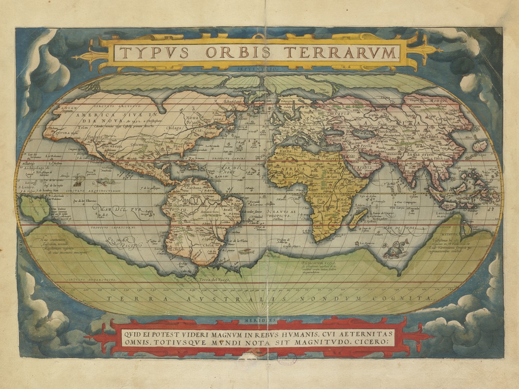
Abraham Ortelius (1527-1598)
“Typus Orbis Terrarum”
In Theatrum Orbis Terrarum (Antwerp, 1570)
Ortelius’s book of maps, first published in 1570, was the first time that a set of maps was designed, drawn, and engraved with the intention of publishing them in a bound volume. Ortelius referred to his publication as “Theater of the World” implying not only that the entire known world could be viewed in this one book, but that the Earth was a stage on which human actions unfolded.
This world map was based on the 21-sheet world map published by Ortelius’s colleague, Gerard Mercator. It displays almost a century of European exploration in the Americas delineating relatively accurate coast lines in the Equatorial areas, and greatly distorted shapes in southern South America and northern and western North America. Interestingly, the map shows a southern polar continent even though the southern oceans had not yet been explored.
The success of this first “atlas” publication marked the beginning of the golden age of Flemish and Dutch cartography.
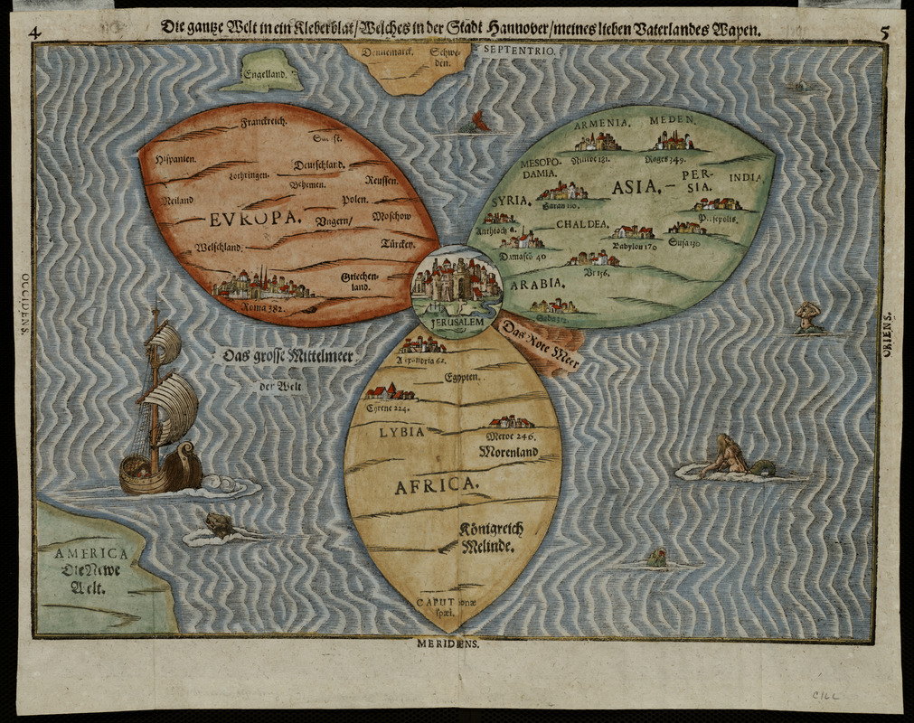
Heinrich Bünting (1545-1606)
“Die gantze Welt in ein Kleberblat …”
From Itinerarium Sacrae Scriptura … (Magdeburg, 1581)
Depicting the world as a cloverleaf, this cartographic curiosity reflects the traditional Medieval world view of three continents. Since it was published in the late-16th century long after the New World discoveries had gained wide acceptance, its primary appeal would have been to readers who cherished the past.
It was one of several whimsical diagrams included in a book, which was essentially the Bible rewritten as an illustrated travel book. The author, a professor of theology in Hannover, used the trefoil or cloverleaf arms of his native city to represent the world, making this map more a statement of civic pride than a serious attempt at cartography.
Each of the three leaves represents one of the continents -- Asia, Europe, and Africa. At the intersection of the leaves, Jerusalem is clearly marked. In recognition of the New World discoveries, America is shown almost as an afterthought in the lower left hand corner.
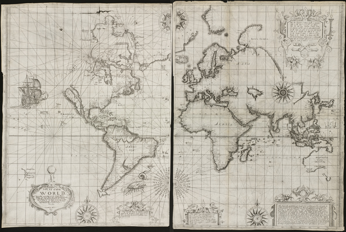
Edward Wright (1561-1615) and Joseph Moxon (1627-1700)
A Plat of all the World, Projected According to the Truest Rules … First Set Forth by Mr. Edw. Wright …
London, 1599 [1657]
In 1599 British mathematician and hydrographer Edward Wright published a navigational guide entitled Certaine Errors of Navigation. This publication included a world map which was one of the first to use Mercator’s cylindrical projection.
Wright’s treatise on navigation, along with the world map, was reissued in 1657 by Joseph Moxon, a London instrument and globe maker, as well as the royal hydrographer. Moxon reworked this map, decorating it with five compass roses, images of a ship and a sea monster, and five ornamented text boxes. Of particular note is the title cartouche which was topped by an image of Atlas holding the Earth, a motif that was just starting to be used on atlas title pages.
Moxon made revisions to the geographic information, reflecting new discoveries around Hudson’s Bay and Australia. He also accepted the mistaken notion of California as an island.
1600-1799
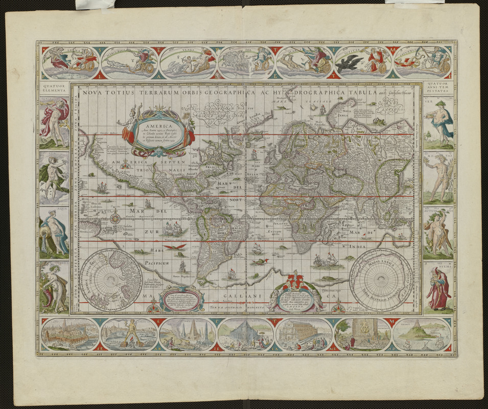
Willem Blaeu (1571-1638)
Nova Totius Terrarum Orbis Geographica ac Hydrographica Tabula
Amsterdam, 1606 [fourth state, 1638]
First published in 1606, Blaeu’s world map is one of the foremost examples of ornamentation and decoration during the Golden Age of Dutch cartography.
The map’s rectangular shape and regular grid of latitude and longitude lines indicate that Blaeu employed Mercator’s cylindrical projection which greatly exaggerates the sizes and shapes of land masses in the polar regions.
The hallmark of this map is its elaborate ornamentation. The blank areas of the map, particularly in the oceans, are decorated with ships, sea monsters, and compass roses.
Allegorical representations of the sun and moon as well as the five known planets – Mercury, Venus, Mars, Jupiter, and Saturn are placed along the top. Fire, Air, Water, and Land -- were illustrated on the left panel, while the four seasons were depicted on the right panel. The seven wonders of the ancient world were displayed in the oval insets along the bottom margin.
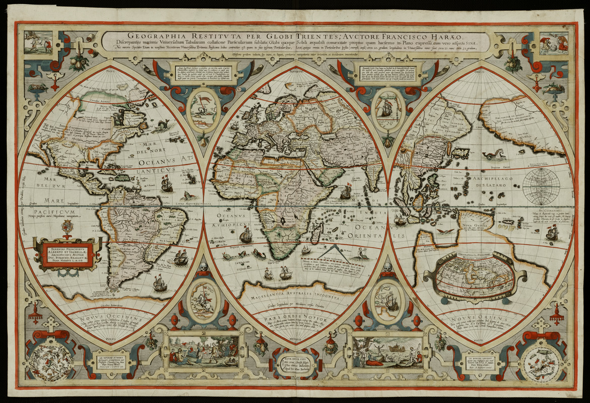
Franciscus Verhaer (c. 1555-1631)
Geographica Restituta per Globi Trientes …
Amsterdam, c. 1618
Displaying the known world of the early 17th century as a triptych was very uncommon during the Golden Age of Dutch cartography. Such a format, however, was commonly used in altarpieces and would have been familiar to a Christian audience.
In Verhaer’s map, the central section focuses on the Old World view of the lands bordering the Mediterranean Sea – Europe, Africa, and western Asia -- with its central focal point by implication, Jerusalem. The left section displays the European discoveries to the west, Novus Occidens, and, the right sphere depicts the European discoveries to the east, Novus Oriens. A legend at the bottom of the map, explains the symbols which identify religious habitations. Other inset views on the map portray biblical themes, including the flood and Noah’s ark.
The map’s author was a theologian and classical historian living in Antwerp. His other works included several small globes and maps of a historical-religious nature.
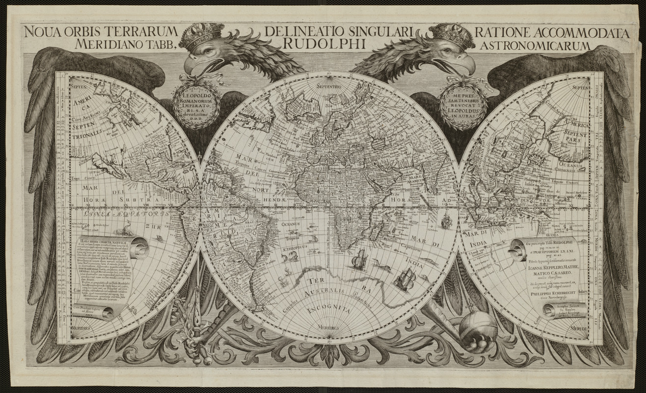
Philip Eckebrecht (1595-1677)
Nova Orbis Terrarum Delineatio Singulari Ratione Accommodata Meridiano Tabb. Rudolphi Astronomicarum
[Ulm?], 1630 [after 1658]
In this striking image, the world is portrayed on one full circle (or hemisphere), which is flanked by two half circles. This unusual geometrical configuration is embraced by a double-headed eagle, an emblem associated with the Holy Roman Empire.
The map was prepared by the German merchant, Philip Eckebrecht, at the request of the noted German astronomer Johannes Kepler to illustrate his published astronomical tables, which used celestial observations to determine longitude. The map’s precisely drawn spheres are crisscrossed and numbered at regular intervals by a grid of latitude and longitude lines.
This map also makes a statement about politics and patronage. While the central sphere, covering the eagle’s body, focuses on Europe, the entire world is embraced by the eagle, suggesting the wide extent of the empire to the east and west.
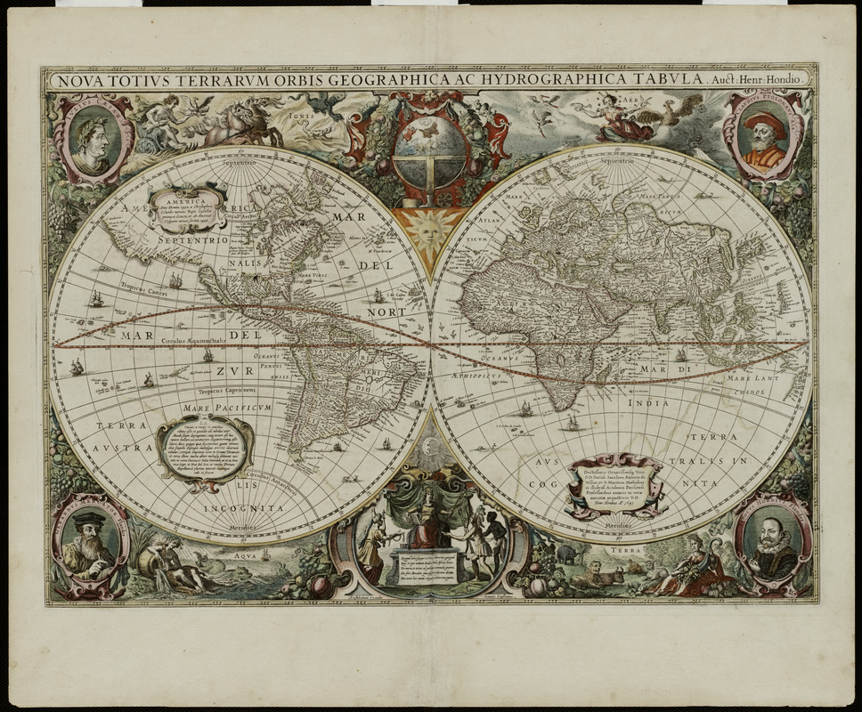
Henricus Hondius (1597-1651)
Nova Totius Terrarum Orbis Geographica ac Hydrographica Tabula
Amsterdam, 1630
Ornately decorated and beautifully colored, this world map epitomizes the baroque style favored during the Golden Age of Dutch cartography. The map was prepared in 1630 by Henricus Hondius, who had joined in partnership with Jan Jansson to revitalize the map book entitled Atlas.
Henricus designed his map using two hemispheres, providing the impression of looking at both sides of a globe at the same time.
The distinguishing feature of this map, however, is the lush ornamentation outside of the two spheres. Vignettes above and below the spheres symbolize the four elements of fire, air, water, and land. In the corners, are portraits of Julius Caesar because he ordered a survey of the Roman Empire, the 2nd century A.D. geographer Claudius Ptolemy, and the atlas's first two publishers, Gerard Mercator and Jodocus Hondius. At the bottom of the map, is a depiction of the continents, with Asia, America, and Africa paying tribute to Europe.
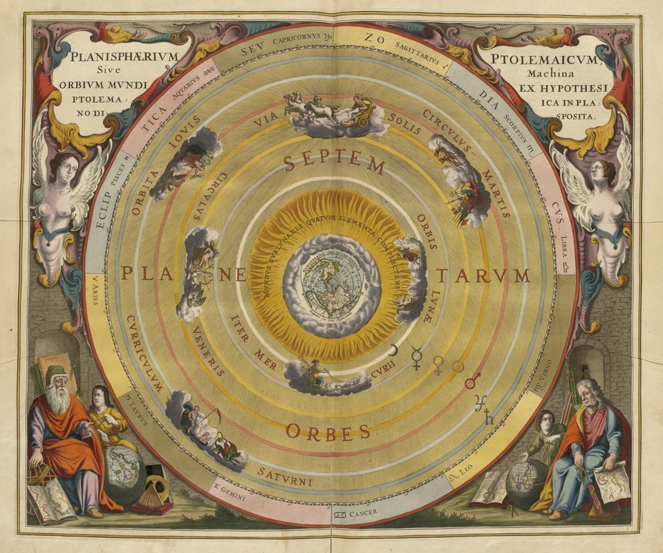
Andreas Cellarius (fl. 1656-1702)
“Planisphaerium Ptolemaicum …”
In his Harmonia Macrocosmica … (Amsterdam, 1661)
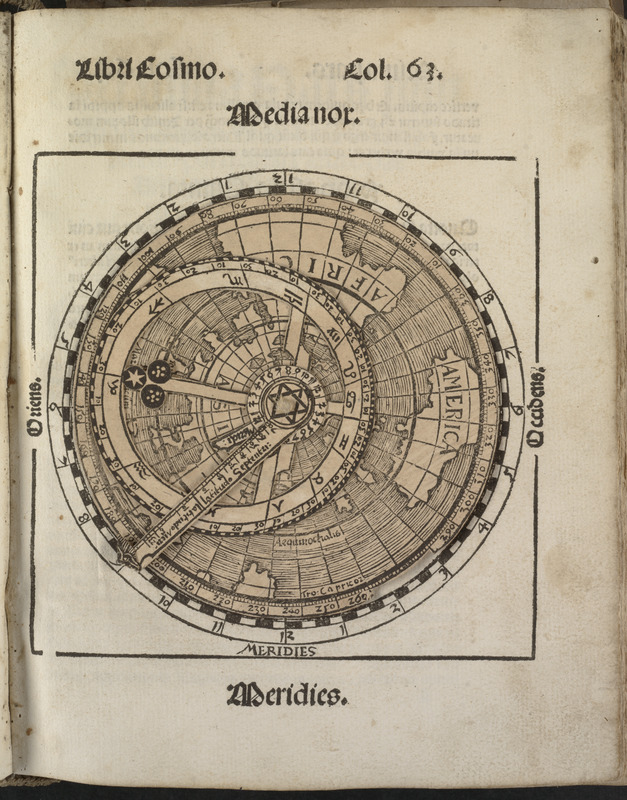
Scientists during the Renaissance and Baroque periods were very interested in observing, mapping, and theorizing about the heavenly bodies and their relationship to the Earth.
In 1661, Andreas Cellarius, a Dutch mathematician and geographer, compiled a lavish celestial atlas illustrated with beautifully engraved and hand colored plates.
This comprehensive book brought together numerous charts and a wealth of astronomical information. Chapters describe the magnitude of the stars, various lunar and solar theories, the nature of the planets, and the constellations of the zodiac.
This plate depicts the Earth-centered universe theorized by Claudius Ptolemy, the 2nd century A.D. geographer. At the center of this diagram, there is a small map of the Earth’s northern hemisphere. Revolving around the Earth in separate orbits are the Moon, Mercury, Venus, the Sun, Mars, Jupiter, and Saturn. The outer circle was reserved for the stars, represented as the constellations of the zodiac.
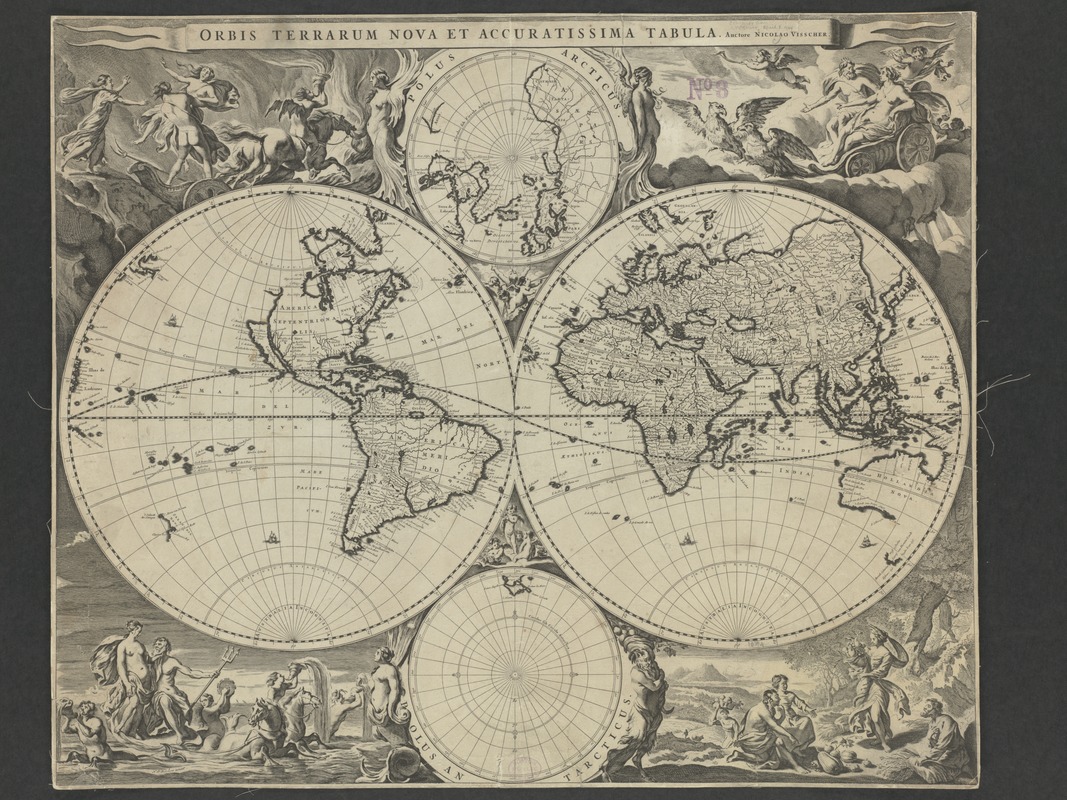
Nicolaes J. Visscher (1618-1679)
Orbis Terrarum Nova et Accuratissima Tabula …
Amsterdam, 1658
As a variation to earlier double hemisphere world maps, Visscher, a mid-17th-century Dutch cartographer, added two smaller spheres to his presentation, with each depicting the northern and southern polar regions. His ornately decorated map was reused in later atlases compiled by the Visscher family.
The map’s uniqueness and distinct attraction is its marginal decorations which were the work of artist Nicolaes Berchem. The artist created four dramatic scenes from classical mythology – the rape of Persephone amidst a flaming background, Zeus as he was carried across the heavens in an eagle-drawn chariot, Poseidon and his entourage emerging from the sea, and Demeter receiving the fruits of the land. These vignettes are also suggestive of the four basic elements.
Geographically, the information presented on this map did not differ significantly from earlier Dutch maps. It continued the practice of showing California as an island, an interpretation that first appeared on English and Dutch maps in the mid-1620s.
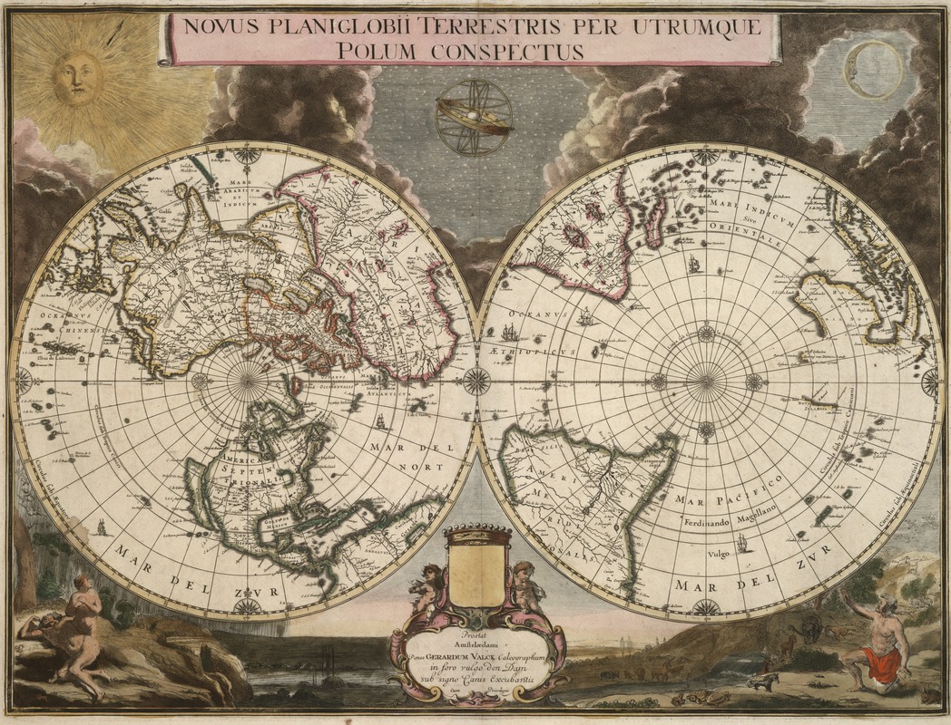
Gerard Valck (1652-1726) after Joan Blaeu (c. 1599-1673)
Novus Planiglobii Terrestris per Utrumque Polum Conspectus
Amsterdam, c. 1672 [c.1695]
Another variation of the double hemisphere projection was one in which each of the spheres depicted the northern and southern hemispheres, rather than the eastern and western. An example of this polar-oriented projection is Gerard Valck’s ornately decorated map.
The two spheres, which are adorned with ships and a symmetrical arrangement of compass roses along the Equator and the polar circles, are set against an artistic backdrop highlighting the Genesis story of creation. At the top is a dramatic presentation of the sun, moon, and stars emerging from clouds of darkness. The vignette at the bottom left reveals Adam and Eve’s shame after leaving the Garden of Eden, while the vignette on the right may depict Adam in the Garden before the fall, as some scholars have suggested, or even Noah selecting pairs of animals for the ark.
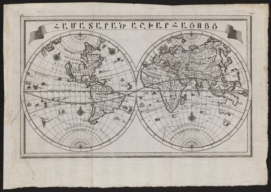
Anonymous
[World Map in Armenian]
Early 18th century
Almost all the maps in this exhibition were published in Europe or the Americas, reflecting a western world view. This map is an example of a map from a non-western culture that depicts a different world view.
Although obviously a hybrid with a strong European influence, this early 18th-century world map was printed entirely with Armenian script. The geographical delineation, however, was based heavily on Dutch maps of the late 17th century.
Undated and with no indication of attribution, this map is similar to and may be a reduced version of an ornately decorated eight-sheet map published in Amsterdam in 1695. That map was published by Adrian and Peter Schoonebeck at the request of Archbishop Warthabeth who founded an Armenian printing press in Amsterdam in 1688 for the benefit of Armenians who had migrated from their homeland.
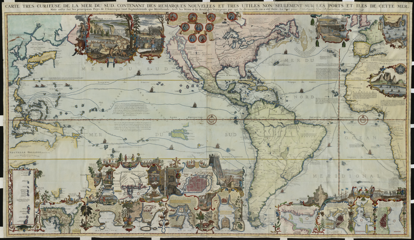
Henri Abraham Châtelain (1684-1743)
Carte très curieuse de la Mer du Sud …mais aussy sur les principaux Pays de l’Amerique tant Septentrionale que Meridionale …
Amsterdam, 1719
This richly decorated map attributed to Henri Abraham Châtelain extends from eastern Asia to western Europe focusing on the Pacific Ocean and the Americas.
Appearing in the sixth volume of the seven-volume work entitled Atlas Historique, this map was a celebration of the age of discovery and the character of the New World. Reflecting the encyclopedic style of the atlas, this information-rich map included more than 35 insets and vignettes.
Nine medallions at the top portray important explorers including Columbus, Vespucci, Magellan, and Drake, and their voyages are marked on the map. The marginal vignettes range from scenes depicting colonial economies based on beaver, cod, and sugar to large-scale maps of significant locations, such as the Mississippi Delta and Niagara Falls, as well as numerous cities and towns.
This was one of the first European maps to questions the myth of California as an island.
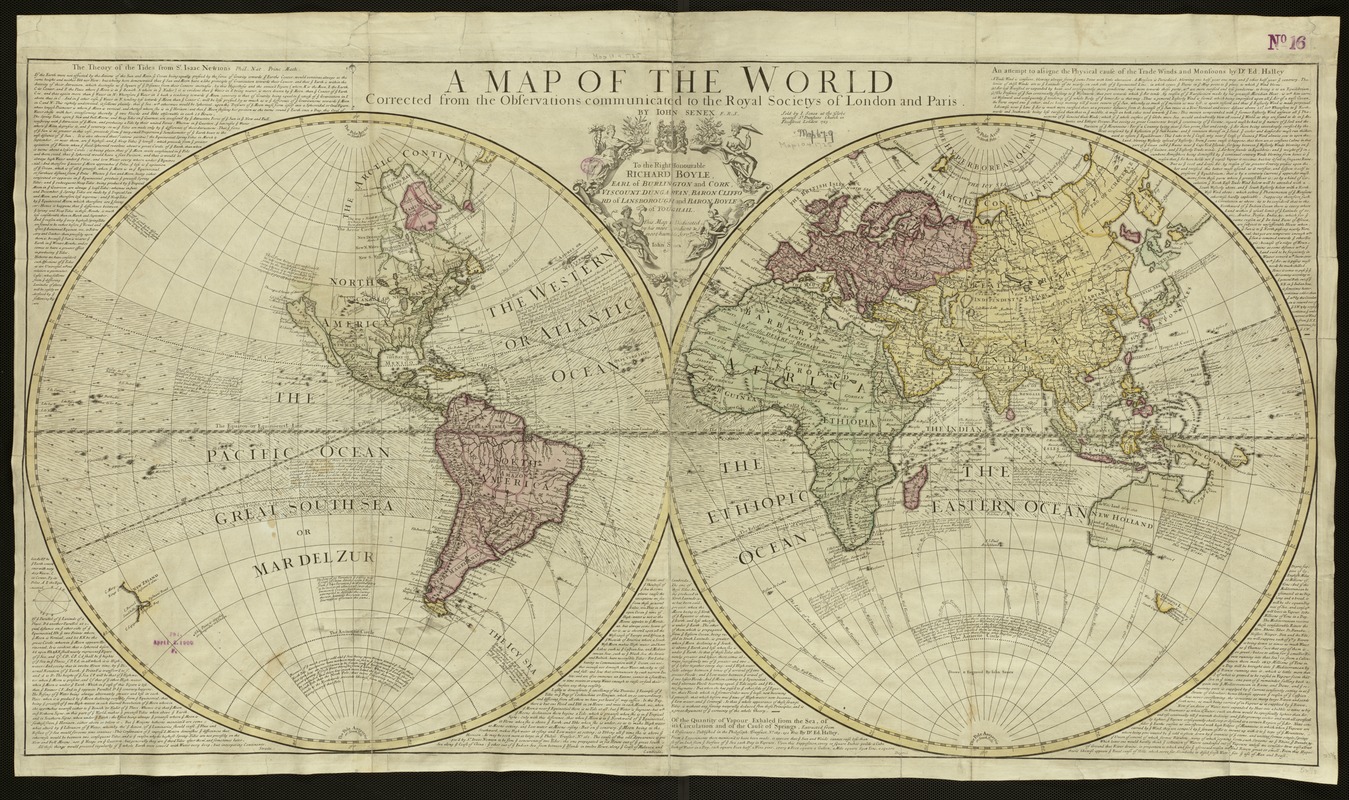
John Senex (1678-1740)
A Map of the World Corrected from the Observations Communicated to the Royal Societys of London and Paris
London, 1725
By the end of the 17th century, the Dutch dominance in the European map trade was being replaced by French, British, and German publishing firms. Displayed here is a 1725 world map by the English map, atlas, and globe publisher John Senex.
Utilizing a double hemisphere projection, Senex included texts about tides, evaporation, and trade winds based on the investigations and theories of Isaac Newton and Edmond Halley. The map’s only ornamentation is in its illustrated cartouche showing four female figures representing the continents of Europe, America, Africa, and Asia.
The Trade Winds were indicated by small directional arrows within the equatorial zone, and lines of magnetic variation were shown with curved lines. Despite the implications that this map was based on precise and accurate observations, it appears that the geographical information was not the latest. California depicted as an island was a concept that was being challenged at this time.
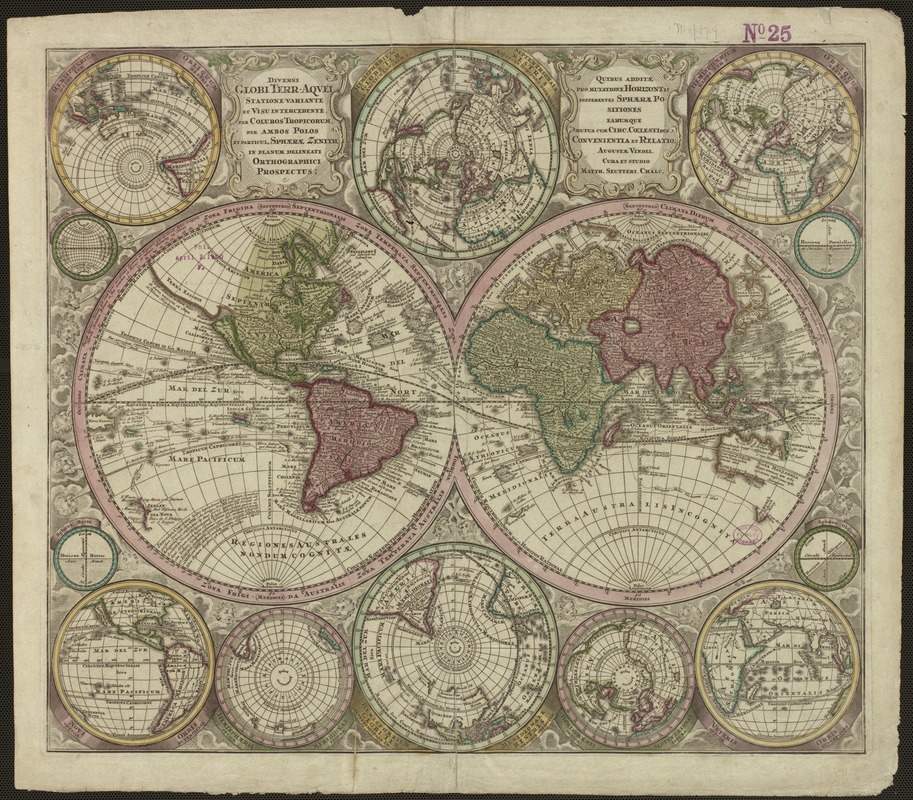
Matthäus Seutter (1678-1757)
Diversi Globi Terr-Aquei Statione Variante et Visu Intercedente…in Planum Delineati Orthographici Prospectus
Augsburg, c.1730
Seutter, one of the most important German globe makers and map publishers during the first half of the 18th century, created this world map using two primary spheres depicting the traditional eastern and western hemispheres and twelve subsidiary spheres. It was included in the 1730 edition, as well as later editions, of his Atlas Novus.
Rather than embellish the map’s margins with ornate decorations, Seutter used these various spheres to provide different views of the Earth. Above and below the two primary spheres at the map’s center are two smaller spheres depicting the northern and southern hemispheres. The corner spheres provide four different perspective views of the Earth as a globe
Despite this innovative format, reflecting Seutter’s interest in globe making, the geographic information was outdated. Like John Senex’s map, California was still shown as an island, a concept that was disappearing from most mid-18th century maps.
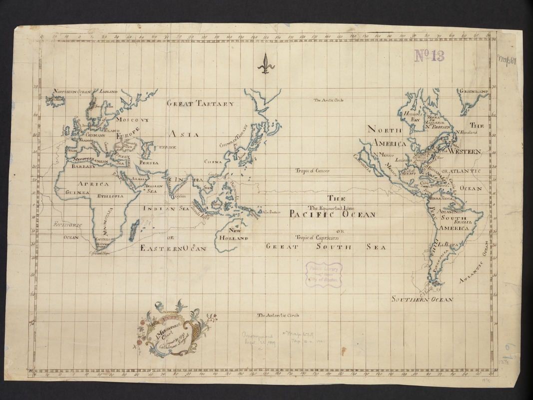
Catharine Sargent
A Mercators Chart
Manuscript, August 31, 1791
With a floral design embellishing its title cartouche and the use of stylized lettering and boundary symbols, this manuscript map of the world, most likely represents a geography project by a late-18th-century Boston school girl.
During this period it was common practice for British and American female students to prepare maps of various parts of the world from patterned samples. School girls also made cloth samplers, embroidering the lettering and boundaries as outlined on their patterns. Such projects were designed to combine instruction in both geography and needlework.
Utilizing the Mercator projection, the map was centered on the 150th degree of longitude, which runs through the Pacific Ocean. Clearly evident in this area is the ship track of British Commodore George Anson’s voyage around the world from 1741-1744. Anson’s circumnavigation was an important British voyage because of the extensive treasures that he captured from the Spanish galleons.
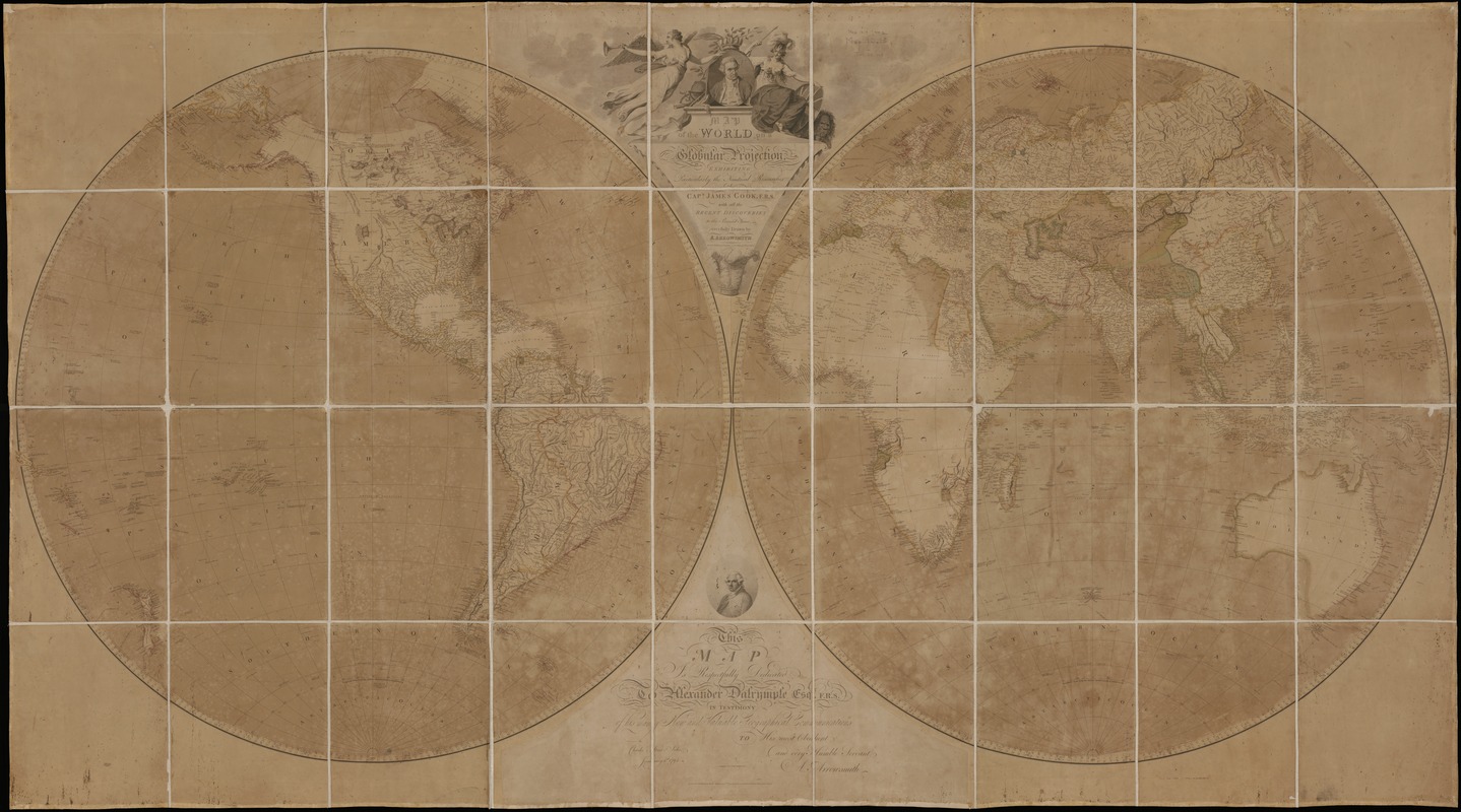
Aaron Arrowsmith (1750-1823)
Map of the World on a Globular Projection Exhibiting Particularly the Natural Researches of Capt. James Cook …
London, 1794
Arrowsmith, a prominent English mapmaker and publisher, had a reputation for producing accurate and updated maps. This 1794 world map clearly delineates the 1770s voyages of Capt. James Cook and a fairly good outline of all the continents, except for the Arctic coastline of North America.
Arrowsmith did not provide fictional information for unexplored areas or fill blank spaces with monsters or fanciful animals. Consequently, no continental landmass was indicated within the southern polar region and California was no longer shown as an island. In addition, the interior portions of western North America, Africa, and Australia were still relatively void of detail, setting the stage for further exploration during the 19th century.
In designing this map, Arrowsmith used the double hemisphere projection, which he labeled a globular projection, a term that is still used today to designate this type of projection
1800-1899
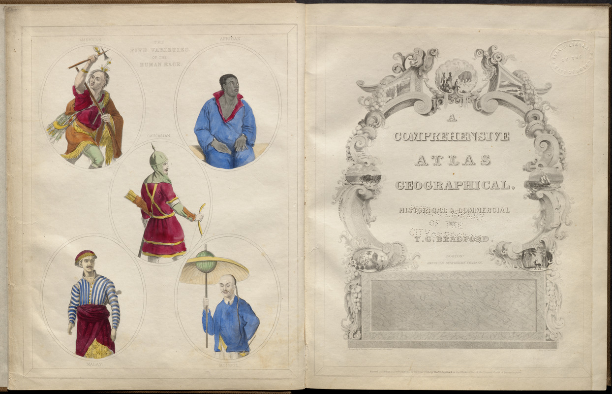
Thomas Gamaliel Bradford (1802-1887)
[Frontispiece and title page]
In A Comprehensive Atlas, Geographical, Historical and Commercial
Boston, 1835
One of the first Bostonians to engage in atlas compilation was Thomas Bradford, who published a number of World and United States atlases during the 1830s.
Bradford entered the atlas trade after working as an assistant editor of the America Encyclopedia. Using a similar encyclopedic format, the maps in his atlas publications were supplemented with lengthy geographical descriptions and statistical tables. Another distinguishing feature of his publications was the innovative design of the frontispieces and title pages. In the example shown here, rather than personifying the continents with the classical icons that were used so frequently during the Renaissance and Baroque periods, he illustrated “five varieties of the human race” with their native costume – American, African, Caucasian, Malay, and Mongol.
The contents and arrangement of maps in this atlas reflect a decidedly American bias, with almost half of the maps pertaining to North America
Anonymous
[Map of the World on a Polyconic Projection]
Manuscript, mid-19th century
Not much is known about the creation of this untitled, unattributed, and undated manuscript map. What is known is that its projection was also used by the Coast and Geodetic Survey for 100 years beginning in the mid-19th century, as the basis for its coastal charts of American waters. The U.S. Geological Survey also adopted this projection for its topographic quadrangles from the end of the 19th century up to the 1950s.
The construction of this projection is based on the theoretical application of many cones to the Earth’s surface, each touching a single line of latitude along which there is true scale. When applied to the entire globe, this projection produces a symmetrical pattern of lines where the prime meridian (in this case a line of longitude running through Washington, D.C.) and the Equator are straight lines.
The map is accurate in its center but geographical distortion increases as you move further to the east and west.
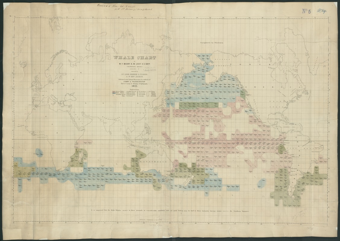
Matthew Fontaine Maury (1806-1873)
Whale Chart
Washington, D.C., 1851
The mid-19th-century American whaling industry, which was dominated by ports in southern New England, especially New Bedford, Massachusetts, is documented by this innovative thematic map. It was prepared by Maury, an American naval officer and oceanographer who served as the Superintendent of the U.S. Navy Depot of Charts and Instruments (later the U.S. Naval Observatory) from 1842 to 1861. Because of his contributions to oceanography including a series of wind and current charts for the world oceans, Maury is recognized as the father of the science of oceanography.
Collecting data from various sources including logs from whaling ships, he compiled this map showing the distribution of several different species of whales, identifying each with a combination of color and pictorial symbols.
In constructing this map, Maury centered it on the Pacific Ocean showing that the primary habitat of whales was the Pacific arena rather than the Atlantic, where the whale resources had been terribly depleted.
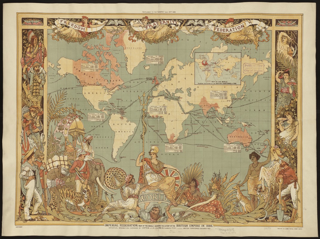
Maclure & Co.
Imperial Federation, Map of the World Showing the Extent of the British Empire in 1886
London, Supplement to the Graphic, July 24, 1886
Everything about the design of this elaborately decorated world map glorifies the late-19th-century British Empire. Cartographically it used a Mercator projection centered on the Greenwich Prime Meridian, placing Great Britain just above the map’s central focal point. The Greenwich Prime Meridian (near London) was adopted as the international standard in October 1884.
The British Isles, as well as all of the British colonies spreading out to the east and the west, were highlighted with red, while other geographical areas were left blank with only a minimum number of place names. In addition, an inset box was placed near each of the major colonies, listing statistics about geographical area, population, and trade.
The words “Freedom, Fraternity, Federation,” suggesting a peaceful co-existence within the British Empire, were prominently placed along the map’s top margin, but the remainder of the map’s illustrations imply “colonialism.”
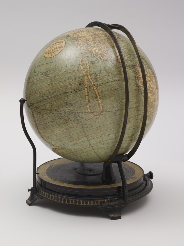
Ellen Fitz (b. 1836)
Fitz Globe Manufactured by Ginn & Heath
Boston, 1879
Designed for educators to use in the classroom, this twelve-inch globe was published in Boston by the textbook firm of Ginn and Heath. A special feature of this globe is its mounting with two vertical rings showing the changing daylight, twilight and nighttime hours any place on the Earth. The mounting system of vertical rings was patented by Ellen Fitz, a governess from New Brunswick. She was the first women involved in the design and manufacturing of globes.
The globe’s mounting, which was Fitz’s unique contribution to this educational tool, was designed to help students understand the effects of the Earth’s daily rotation on its axis and yearly revolution around the Sun, with regard to daylight, twilight, and nighttime.
By turning the globe’s base in relation to the pointer representing the Sun’s vertical ray, it is possible to observe these changes through the seasons.
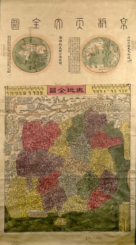
Jungmen Chen, for Jinliang Ma
[Universal Map of China]
Woodcut, mid-19th century (late Ching dynasty)
The primary emphasis of this unusual woodcut and hand-colored world map is China, but Europe and the British Isles are represented as a very thin sliver of uncolored land and islands in the upper left corner. The two vignettes depict the world in the European context of two hemispheres – to the left are Eurasia and Africa, and to the right, Asia, Antarctica, and the Americas.
The seventeen provinces of China dominate the main section of the map. Cities, towns, and villages are outlined and colored. Rivers, mountains, the Great Wall of China, and the Gobi Dessert are also depicted using simple pictorial symbols.
China, identified as the "Qing Empire," implies that the map dates from before the fall of the Ching dynasty and the Chinese Empire in 1911. A handwritten note refers to a rebellion in "Yung Ngan," almost certainly the Muslim Rebellion that took place in the province of Yunnan between 1855 and 1873.
1900-present
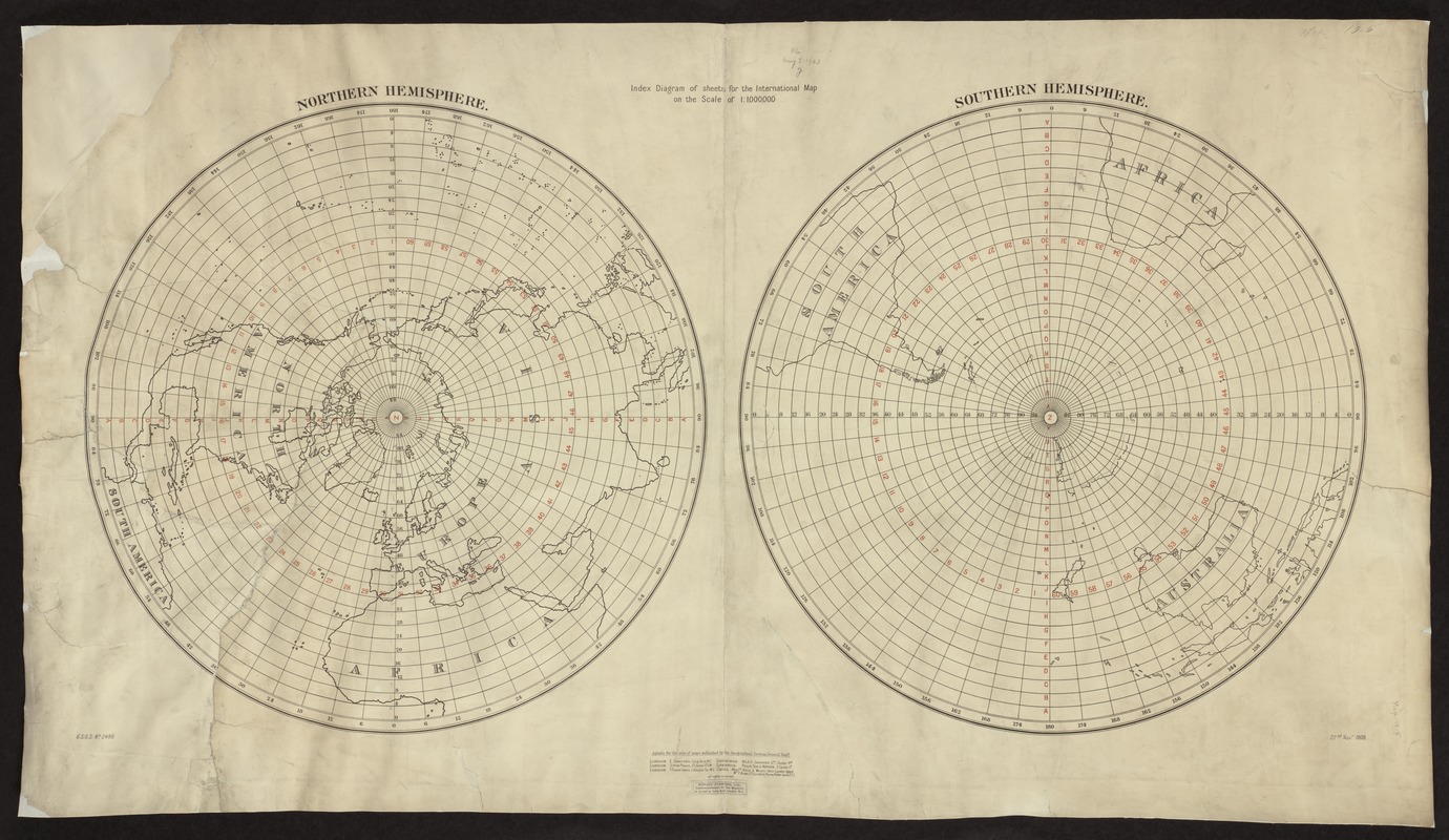
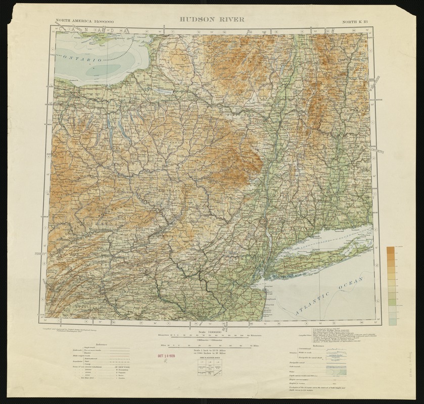
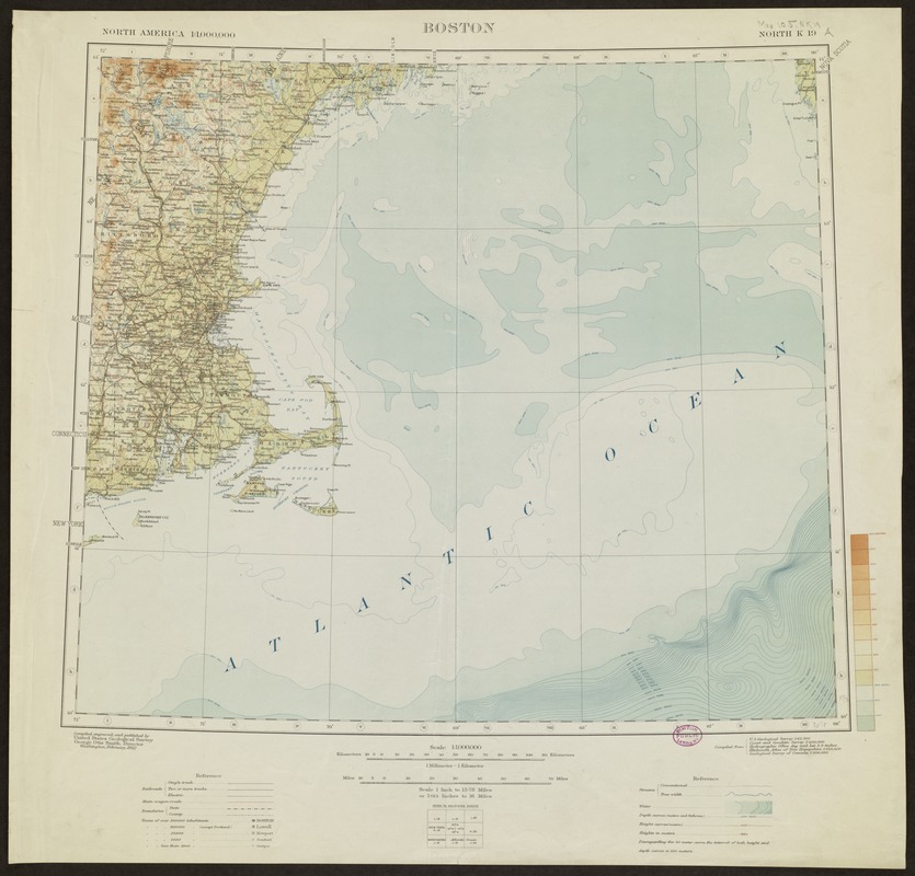
International Map of the World on the Scale of 1:1,000,000
Great Britain Ordnance Survey, Index Diagram (London, 1909)
U.S. Geological Survey, Hudson River and Boston Sheets (Washington, D.C., 1912)
At the beginning of the 20th century, the world’s major countries joined together to create a comprehensive and uniform series of topographic map sheets for the entire world. The participating countries agreed that the series would use standardized map symbols. Each map sheet, corresponding to four degrees of latitude and six degrees of longitude, would have a scale of 1:1,000,000 (or 1 inch equals 15.78 miles). The map series was known as the International Map of the World (IMW) or the Millionth Map.
Most standard-sized world maps have a scale in the range of 1:50,000,000 (one inch equals 800 miles). These small-scale maps show a limited amount of detail. The international series was intended to provide a general planning map for the entire world depicting greater detail.
Displayed here is an example of the 1909 index map for the series and two adjoining sheets showing detail for the northeastern United States.
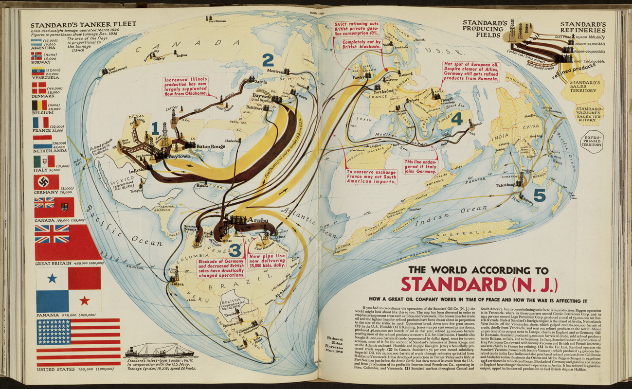
Richard Edes Harrison (1901-1994)
“The World According to Standard (N.J.)"
In Fortune 21, no. 5 (May 1940)
This unusual world map was prepared by freelance cartographer Richard Harrison. For this assignment, he prepared a map to illustrate a series of three articles on the Standard Oil Company of New Jersey.
This creative “oil drop projection” allowed Harrison to emphasize Texas and Venezuela, Standard Oil's major areas of crude oil production, and Aruba, the site of the company's largest refinery.
The primary focus of the map was those portions of the company's operations that were the most profitable. Since the company's operations were global, the rest of the world is shown, but geographic areas that were less profitable, especially eastern Africa, southeastern and eastern Asia, and Australia are marginalized on this map.
As Harrison stated, his objective was to show the perspective of the Standard Oil Company’s top executives, as they had to co-ordinate the global activities of their corporate empire in the face of an impending world war.
151 words
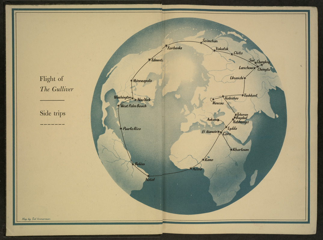
Sol Immerman (d.1983)
“Flight of The Gulliver”
In Wendell L. Willkie, One World (New York, 1943)
Following Richard Harrison’s lead, other World War II cartographers and illustrators adopted global perspectives. When centered on the North Pole, such works highlighted that almost 90 per cent of the world’s population lived north of the Equator.
In this example, free-lance illustrator Sol Immerman used a global perspective as the basis of his end-paper illustration for One World, Wendell Willkie’s account of his wartime goodwill trip around the world in 1942. Although the trip was accomplished in 49 days, it took only 160 hours of flying time, underscoring how small the world was becoming.
Willkie is best remembered as the Republican Presidential candidate who was defeated by Roosevelt in 1940. Roosevelt later urged Willkie to undertake this trip, visiting America’s allies around the globe.
Willkie noted “ If I had ever had any doubts that the world has become small and completely interdependent, this trip would have dispelled them altogether.”
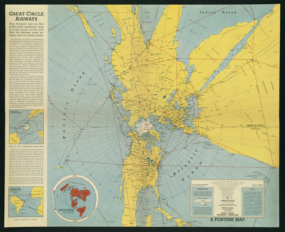
Richard Edes Harrison (1901-1994)
Great Circle Airways
Supplement to Fortune, May 1943
Throughout his work Richard Harrison was intent on showing the close proximity of North America to the Eurasian landmass by crossing over the North Pole. This was an important and urgent message at the beginning of World War II. Many believed that the apparent isolation offered by the Atlantic and Pacific Oceans, provided security from the military conflicts in central Europe and eastern Asia.
By using a map projection centered on the North Pole, Harrison demonstrated that the shortest distance from the major North American cities to Europe and Asia was across Canada and the northern polar region. With the advent of the airplane during the first half of the 20th century, attack from the North by air appeared to be a real threat.
In this map, Harrison used an unusual projection, called gnomic. It is accurate only at the center and is used primarily for navigation.
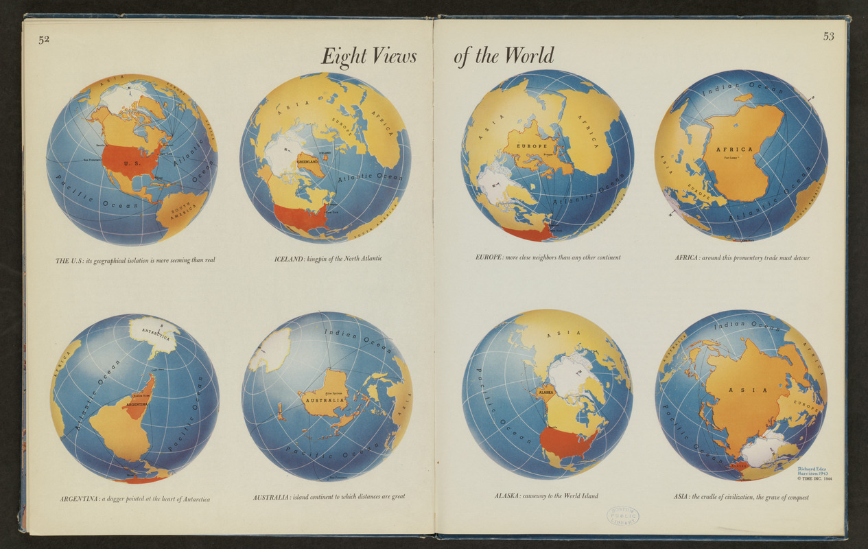
Richard Edes Harrison (1901-1994)
“Eight Views of the World”
In Look at the World (New York, 1944)
Mid-20th century cartographer Richard Harrison generally drew world maps as if the Earth was viewed from a satellite, allowing him to portray it using a three-dimensional perspective. By using such unconventional presentations, he forced his World War II American audiences to realize the implications of a true global world view.
“Eight Views of the World,” provides a sampling of the unique perspectives and orientations that Harrison used. While the first of the eight views focuses on the United States and its isolation, the others emphasize Iceland, Argentina, Australia, Europe, Africa, Alaska, and Asia. By rotating and inverting the globe, often with the South Pole at the top, Harrison prods his readers to think about the peculiar roles various places play within the global theater.
This particular presentation was included in a cartographic anthology that was appropriately entitled Look at the World, imploring Americans to look at a world that was not centered on America.
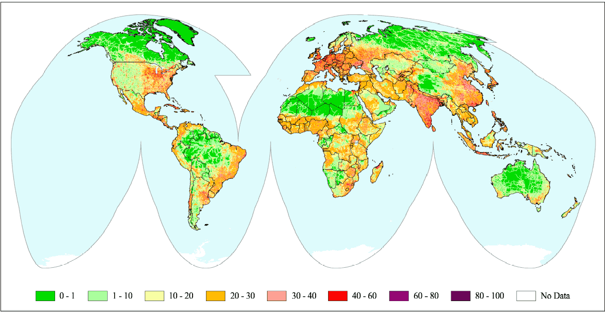
Wildlife Conservation Society and Center for International Earth Science Information
The Human Footprint
New York, [2002]
Just as the use of Geographic Information Systems (GIS) allows the layering of various types of data, this map portrays the accumulated impact of various generations of human activity on the Earth.
While the array of maps in this exhibition provides a selection of chronological snap shots recording the world as known or imagined during the last 500 years, this map combines those geographical insights by mapping the results of humans exploring, occupying, and using the Earth’s physical landscape. The map’s creators refer to the imprint resulting from this historical process as the “human footprint.”
This map combines data from nine public data bases on human population density, land use, settlements, power infrastructure, and access from roads and rivers to estimate “the human footprint.” Analysis of their results reveals that 83 percent of the Earth’s land surface is affected by humans in one or more ways.
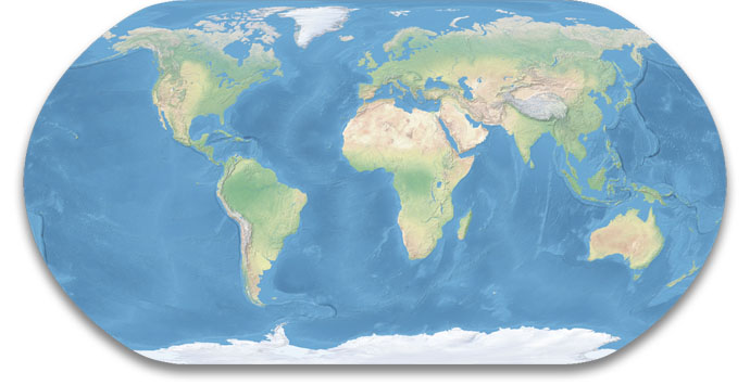
U.S. National Park Service
Natural Earth
Harpers Ferry, WV, [2005]
A natural Earth – the world without boundaries, place names, or human settlements – is the first impression provided by this world map created by Tom Patterson, a cartographer with the U.S. National Park Service. He designed it as a base map to show the 388 National Park Service sites, which span eleven time zones. He intended to show these sites not as isolated places but within an interconnected context emphasizing major environmental zones.
The map is based on data and imagery collected by National Aeronautical and Space Administration satellites. This information was graphically enhanced by National Park Service cartographers. In designing the map, they combined shaded relief, representing the Earth’s topography (land forms), with a palette of seven colors portraying broad patterns of natural vegetation. The result is a printed natural color image that approximates the Earth’s landscape as if viewed from an airplane or satellite.
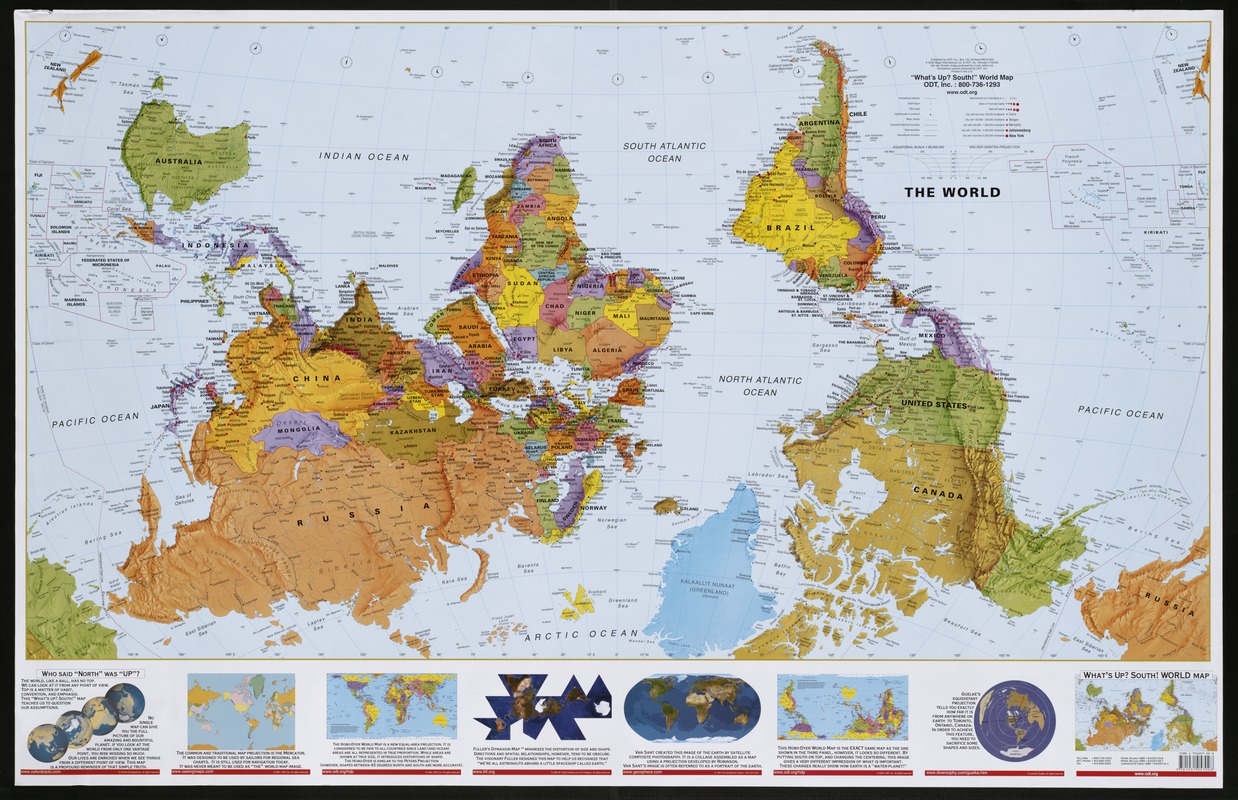
ODT, Inc.
“What’s Up? South!” World Map
Amherst, MA, 2002
The ODT company in Amherst, Massachusetts, whose mission it is to “honor differences” and to teach “people to see the world from a broader, more inclusive perspective,” published this “upside-down” world map, oriented with South at the top.
The map obviously has a message to convey.
North-oriented maps emphasize the geography of Europe and America. By placing other continents on the periphery, we imply that these other countries are not equally important.
This map emphasizes that there are other ways to look at the world. Its upside-down perspective puts Africa in the center, flanked by Australia and South America. This orientation emphasizes the Third World countries, suggesting perhaps that they are also an important part of the world community and that we need to constantly reevaluate our perspectives.
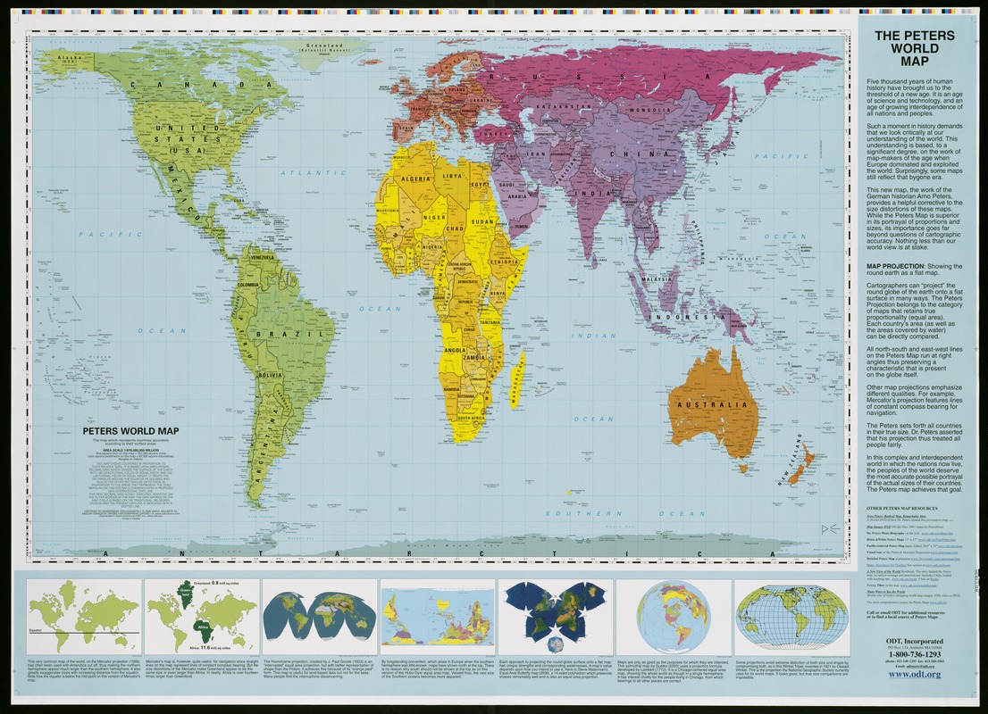
Akademische Verlagsanstalt
Peters World Map
Oxford, UK, and Amherst, MA, 2006
A much more controversial map distributed by the firm ODT in Amherst, Massachusetts, is a world map based on the Peters Projection. This projection was popularized by Arno Peters, a 20th-century German historian, who was dissatisfied with the Mercator projection.
Peters argued that the Mercator projection grossly exaggerates the importance of the countries in the northern hemisphere, i.e. the well developed, industrialized countries, at the expense of the third world countries in South America, Africa, and southern Asia.
In place of the Mercator projection, Peters advocated the use of a projection that is known technically as the Gall equal-area projection, but is now popularly known by Peters’ name. This projection preserves relative area or size throughout the entire map, according to the surface area of a particular country, but in doing so, distorts the shapes of continents and countries.
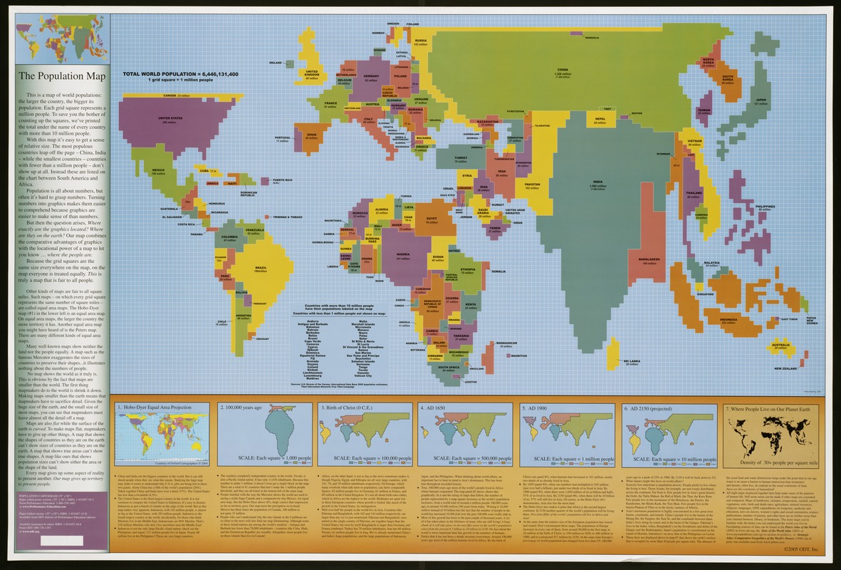
ODT, Inc.
The Population Map
Amherst, MA, 2005
This strange “lego”- like ODT map is called a cartogram, a diagram combining map and graph qualities. It distorts the size and shape of countries to portray their population (number of people) rather than their geographic territory (number of square miles).
Since this is a map about people, it has a totally different appearance than conventional maps. China and India occupy the most space because they have the largest populations, while the United States and Indonesia vie for the third and fourth places. On the other hand, Russian Siberia and Canada, which cover large expanses of geographic territory, have much smaller populations and appear as narrow strips north of their much larger neighbors, China and the United States.
This cartogram was compiled on a grid of small squares, where each square represents one million people. The insets at the bottom of the map show the historical trends of population growth.
Reading List
Black, Jeremy. Maps and Politics. Chicago: University of Chicago Press, 1997.
Ehrenberg, Ralph E. Mapping the World: An Illustrated History of Cartography. Washington, D.C.: National Geographic, 2006.
Harley, J. Brian. “Texts and Contexts in the Interpretation of Early Maps,” pp. 3-15, in From Sea Charts to Satellite Images: Interpreting North American History through Maps, edited by David Buisseret. Chicago: University of Chicago Press, 1990.
Harrison, Richard Edes. Look at the World: The Fortune Atlas for World Strategy. New York: Alfred A. Knopf, 1944.
Hébert, John, ed. 1492: An Ongoing Voyage. Washington, D.C.: Library of Congress, 1992.
Kaiser, Ward L. and Denis Wood. Seeing through Maps: The Power of Images to Shape Our World View. Amherst, MA: ODT, Inc., 2001.
Kidron, Michael and Ronald Segal. The State of the World Atlas. 5th ed. New York: Penguin Books, 1995.
Monmonier, Mark S. How to Lie with Maps. Chicago: University of Chicago Press, 1991.
Monmonier, Mark S. Rhumb Lines and Map Wars: A Social History of the Mercator Projection. Chicago: University of Chicago Press, 2004.
Schulten, Susan. The Geographical Imagination in America, 1880-1950. Chicago: University of Chicago Press, 2001.
Schwartz, Seymour I. The Mismapping of America. Rochester, NY: University of Rochester Press, 2003.
Scott, Valerie, ed. Tooley’s Dictionary of Mapmakers. 4 vols. Riverside, CT: Early World Press, 1999-2004.
Shirley, Rodney W. The Mapping of the World: Early Printed World Maps, 1472-1700. London: Holland Press, 1983.
Snyder, John P. Flattening the Earth: Two Thousand Years of Map Projections. Chicago: University of Chicago Press, 1993.
Credits
Exhibition Sponsors
Muriel and Norman B. Leventhal
Sally and Bill Taylor
Boston Globe Foundation
Mabel Louise Riley Foundation
Mellon /Arthur F. Blanchard Trust
Ann and Graham Gund
Chan Krieger & Associates
Beacon Capital Partners
Equity Office Properties
In kind donations:
Robert Abramms, ODT, Inc., Amherst, Massachusetts
Family of Richard Edes Harrison
John Hebért, Chief, Geography and Map Division, Library of Congress
Family of Sol Immerman
Robert Karrow, Newberry Library, Chicago, Illinois
Tom Patterson, National Park Service, Harpers Ferry, West Virginia
Eric Sanderson, Wildlife Conservation Society, Bronx, New York
Brad Sheppard, Sheppard Software
Curators:
Ronald E. Grim, Curator, Norman B. Leventhal Map Center at the Boston Public Library
Roni Pick, Director, Norman B. Leventhal Map Center at the Boston Public Library
Exhibition Design:
Brandon Bird, Chan Krieger & Associates
Graphic Design:
Rena Sokolow, One2tree
Exhibition Catalog Design:
Stinehour Press
Educational Outreach:
Candice Gomes, Citizen Schools Teaching Fellow
Trustees of the Public Library of the City of Boston
William O. Taylor, Chairman
The Honorable Angelo M. Scaccia, Vice Chairman
The Honorable William M. Bulger
James Carroll
Donna M. DePrisco
Berthé M. Gaines
Jeffrey B. Rudman, Esq.
Karyn M. Wilson
Norman B. Leventhal Map Center Board of Advisors
Norman B. Leventhal, Chair
Bernard A. Margolis, President, Boston Public Library
William O. Taylor
Norman Fiering
William M. Fowler
Alex Krieger
Robert M. Melzer
Dan L. Monroe
Scott A. Nathan
Ronald P. O’Hanley
Harold Osher
Paula Sidman
Alfred J. Walker
Robert F. Walsh