Introduction
The mapping of broad climate zones, wind
direction, ocean currents, and related weather events has a long and storied
history. In this exhibition, you will discover how “Venti” were wind
personas who directed ancient ships and “Horae” were goddesses of the seasons
who dictated natural order during the 15th-17th
centuries, how Enlightenment scientists started to collect and map weather
data, and how 19th-century geographers reflecting the golden age of
thematic cartography created innovative techniques to represent vast amounts of
statistical data and developed complex maps furthering our understanding of
climatic regions. As you explore five centuries of regions and seasons, you can
compare this gradual sophistication of mapping climatic data with the modern
use of computers and models that analyze the impact of changing climatic conditions
on future generations.
1. Climate Zones
J.G. Bartholomew (1860-1920)
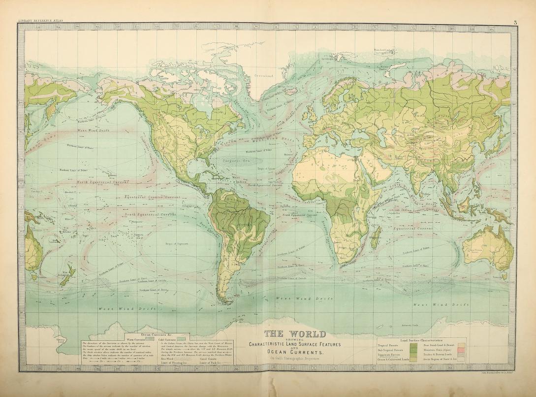
“The World Showing Characteristic Land Surface Features and Ocean Currents,” from The Library Reference Atlas of the World
London, 1890.
Norman B. Leventhal Map Center at the Boston Public Library.
Published in a late 19th-century atlas, this world map displays both warm and cold ocean currents, along with characteristic vegetation types around the globe. In this map, you can see the warm Gulf Stream current on the east coast of the United States and tropical rainforests in the Amazon River region. The mapping of ocean currents began in the 17th century, and maps of regional plant life were introduced in the first half of the 19th century. This map is a precursor to the 21st-century climate zone map.
Markus Kottek, J.Grieser, C. Beck, B. Rudolf and F. Rubel
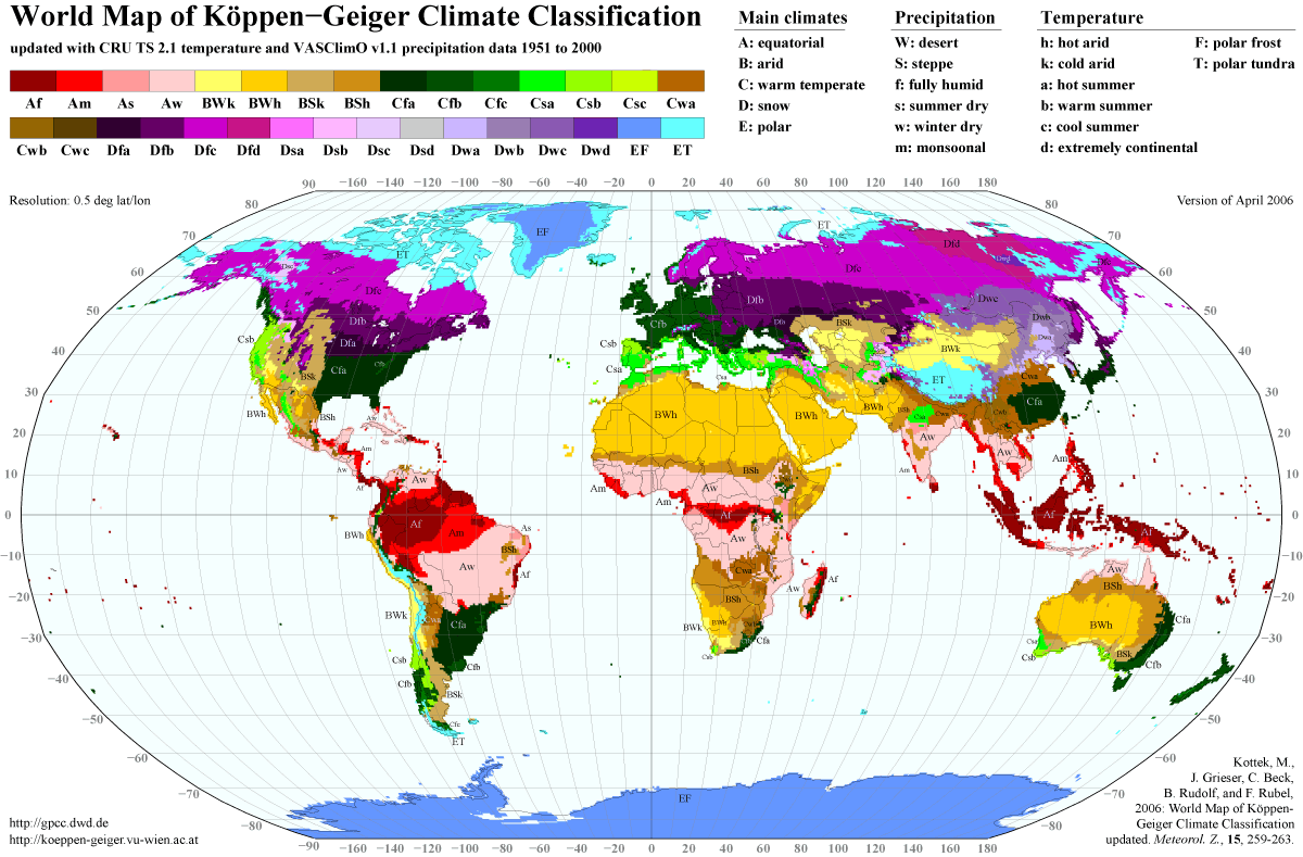
World Map of Köppen-Geiger Climate Classification Updated
[Berlin, Germany], 2006 April.
Courtesy of Dr. Markus Kottek.
The ancient Greeks began describing the Earth according to its patterns of weather and environmental conditions in the 5th century BCE. These zones, of which there were originally five, became known as climates. After thousands of years of scientific progress, the world is now commonly divided into thirty-one climate zones, as illustrated in this 2006 map. German meteorologist Wladimir Köppen (1846-1940) first developed this classification system in 1900, and each colored zone corresponds to the vegetation of an area – rainforest being an example. The first letter in the classification refers to the zone; second letter to precipitation; third letter to temperature.
2. Windheads
Minerva sent them a fair wind from the West, that whistled over the deep blue waves...
–Homer. The Odyssey, book II. Translated by Samuel Butler, 1999.
Lienhart Hol, Printer (active 15th cent.); Johannes Schnitzer, Engraver (active 1482)
[World map] in Claudius Ptolemy’s Cosmographia
Ulm, Germany, 1482.
Norman B. Leventhal Map Center at the Boston Public Library.
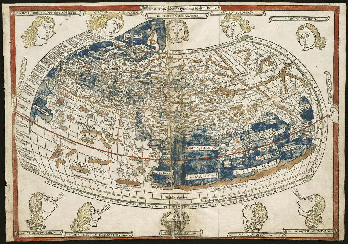
The winds, collectively known as Venti, have long been viewed as both bringers of good fortune and sources of chaos. In ancient Greece and Rome, the god-like winds played a significant role in navigation of the Mediterranean Sea. The Greek philosopher Aristotle (4th cent. BCE) named twelve winds, which are illustrated on this world map included in the 1482 edition of Claudius Ptolemy’s (2nd cent. CE) Cosmographia. Carved from a woodblock – an early method of printing – this map names the four main winds that blow from the cardinal directions of north, south, east and west, along with eight minor winds.
Bernardo Sylvanus, Editor (fl. 1490-1511)
[World map] in Claudius Ptolemy’s Geographia
Venice, 1511.
Norman B. Leventhal Map Center at the Boston Public Library.
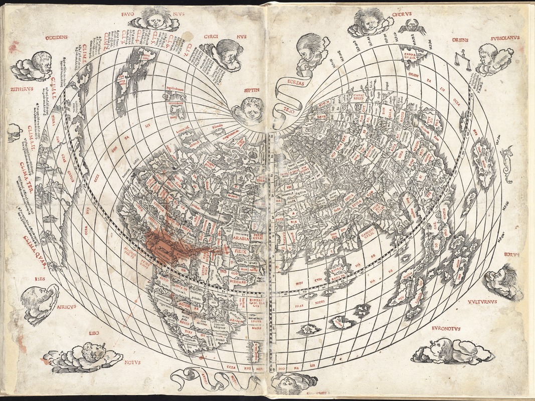
The winds, known collectively as Venti, have long been viewed as both bringers of good fortune and sources of chaos. In ancient Greece and Rome, the winds were seen as personas; gods who brought favorable or difficult weather. The Greek philosopher Aristotle (4th cent. BCE) named twelve winds, which are illustrated on this world map in the 1511 edition of Claudius Ptolemy’s (2nd cent. CE) Geographia. The map also features climate zones, shown here as horizontal bands that correspond to latitudinal lines across the globe. Marked with “CLI[MA]” in red, these zones number seven north of the equator and five south.
Lorenz Fries, editor (ca. 1490-ca.1531)
[World map] in Claudius Ptolemy’s Geographia
Strasbourg, France, 1525.
Norman B. Leventhal Map Center at the Boston Public Library.
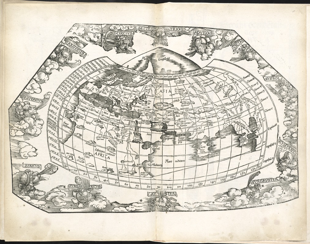
The winds, collectively known as Venti, have long been viewed as both bringers of good fortune and sources of chaos. In ancient Greece and Rome, the winds were seen as personas; gods who brought favorable or difficult weather to humans on earth. The Greek philosopher Aristotle (4th cent. BCE) named twelve winds, which are illustrated on this world map in the 1525 edition of Claudius Ptolemy’s (2nd cent. CE) Geographia. Carved from a woodblock – an early method of printing – this map names the four main winds that blow from the cardinal directions of north, south, east and west, along with eight minor winds.
Franz Ritter (fl. 1610-1640)
[World Map]
[Nuremberg, Germany, 1607]
Norman B. Leventhal Map Center at the Boston Public Library.
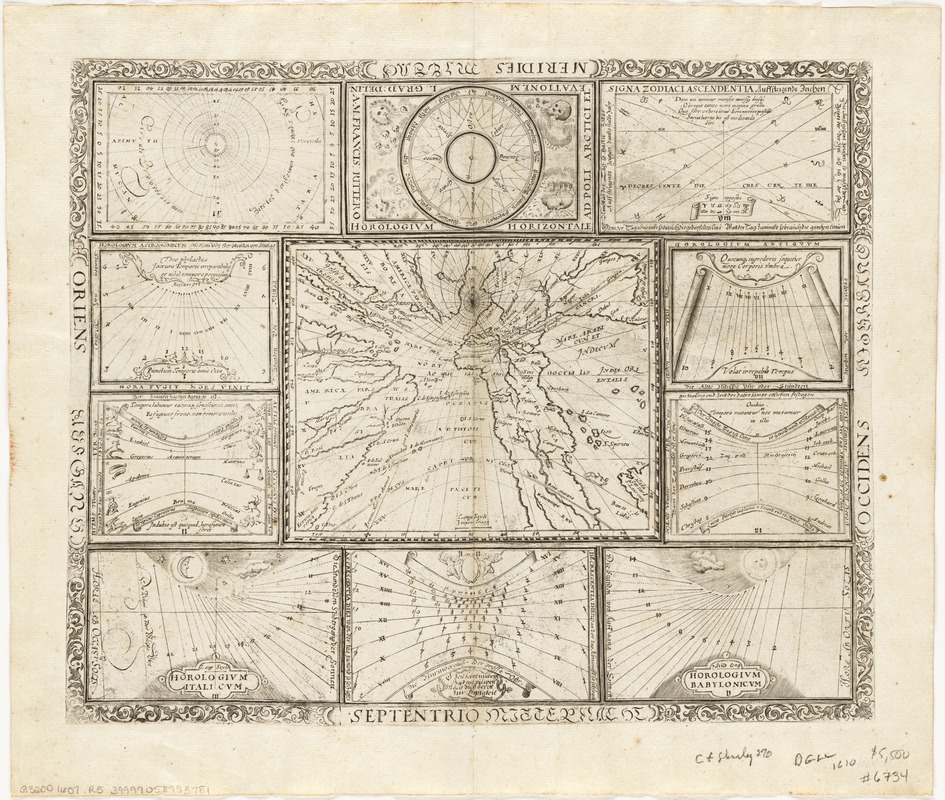
The winds remained on maps into the 17th century, as illustrated on this 1607 horological diagram, which was used for measuring time. Produced by German mathematician Franz Ritter, this unique example contains one central world map surrounded by ten diagrams illustrating different ways of recording or measuring time. Ritter’s wind diagram appears in the top center margin here. The four principal winds are represented encircling a compass, with north at the south. “Destructive” winds in the south are illustrated here as skulls, indicating the negative effects they were believed to have on humankind.
Matthaeus Seutter (1678-1756)
Tabula Anemographica seu Pyxis Nautica, Vulgo Compass: Charte Ventorum …
[Augsburg, Germany], 1760.
Norman B. Leventhal Map Center at the Boston Public Library.
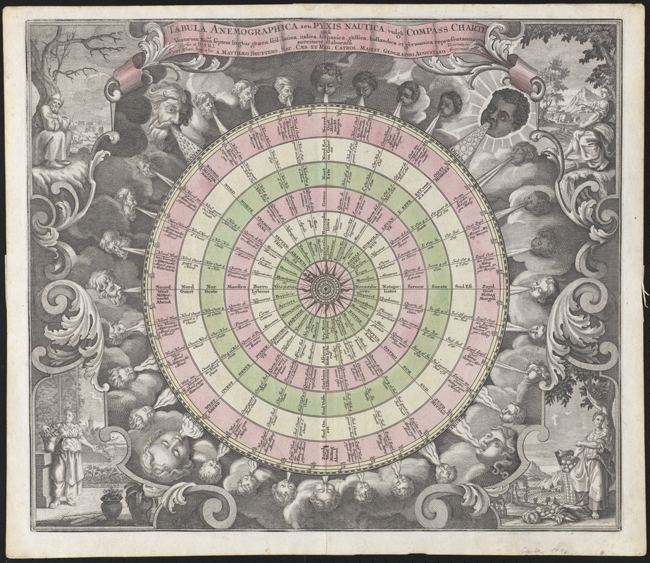
Thirty-two windheads appear on this 1760 chart of the heavens by German mapmaker Matthaeus Seutter. Corresponding with each of the thirty-two points on the compass, these winds range in age from young to old, with the largest wind heads representing the four principal winds Boreas (North), Eurus (East), Notus (South) and Zephyrus (West). Figures representing the four seasons appear in each corner of the map, and their placement near the four groups of winds symbolizes the weather and natural phenomena each wind was said to bring.
3. Horae, Elements and Seasons
And thorough this distemperature we see
The seasons alter: Hoary-headed frosts
Fall in the fresh lap of the crimson rose,
And on old Hiems’ thin and icy crown
An odorous chaplet of sweet summer buds
Is, as in mockery, set: The spring, the summer,
The childing autumn, angry winter, change
Their wonted liveries, and the mazed world,
By their increase, now knows not which is which.
–William Shakespeare. A Midsummer Night’s Dream, 1595. Titania, 2.1.106-114
Moses Pitt (fl. 1654-1696)
Nova Totius Terrarum Orbis Geographica ac Hydrographica Tabula
[Oxford, England], 1680.
Norman B. Leventhal Map Center at the Boston Public Library.
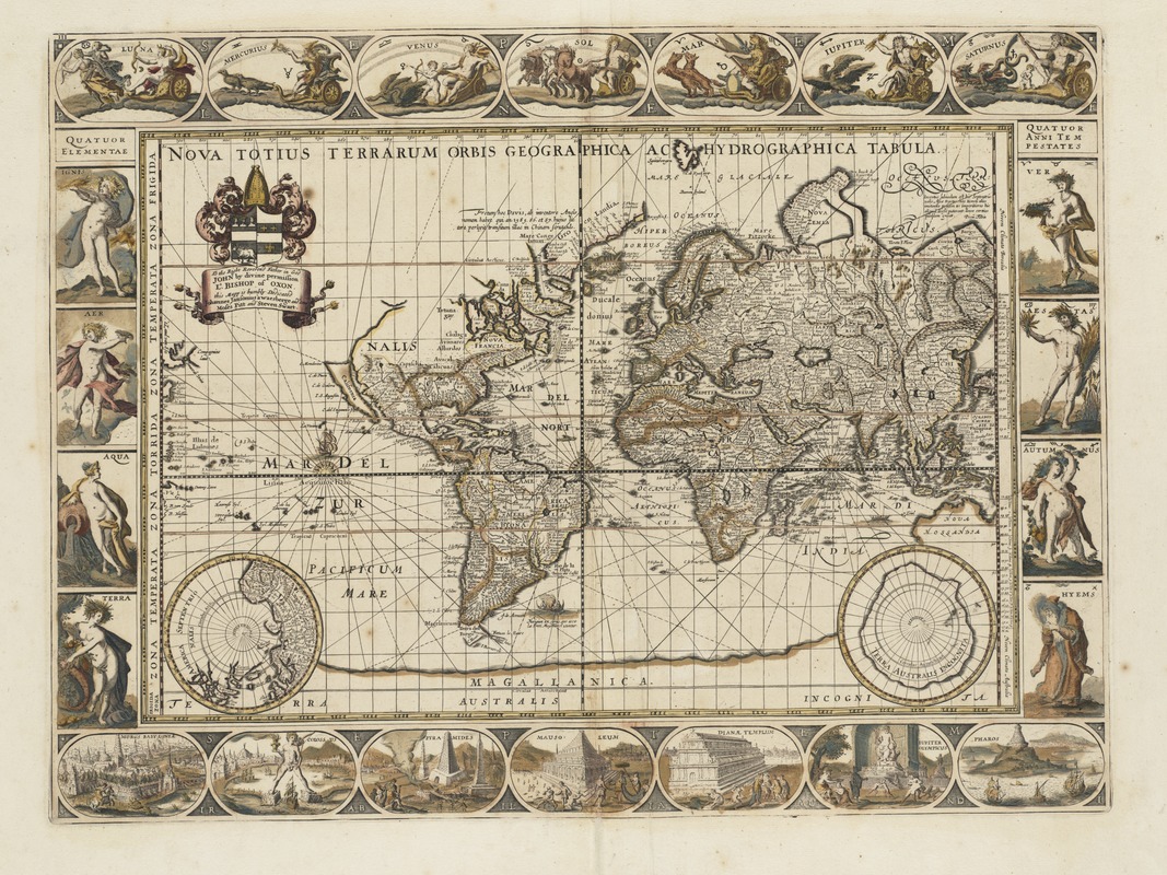
In Greek mythology, the Horae – a group of three rain-giving goddesses – ruled over natural order and the seasons, and through their gift of water from the heavens they brought agricultural wealth to the earth. Carpo, Thallo and Auxo represented spring, summer and winter. By the 4th century BCE, a fourth season – autumn – was added to the group. This 1680 map of the world illustrates the four seasons in the right margin with Latin names: Ver (Spring), Aestas (Summer), Autumnus (Fall) and Hyems (Winter). The four elements (fire, air, water and earth) are shown opposite of the seasons.
Pieter Goos (1615-1675)
“Orbis Terrarum Nova et Accuratissima Tabula = Nieuwe Werelt Kaert uÿt Gegeven,” in De Zee-Atlas Ofte Water-Wereld
Amsterdam, 1672. Reproduction, 2017.
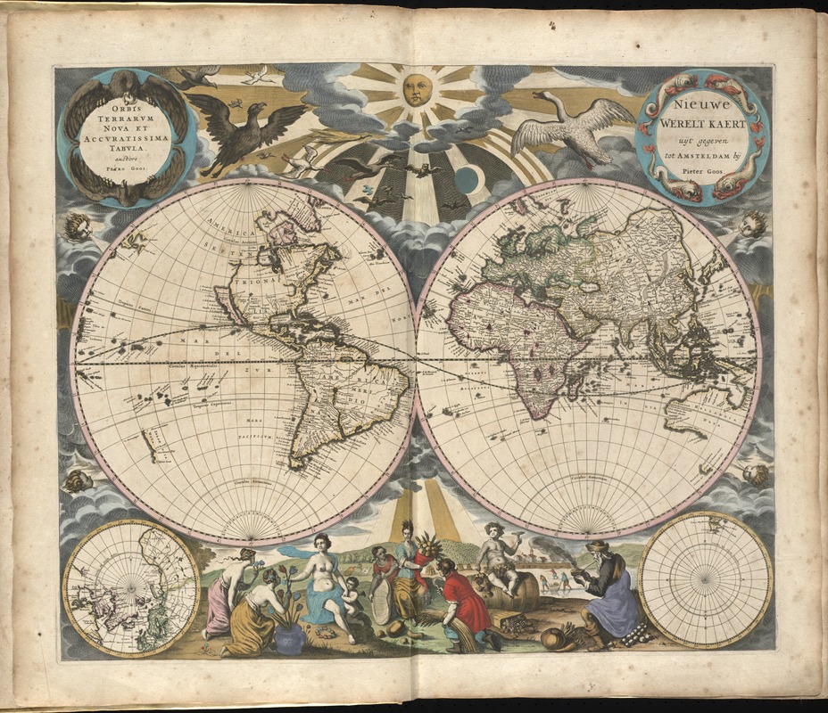
Allegorical figures of the seasons – both male and female – along with their characteristic symbols, are placed in the lower center of this double-hemisphere world map. Spring with her flowers sits near Summer with the Horn of Plenty, while “Old Man” Winter kneels to the right. Dionysus, the Greek god of fruitfulness and wine is also present as an ode to an abundant harvest, while four wind heads blow on the earth from their designated part of the sky. This map combines contemporary geography with mythological figures from the past, creating a decorative blend of old and new.
Charles Grignion (1721-1810)
“Begin with Sense, of Ev’ry Art the Soul …” from The Gentleman’s Magazine, Vol. XXI
London, 1751.
Norman B. Leventhal Map Center at the Boston Public Library.
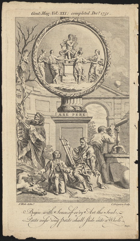
In a number of ancient cultures, weather was believed to have been controlled by deities, which allowed these groups to cope with natural phenomena. With the 17th-century European Enlightenment, scientific explanation and reason combined with religious belief to create a revolutionary worldview that expanded this principle. This 1751 print illustrates that transition. Environmental conditions and seasonal change were long thought to influence health and disease. Here, the Greek god of medicine Asclepius lays aside his staff to consult a barometer – a modern instrument that recorded atmospheric pressure, while a farmer looks to the heavens and laments his deceased cow.
4. Currents
Lulled lay the smooth and silent sea,
A mirror in translucent calm,
The breeze, along that crystal realm,
Unmurmuring, died in balm.
–Friedrich Schiller. Hero and Leander, 1801.
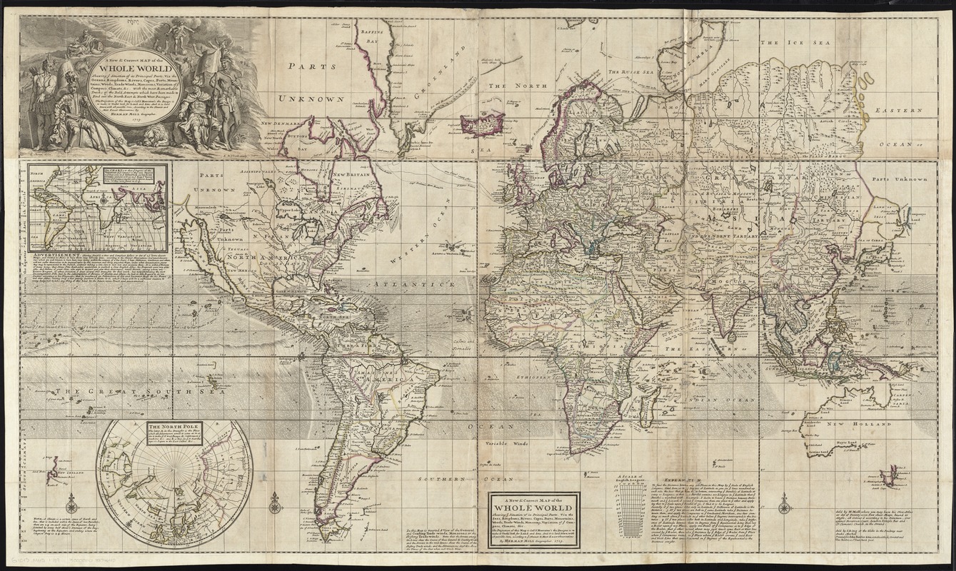
Herman Moll (ca. 1654-1732)
“A New & Correct Map of the Whole World: Shewing ye Situation of its Principal Parts. viz. the Oceans, Kingdoms, Rivers, Capes, Ports, Mountains, Woods, Trade-winds, Monsoons, Variation of ye Compass, Climate, &c.” from The World Described
London, 1719.
London-based cartographer Herman Moll produced this world map for his atlas The World Described (1709-36) to document the numerous expeditions undertaken by English explorers searching for an ocean passage to Asia. In addition to notes on climate and weather events, Moll also included an early rendering of the trade winds in this map. Shown as small arrows and curving lines, Moll based his depiction on the first meteorological map produced by Edmund Halley in 1686. The seasonal trade winds were critical to efficient navigation of oceans in the 18th century.
5. Education Tools
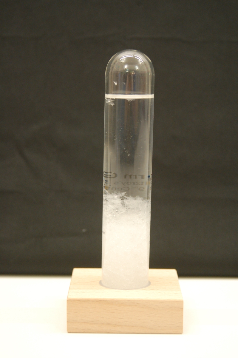
Admiral Fitzroy’s Storm Glass
21st century.
Norman B. Leventhal Map Center at the Boston Public Library.
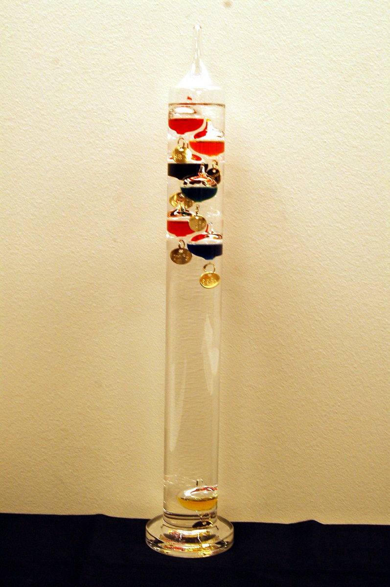
The two instruments displayed here were once used to measure temperature and predict stormy weather; however, in the 21st century they are viewed as amusing curiosities. The “Galileo thermometer,” named for Italian scientist Galileo Galilei (1564-1642) is a liquid-filled glass tube in which are suspended colored liquid-filled spheres supporting weighted metal tags. As the temperature of the air outside the thermometer changes, so does the liquid inside the tube, which causes the colored spheres to float or sink. The lowest floating sphere represents the air temperature.
The storm glass, originally invented in late 18th-century France, was made famous the following century by English mariner Robert FitzRoy, who captained the “HMS Beagle” during Charles Darwin’s voyage in 1830. An advocate of meteorology, FitzRoy recommended that weather stations use an instrument called a “weather glass,” to predict storms. This simple but controversial device consisted of a glass tube filled with a chemical mixture, and when small crystals appeared in the tube, was thought to be an indication of impending weather. It is believed the “weather” or “storm glass” is sensitive to temperature; however, the device was never considered a serious instrument for meteorological purposes.
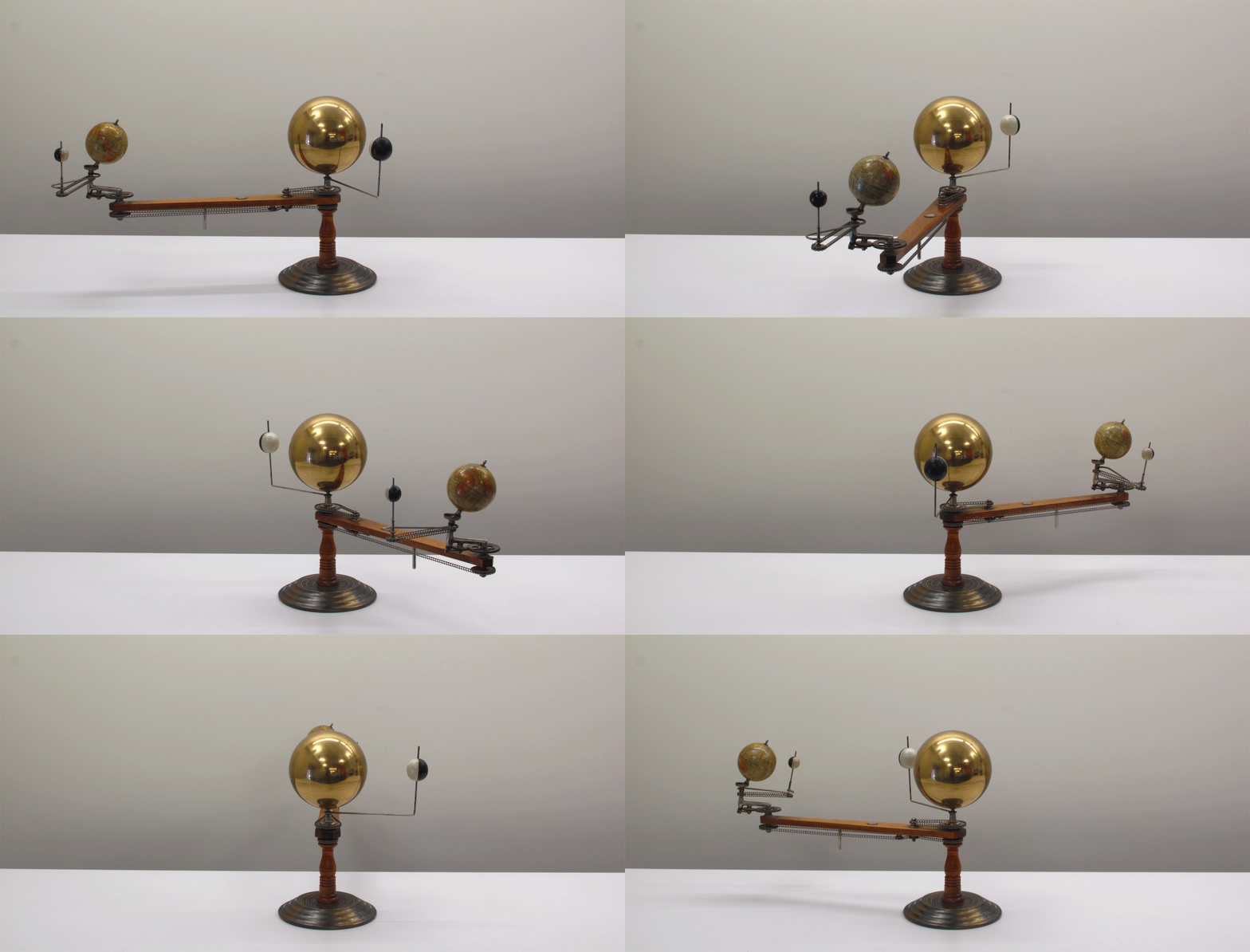
Trippensee Planetarium Company
The Trippensee Planetarium
Detroit, MI, 1908-25.
Norman B. Leventhal Map Center at the Boston Public Library.
Holbrooks Apparatus Manufacturing Co.
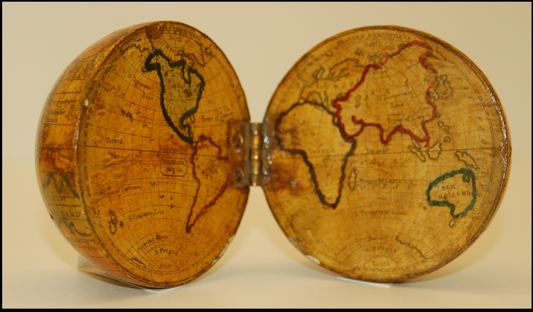
[Terrestrial Pocket Globe]
Weathersfield, CT, [1855?]
Norman B. Leventhal Map Center at the Boston Public Library.
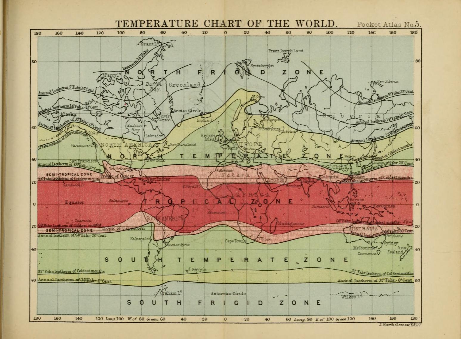
John Bartholomew (1831-1893)
“Temperature Chart of the World,” from the Pocket Atlas of the World
New York, 1887. Reproduction, 2017.
Norman B. Leventhal Map Center at the Boston Public Library.
The objects displayed here are tools that were used to teach geography and climate-related topics to schoolchildren in the 19th and early 20th centuries. The map illustrates the five main climatic zones of the earth, using color to differentiate between regions. When open as a “flat map,” the pocket globe also depicts the same five zones, but also shows the sphere of the earth on the exterior when closed. Orreries were used as visual aids in classrooms. This model demonstrates the movements of the Earth, moon and Venus relative to one another and around the sun, and illustrates the timing of seasonal change.
6. Oceans
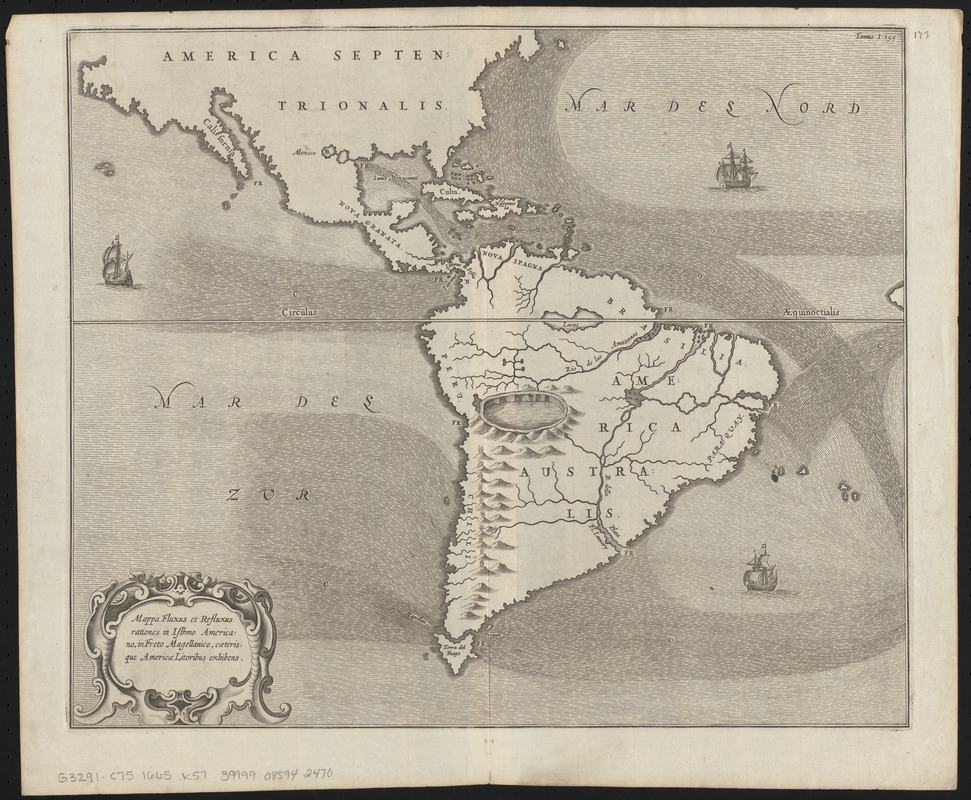
Athanasius Kircher (1602-1680)
"Mappa Fluxus et Refluxus Rationes in Isthmo Americano . . ." from Mundus Subterraneus
Leiden, Netherlands, 1670.
Norman B. Leventhal Map Center at the Boston Public Library.
Mariners have charted the oceans since the late 13th century. However, the 1670 map here is not a general sea chart, but is one of the first thematic maps produced. Thematic maps illustrate phenomena and related patterns, rather than locations or geographical features. When originally developed, thematic maps required mapmakers to create new techniques to display data. This map depicting ocean currents in the western hemisphere is by Athanasius Kircher, a Jesuit scholar, mathematician and mapmaker. Circulation of ocean waters and winds was one of the earliest subjects of thematic mapping, due to their navigational and commercial value to mariners.
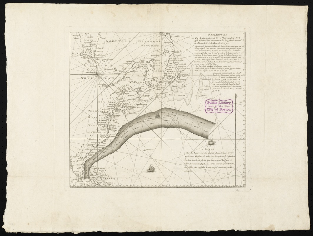
Georges-Louis Le Rouge (ca. 1717-ca. 1790)
Remarques sur la Navigation de Terre-Neuve à New-York Afin d’Eviter les Courrants et les Bas-fonds au Sud de Nantuckett et du Banc de George …
Paris, 1785.
Norman B. Leventhal Map Center at the Boston Public Library.
Conservation of this piece was funded by Lavinia Lee Witt Touchton of Tampa, Florida in memory of her father, Currie B. Witt, whose study of Benjamin Franklin “was a positive influence in his life.”
One of the preferred routes that captains and navigators sailing from America to England learned to use was the Gulf Stream, a strong, warm current that flows north along the Atlantic Coast and then east toward Europe. Initially theorized by Benjamin Franklin in 1768, this discovery helped ships minimize travel time across the ocean, speeding up the transatlantic voyage for travelers, merchants, and goods. Franklin purchased this 1785 chart, a French adaptation of his original findings, when he served in Paris as a diplomat for the United States during the early years of the nation.
Frederick Warne & Co.
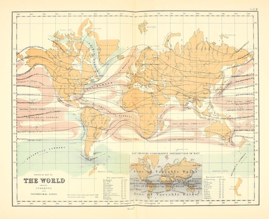
“Physical Map of the World Showing Currents and Isothermal Lines,” in The College Atlas, for Schools and Families
London, 1870.
Norman B. Leventhal Map Center at the Boston Public Library.
Observation of currents in the open ocean was a difficult process compared to watching tides from the coast. Therefore, maps of currents around the whole world did not appear until the mid-19th century. By this time, travel and scientific observation from all parts of the globe were a reality. This map, which appears in an atlas for children and families from “the golden age” of thematic mapping, names ocean currents worldwide and includes “isotherms” – curved lines that indicate areas of equal temperature, as well as data on rainfall around the globe. Shading, color and lines were used to convey variations with vast amounts of data collected.
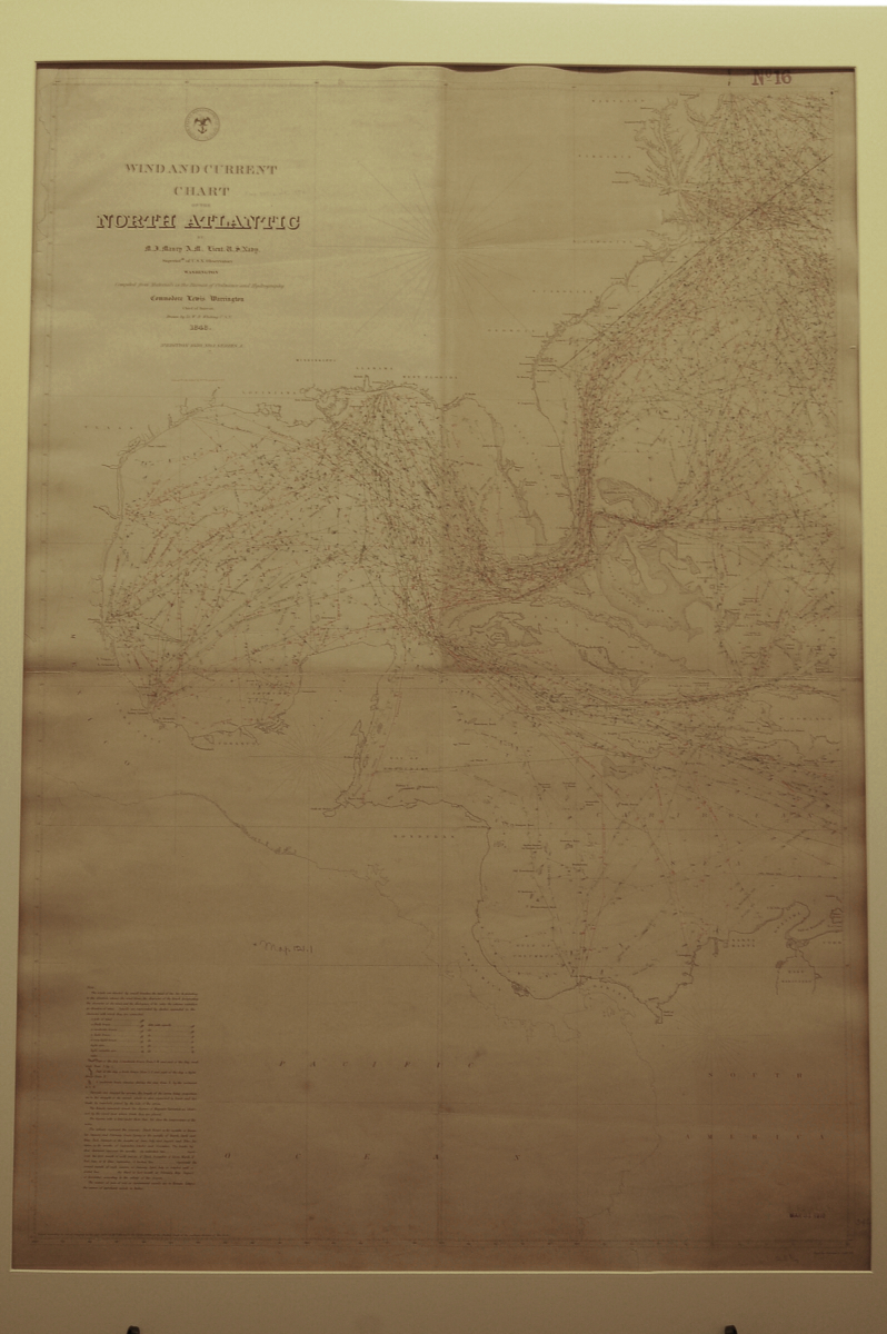
Matthew Fontaine Maury (1806-1873)
Wind and Current Chart of the North Atlantic
Washington, D.C., 1850.
Norman B. Leventhal Map Center at the Boston Public Library.
The United States government was heavily invested in collecting environmental data and studying weather by the mid-19th century, as this chart illustrates. Produced by Officer Matthew Maury, this chart was issued by the U.S. Navy as part of a series that endeavored to improve navigation of the world’s oceans. Maury relied on ship’s logs and the observations of crew members to compile data shown on this chart. The chart outlines sailing routes and includes names of vessels, dates of voyages, direction of currents and wind speeds. The four colors black, blue, red and green correspond to the four seasons.
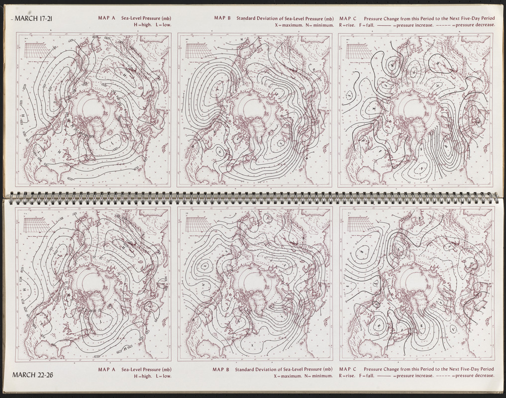
James F. Lahey et al.
“March 17-21 and March 22-26,” from Atlas of Five-Day Normal Sea-Level Pressure Charts for the Northern Hemisphere
Madison, WI, 1958.
Norman B. Leventhal Map Center at the Boston Public Library.
Atmospheric pressure, or the weight of air above any given point, was first measured using a barometer in the 17th century, and is one of the main elements that combine to make weather along with temperature and precipitation. Sea-level pressure is the atmospheric pressure at sea level for any given location. This mid-20th-century nautical atlas made on behalf of the U.S. Air Force, with a viewpoint from the North Pole, presents sea-level pressure readings in the northern hemisphere. The solid and dashed lines, known as isobars, represent areas of equal pressure. Variations in pressure can be analyzed by meteorologists to see high or low pressure areas.
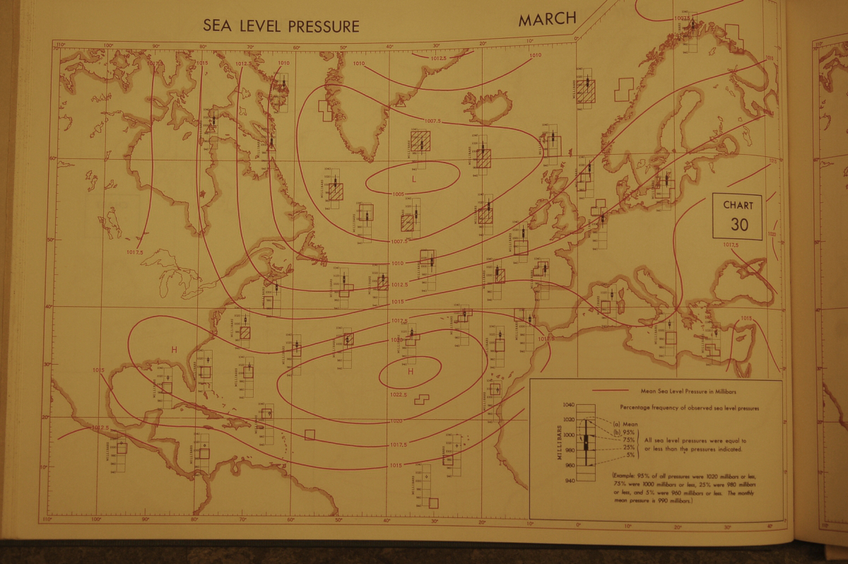
U.S. Office of Climatology; U.S. Weather Bureau; U.S. Hydrographic Office
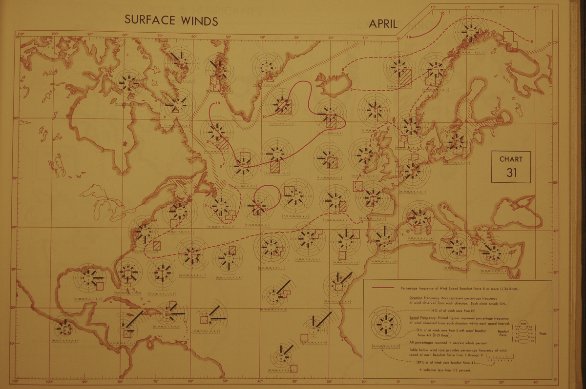
“Chart 30 and Chart 31,” from Climatological and Oceanographic Atlas for Mariners
Washington, D.C., 1961.
Norman B. Leventhal Map Center at the Boston Public Library.
Winds and the directions from which they blow have been important subjects for mapmakers for centuries. Wind roses, the circular diagrams showing wind strength and direction for a given location, were used by mapmakers in the earliest sea charts of the 13th century, and were still in use in the mid-20th century, as illustrated in this atlas. Sea-level pressure readings are also included here. As technology and methods for data collection improved, mapmakers were able to include more accurate information on maps and charts, which increased the efficient and safe navigation of oceans.
7. Temperature
William C. Woodbridge (1794-1845)
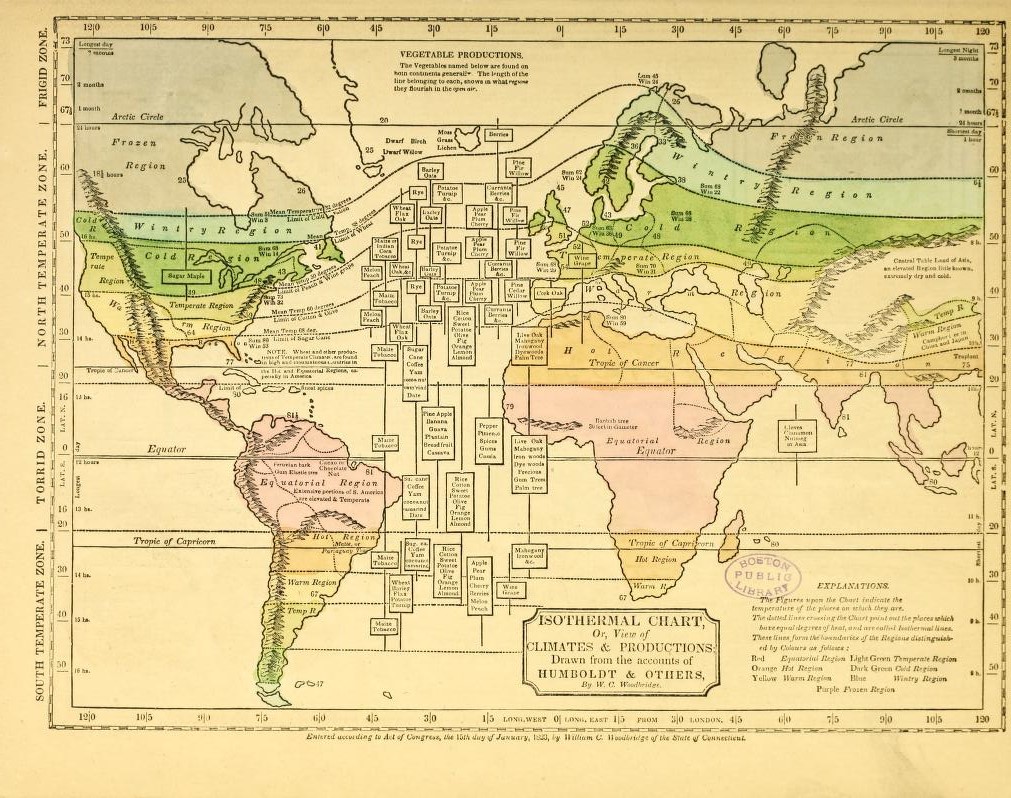
“Isothermal Chart, or, View of Climates and Productions; Drawn from the Accounts of Humboldt & Others,” in Modern Atlas, on a New Plan, to Accompany the System of Universal Geography
Hartford, CT, 1831. Reproduction, 2017.
Norman B. Leventhal Map Center at the Boston Public Library.
The science of meteorology began in early 19th-century America in an effort to better understand and predict destructive storms, as well as the relationship between the environment and disease. Temperature was one of the first phenomena to be mapped. German naturalist Alexander von Humboldt was the earliest to use isotherms, or lines connecting points or locations that have the same temperature, in 1817. The 1831 map displayed here by W.C. Woodbridge – an early adopter of Humboldt’s isotherm technique – is from a school atlas. Woodbridge divides the Earth into climatic zones and connects vegetation and products to each region.
G.W. & C.B. Colton & Co.
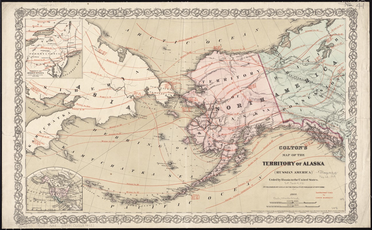
Colton’s Map of the Territory of Alaska: (Russian America) ceded by Russia to the United States
New York, 1868.
Norman B. Leventhal Map Center at the Boston Public Library.
Use of the curving isotherm allowed 19th-century mapmakers to break with the ancient and rigid concept of five climatic zones aligned with latitudes, while providing more accurate data and the ability to form relationships using this information. This 1868 map of Alaska features isotherms drawn by mapmaker Lorin Blodget, whose technique made vast amounts of environmental data easy to understand. Blodget’s data was also used by government offices to examine the financial capacity of the Alaska territory, as the nation was rapidly expanding into the West. Red lines indicate temperatures and average readings throughout the territory.
Charles A. Schott (1826-1901)
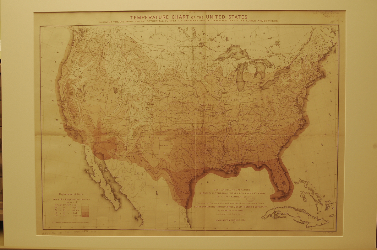
Temperature Chart of the United States: Showing the Distribution by Isothermal Curves of the Mean Annual Temperature for the Year
Washington, D.C., 1874.
Norman B. Leventhal Map Center at the Boston Public Library.
Techniques for illustrating temperature differences on maps improved throughout the 19th century, as the lithographic printing process was refined. Charles Schott produced this map and a series of others for the Smithsonian Institution from 1868 to 1874. Building upon Lorin Blodget’s earlier work with isotherms, Schott also uses color in varying intensities to indicate cool or warm areas. The darker areas represent the warmer regions of the country, while lighter parts signify cooler zones. Combining isotherms and color in this map allows the reader to understand vast amounts of information in a simple visual presentation.
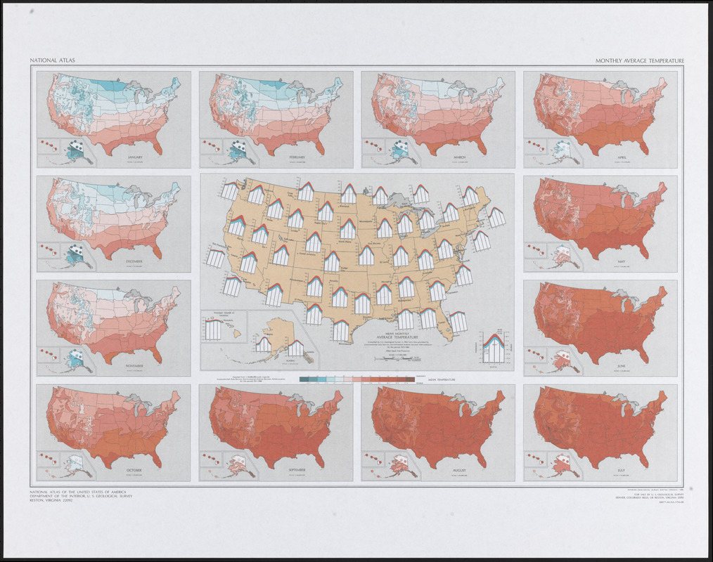
U.S. Geological Survey
Monthly Average Temperature, US
[Reston, VA, 1986]
Norman B. Leventhal Map Center at the Boston Public Library.
By the 20th century, digital technologies had replaced the older, manual mapmaking processes of copperplate engraving and lithography. However, visual techniques first developed in the mid-19th century such as shading variations were, and are still employed in thematic maps. This modern map illustrates monthly average temperatures for the United States from 1931-1960 using isotherms and a color scale from cold blues to warm reds. The large map in the center shows daily mean high and low temperatures during January, April, July and October for major cities across the country using two colors and a bar graph.
8. Precipitation
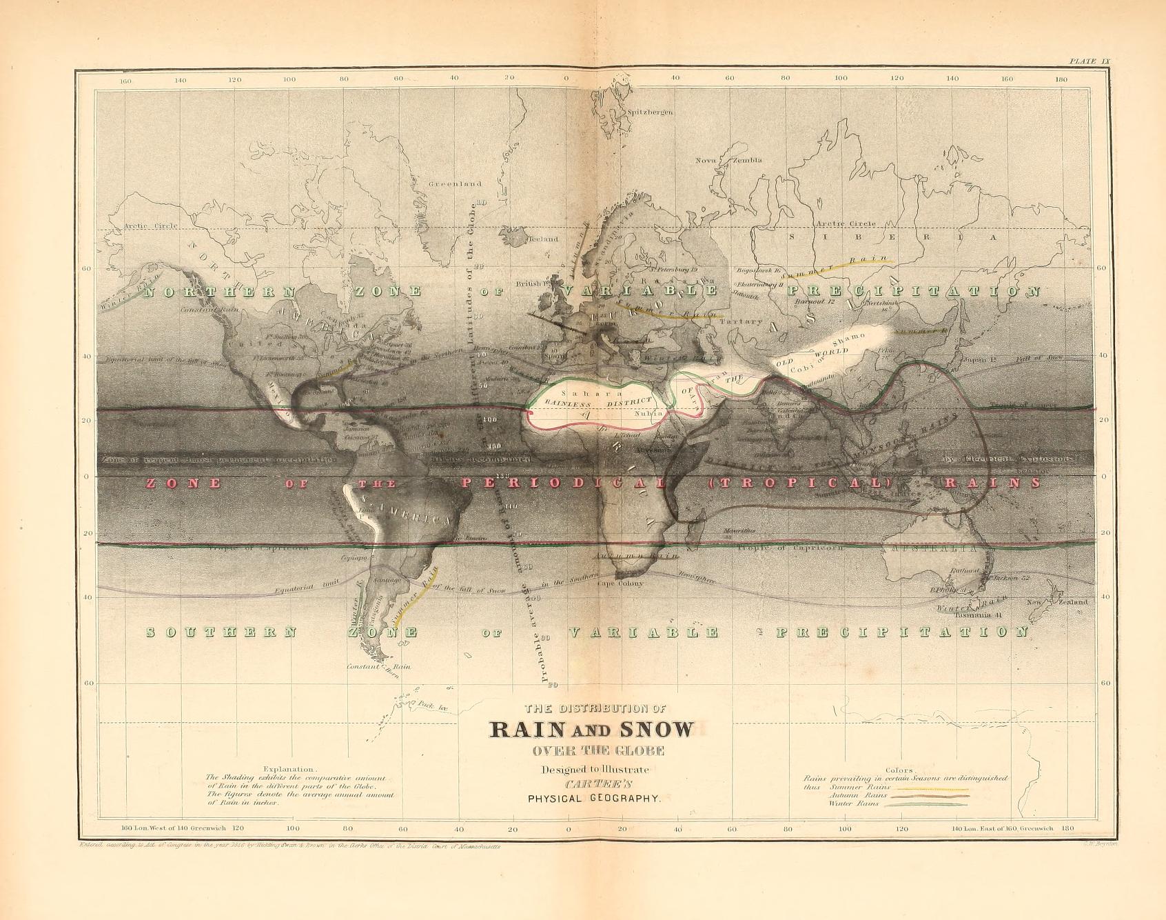
Cornelius S. Cartée (1806-1885)
“The Distribution of Rain and Snow over the Globe,” in A School Atlas of Physical Geography Illustrating … the Elementary Facts of Geology, Hydrology, Meteorology, and Natural History …
Boston, 1856. Reproduction, 2017.
Norman B. Leventhal Map Center at the Boston Public Library.
Precipitation soon followed temperature as a meteorological phenomenon that merited mapping in the 19th century. The earliest map of rain and snowfall worldwide appeared in H.K.W. Berghaus’ Physikalischer Atlas in 1841. The 1856 “hyetographic,” or rain map displayed here is based on Berghaus’ original visual techniques, and uses shading to indicate variable precipitation – the darker the shade, the more rain in that region. Blank spaces indicate rainless areas, such as the Sahara Desert. Issued in a school atlas, this map was intended to teach children about weather and climate in an easy and logical style.
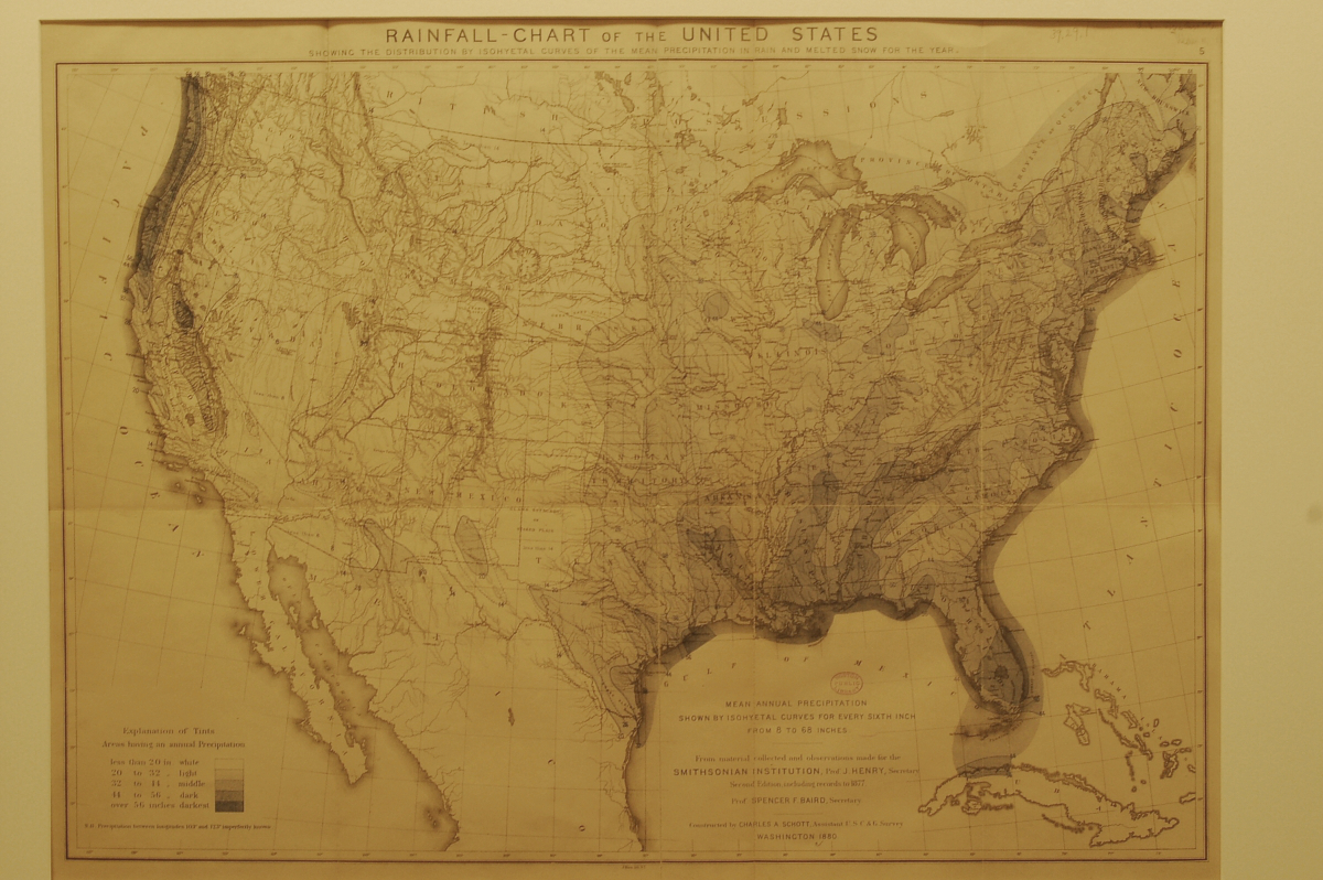
Charles A. Schott (1826-1901)
Rainfall-chart of the United States: Showing the Distribution by Isohyetal Curves of the Mean Precipitation in Rain and Melted Snow for the Year
Washington, D.C., 1880.
Norman B. Leventhal Map Center at the Boston Public Library.
Charles Schott was also making precipitation maps while working on his temperature charts for the Smithsonian in the 1860s-1870s. As was the case with his temperature map, Schott uses color variations and “isohyets,” or lines connecting points of equal precipitation. Like earlier maps by Schott, intensity of color indicates a range from minimal to abundant rain or snowfall. Schott’s maps became part of the 1874 “Statistical Atlas of the United States,” a revolutionary book which provided a graphic representation of the statistical data contained in the 1870 census. With this atlas, the American public could easily comprehend the data surrounding their lives.
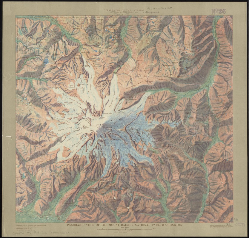
John H. Renshawe (1852-1934)
Panoramic View of the Mount Rainier National Park, Washington
Washington, D.C., 1914.
Norman B. Leventhal Map Center at the Boston Public Library.
Snowfall is another component of precipitation data found on weather maps, and is critical to a location’s resistance to drought during warm months. Mount Rainier, a national park, is an active volcano and the most glaciated peak in the lower forty-eight states. The Washington state mount was illustrated by topographer John Renshawe in 1914 during his work for the U.S. Geological Survey. Renshawe has applied color in a painterly manner to indicate relief, making this map look more like a work of art than a typical topographic map which used contour lines and minimal color to indicate relief.
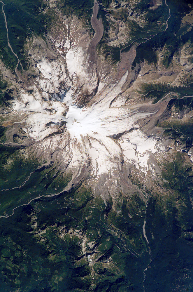
NASA’s Earth Observatory
Mt. Rainier, Washington
[Greenbelt, Maryland], 2005 July 31. Reproduction, 2017.
Norman B. Leventhal Map Center at the Boston Public Library.
Photographed from the International Space Station in 2005, this image of Mount Rainier illustrates the numerous glaciers emanating from the summit. Glacial melt water feeds six river systems in the area, and is an important resource for battling drought seasonally and throughout the years. When snow or ice suddenly melts from these glaciers, landslides may occur, which is one reason for the constant monitoring of Mount Rainier by the U.S. Geological Survey. Precipitation, whether as rain or snowfall, was once only measured from the ground. However, as this photograph shows, astronauts now gather data miles above the Earth.
9. Vegetation
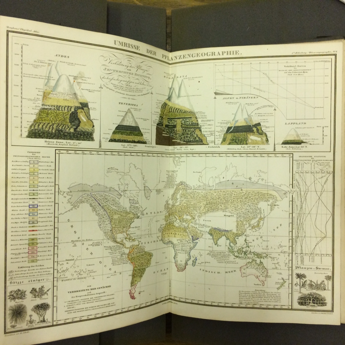
Heinrich Karl Wilhelm Berghaus (1797-1884)
“Umrisse der Pflanzengeographie,” in Dr. Heinrich Berghaus’ Physikalischer Atlas …
Gotha, 1845-1848.
Courtesy BPL Rare Books Department
Variation of plant life worldwide has been recognized for ages; however, the mapping of vegetation and its relation to temperature and elevation did not begin until the early 19th century. Heinrich Berghaus’ innovative atlas, displayed here, brought together all of the scientific data of the time and mapped it in one atlas that was beyond the scope of anything produced prior. The Physikalischer Atlas contains six maps related to vegetation, and many more illustrating physical phenomena, animal life, and social subjects. Berghaus’ complex maps were simplified by A.K. Johnston in an English edition of the atlas published in 1848.
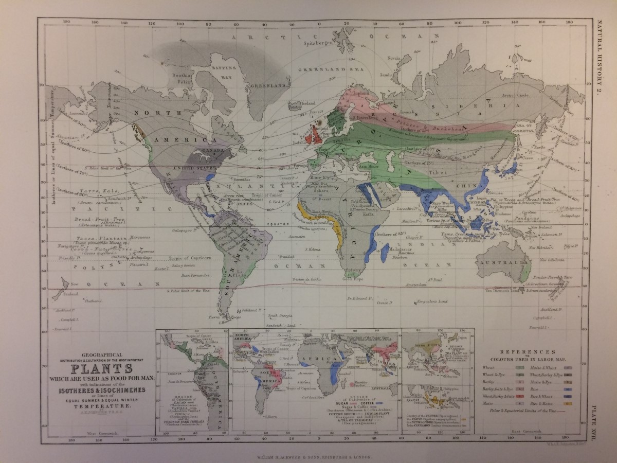
Alexander K. Johnston (1804-1871)
“Geographical Distribution & Cultivation of the Most Important Plants Which are Used as Food for Man …,” in The Physical Atlas of Natural Phenomena
Philadelphia, 1850.
Norman B. Leventhal Map Center at the Boston Public Library.
A.K. Johnston produced an English-language version of Berghaus’ atlas in 1848 in order to make the earlier maps more cohesive and readily understood by a general audience. For these reasons, Johnston’s Physical Atlas is considered to be the first true thematic atlas produced. The atlas contains two maps showing world-wide vegetation, one of which is displayed here. Johnston indicates crops grown in various regions, and includes “isotheres” designating average summer temperatures, and “isochimenes” showing average winter temperatures.
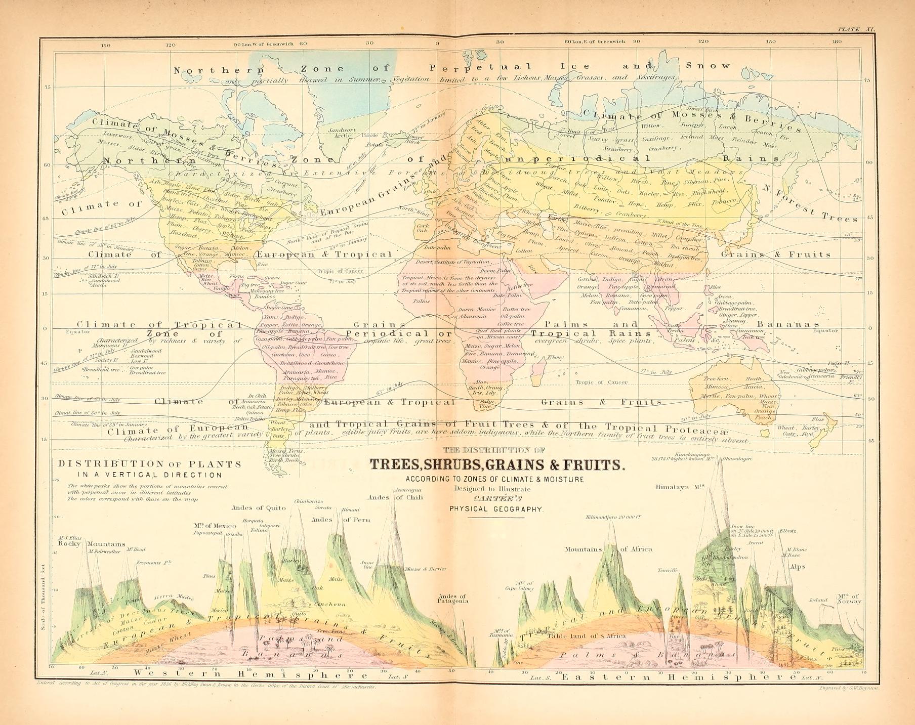
Cornelius S. Cartée (1806-1885)
“The Distribution of Trees, Shrubs, Grains and Fruits According to Zones of Climate & Moisture,” in A School Atlas of Physical Geography Illustrating … the Elementary Facts of Geology, Hydrology, Meteorology, and Natural History …
Boston, 1856.
Norman B. Leventhal Map Center at the Boston Public Library.
Cornelius Cartée made use of maps from Johnston’s atlas and made them accessible for children and teachers, as illustrated in his 1856 School Atlas displayed here. Cartée illustrates broad climatic zones in different colors, with more precise isotherms detailing average temperatures in this vegetation map. Geographic locations are labeled with plants or crops grown in those areas, while pictorial profiles show variations in plant life according to elevation – a technique also used in the Berghaus atlas. As collection of vegetation-related data became easier through the 19th and 20th centuries, maps became more detailed and readily produced.
10. Agriculture
Richard Saunders (né Benjamin Franklin), 1706-1790
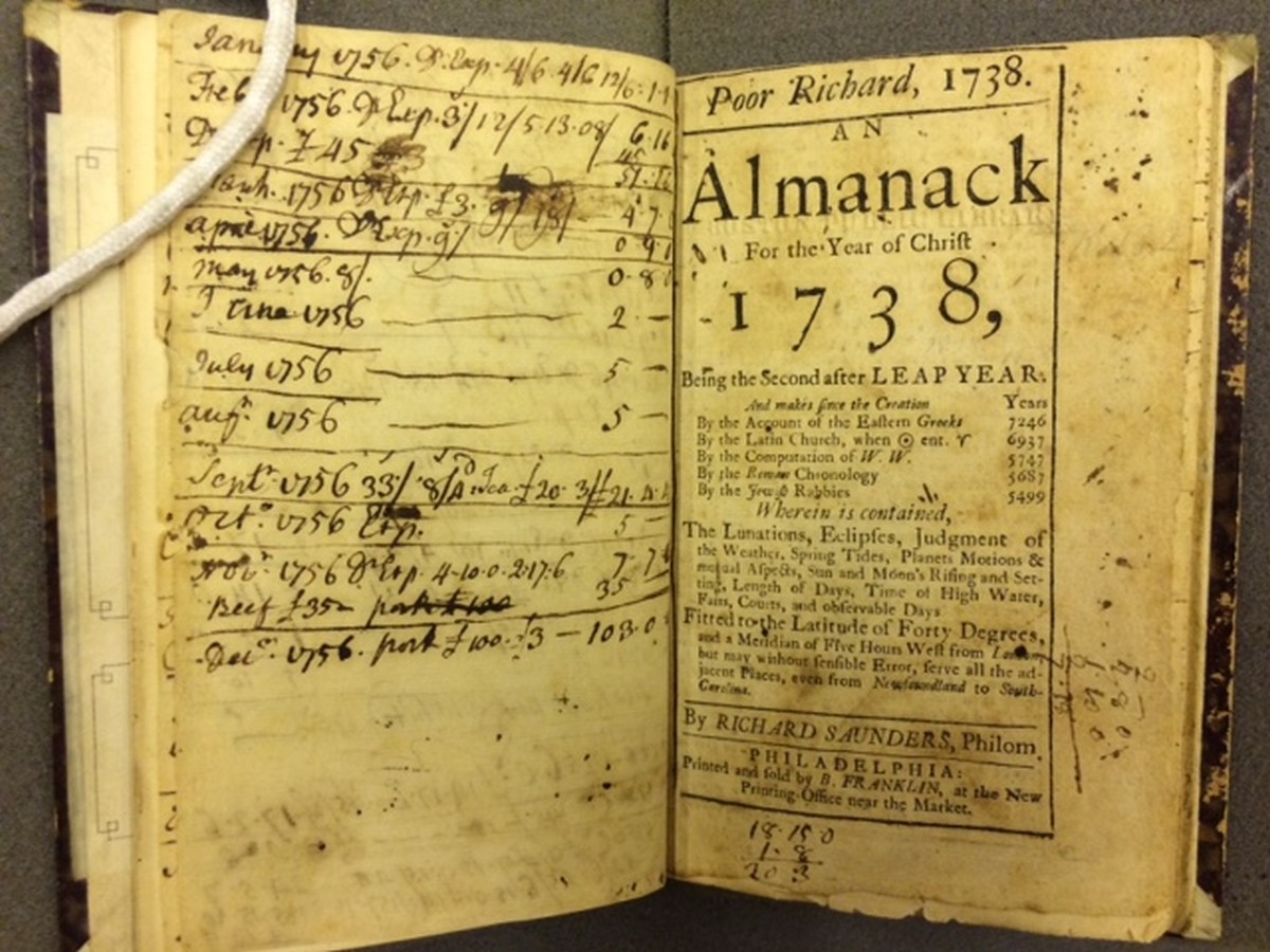
Poor Richard 1738: An Almanac for the Year of Christ 1738
Philadelphia, 1738.
Courtesy BPL Rare Books Department.
Almanacs appeared in America in the late-17th century. These small books, which combined astrology, astronomy, agriculture, human medicine, literature, politics and weather – often times with a strong dose of humor – were plentiful in 18th- and 19th-century popular culture, and are still published today. Benjamin Franklin, under the pen name Richard Saunders, wrote and published the successful “Poor Richard’s Almanac” from 1733-1758. The 1738 edition displayed here was used for note taking and calculations, as the owner recorded figures on livestock for the year 1756. “Poor Richard’s Almanac” was printed until the 19th century.
Truman Abell (1779-1853)
The New England Farmer’s Diary, and Almanac …
Windsor, VT, 1816.
Courtesy BPL Rare Books Department
Nathan Daboll (1782-1863)
The New England Almanac and Farmer’s Friend
New London, CT, 1861.
Courtesy BPL Rare Books Department
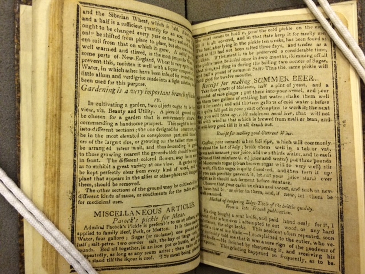
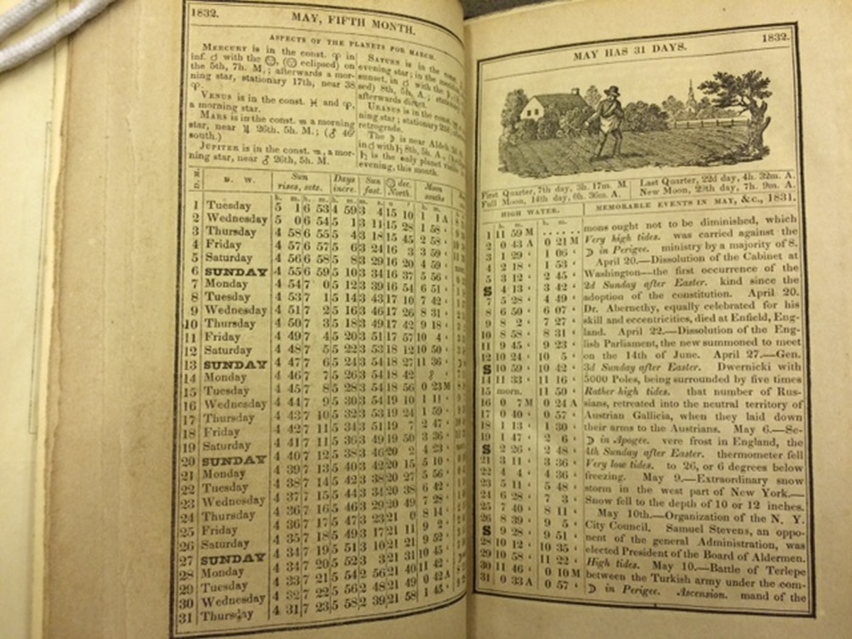
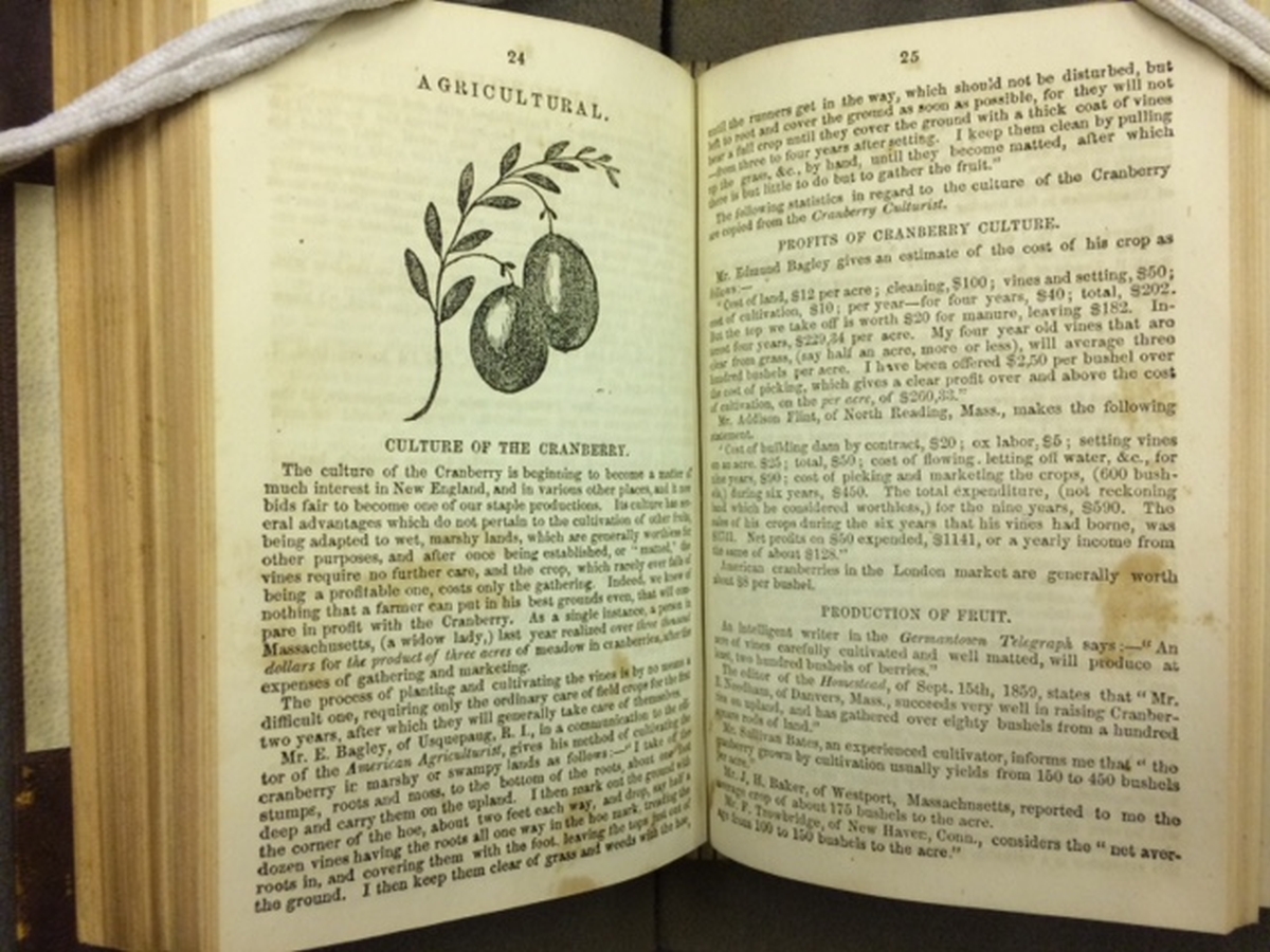
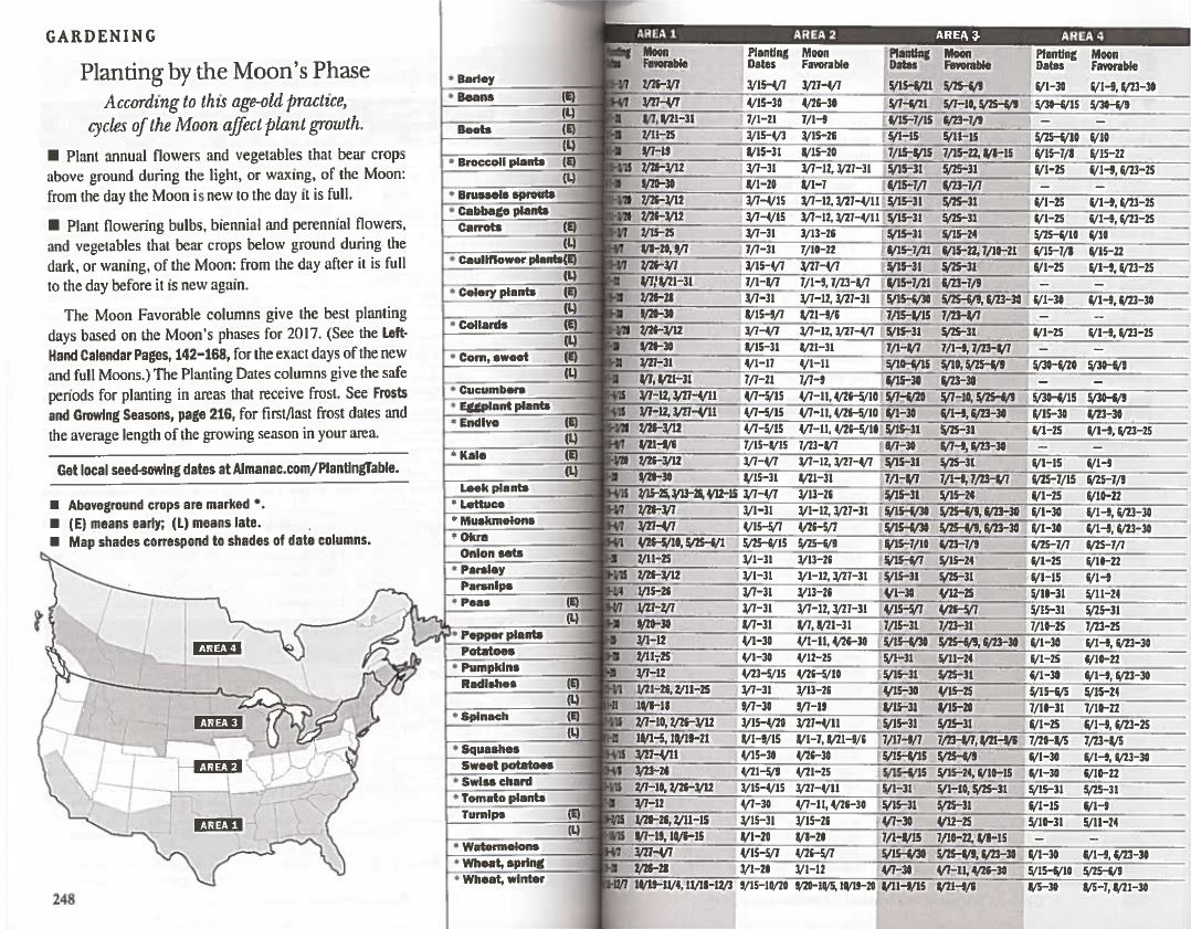
The three almanacs displayed here were published in New England in the early 19th century. Many New Englanders farmed during this period, and almanacs provided agricultural information in a low cost and easily obtainable format for this population. Astronomical conditions and their relationship to planting and growing seasons were a main feature in almanacs. It was long thought that “natural astrology,” such as phases of the moon, affected agriculture and weather, and these beliefs remained popular after scientific discoveries and advancements in technology in the 18th-19th centuries. These almanacs describe the importance of gardening, a recipe, and astronomical tables.
Robert B. Thomas (1766-1846)
“Planting by the Moon’s Phase,” in The Old Farmer’s Almanac
Dublin, NH, 2016.
Norman B. Leventhal Map Center at the Boston Public Library.
2017 marks the 225th anniversary of “The Old Farmer’s Almanac,” founded in 1792 by Robert Thomas in Boston. As seen in other almanacs, this book includes astronomical calculations, weather predictions and tips for growing bountiful gardens. The table displayed here informs readers when to plant annual or perennial crops and flowers, according to the cycle of the moon. Gardeners in Massachusetts, which is in “zone 3,” are advised to plant tomatoes between May 25th and 31st, when the moon is “favorable.” Despite modern science and the wealth of technology available now, the Almanac endures as a source of practical information.
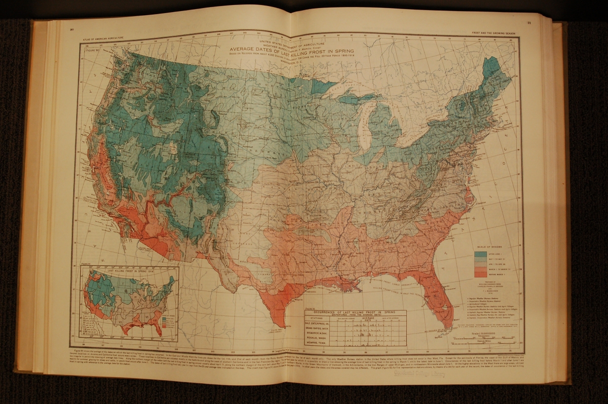
U.S. Department of Agriculture
“Average Dates of Last Killing Frost in Spring,” in Atlas of American Agriculture
Washington, D.C., 1936.
Norman B. Leventhal Map Center at the Boston Public Library.
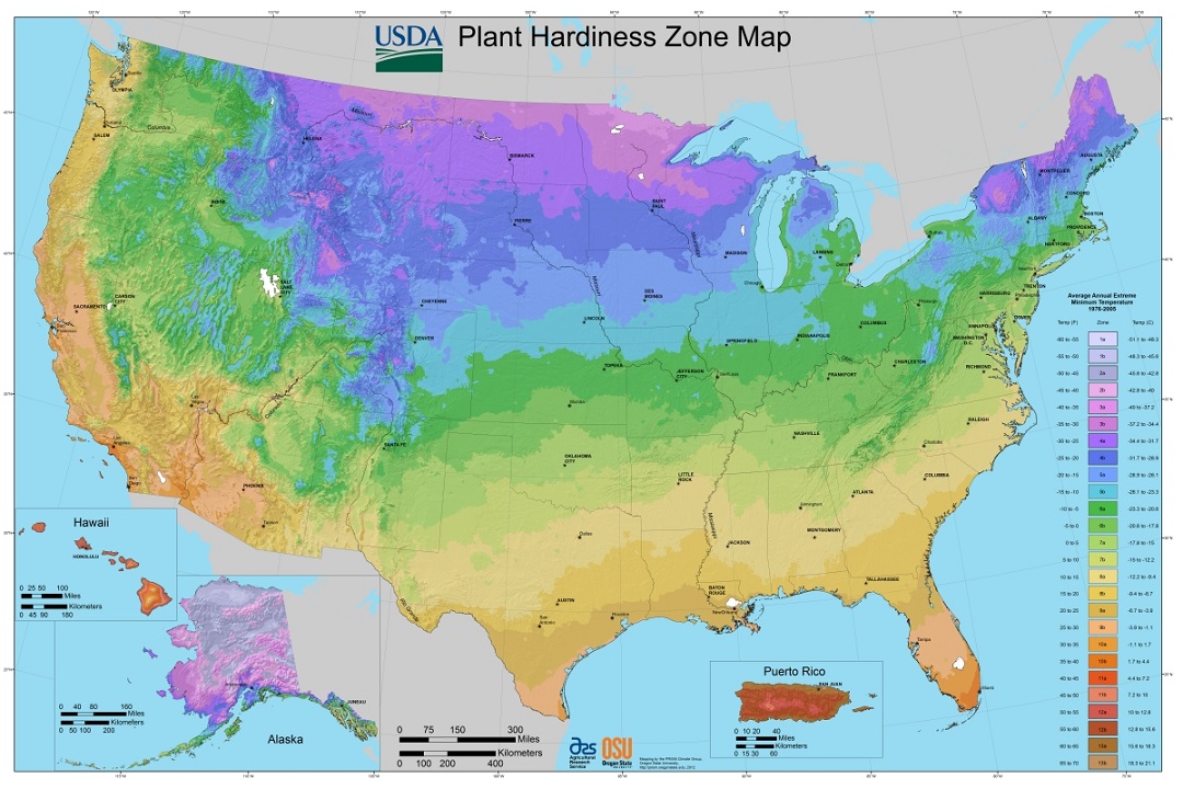
For farmers and home gardeners, knowing the safe date to plant seeds or seedlings is critical to the survival of young vegetation. The 1936 map displayed here illustrates the average date of the last killing, or destructive frost for the lower forty-eight states, for the years 1895-1914. A “killing frost” is described as an icing-over or temperature condition that would destroy a plant. This map illustrates where safe spring planting occurs, with grey isolines providing detailed dates for specific areas. These maps are still produced by the USDA – the agency’s Plant Hardiness Zone Map is included in this exhibition.
Agricultural Research Service, U.S. Department of Agriculture
USDA Plant Hardiness Zone Map, 2012
Accessed from http://planthardiness.ars.usda.gov
“The 2012 USDA Plant Hardiness Zone Map is the standard by which gardeners and growers can determine which plants are most likely to thrive at a location. The map is based on the average annual minimum winter temperature, divided into 10-degree F zones.”
-Excerpt from the USDA Site
11. Hurricanes
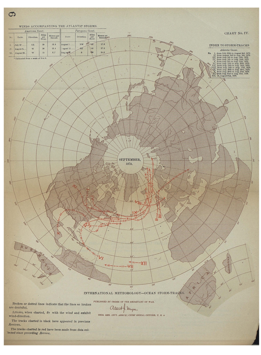
“International Meteorology – Ocean Storm-Tracks,” from Annual Report of the Chief Signal Officer to the Secretary of War for the Year 1880
Washington, D.C., 1881. Reproduction, 2017.
Reproduction courtesy of the National Oceanic and Atmospheric Administration (NOAA) Central Library Data Imaging Project.
The United States military began to collect weather data during the War of 1812, in hopes of better understanding infectious disease and predicting severe storms. By 1861, the U.S. Army Signal Corps was responsible for collecting meteorological data, and their findings were published in annual reports. The map of ocean storm tracks displayed here was published in the 1880 report. At this time, hurricanes and tropical storms were traced according to their position in the ocean or on land at a certain date, and those points were connected to form lines or tracks. The red lines here show storms during September 1879.
U.S. Weather Bureau
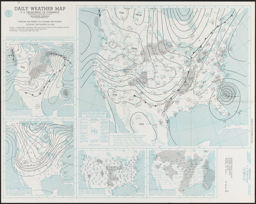
Daily Weather Map
Washington, DC, September 29, 1959.
Norman B. Leventhal Map Center at the Boston Public Library.
Early 19th-century weather observers often looked to the damage left in the wake of a hurricane to determine how the storm functioned. However, with the advent of aircraft and radar in the 1940s, meteorologists could observe hurricanes from above. This daily weather map – issued by the U.S. Weather Bureau – illustrates a hurricane that threatened South Carolina on September 29, 1959. The concentric rings with an “L” in the center indicate the low pressure system of “Hurricane Gracie,” which lasted ten days. These weather maps have documented the basic atmospheric elements of temperature, pressure, precipitation, humidity and a forecast since the late 19th century.
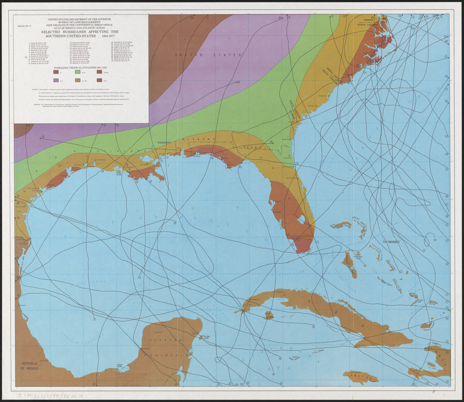
U.S. Department of the Interior. Bureau of Land Management. New Orleans Outer Continental Shelf Office. Gulf of Mexico and Atlantic Ocean.
Selected Hurricanes Affecting the Southern United States 1954-1977
[Washington, D.C., 1977]
Norman B. Leventhal Map Center at the Boston Public Library.
By the 1960s, satellites were used to track hurricanes from the air. Issued as part of a government report, this map illustrates thirty-six hurricane tracks in the Gulf of Mexico over a twenty-year period. The different colors represent numbers of tropical cyclones that have impacted areas along the Gulf from 1901 to 1955. Florida’s west coast and the east coast of the Carolinas were heavily impacted by tropical storms, as evidenced by the dark rust color in those locations.
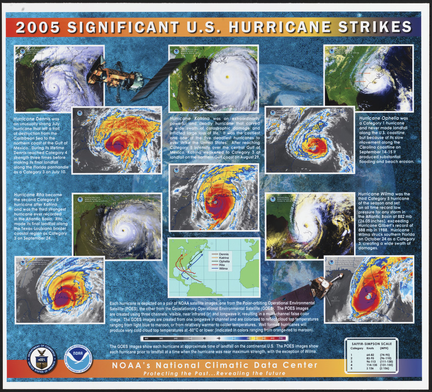
NOAA – National Climatic Data Center
2005 Significant U.S. Hurricane Strikes
[Asheville, North Carolina, 2005]
Norman B. Leventhal Map Center at the Boston Public Library.
Hurricane data collection has advanced greatly since the early-19th century, as evidenced by the development of reconnaissance aircraft, radar, satellites, and classification systems. The Saffir-Simpson Hurricane Wind Scale was created in the 1970s to categorize hurricane intensity, and has proven to be an important tool for warning the public of potential hurricane damage. The five hurricanes featured here are depicted using two types of satellite imagery, and are categorized according to the Saffir-Simpson scale. One set of images shows the rotating clouds of the hurricane, with the distinct “eye” in the center, while the other illustrates cloud top temperature, with warm blue and cold maroon.
12. Tornadoes
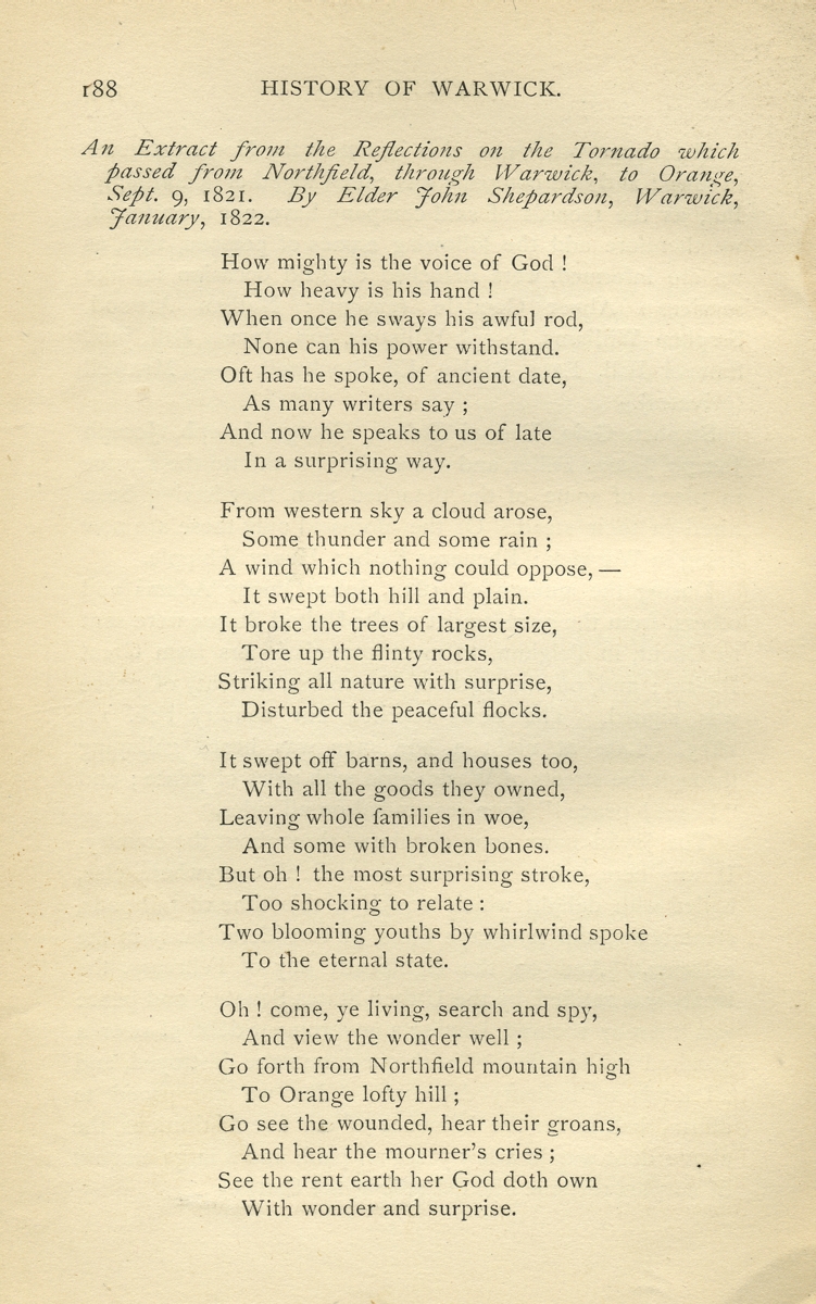
John Shepardson (d. 1833)
“An Extract from the Reflections on the Tornado which Passed from Northfield, through Warwick, to Orange, Sept. 9, 1821,” from History of the Town of Warwick Massachusetts …
Boston, 1873. Reproduction, 2017.
Courtesy Boston Public Library.
The age-old belief that violent natural occurrences were punishments by an angry god or gods persisted into the 19th century, as illustrated in this poem. In early September of 1821, a “whirlwind,” or tornado, passed through the northern Massachusetts towns of Orange and Warwick, devastating homesteads and taking lives. John Shepardson, an elder resident of Warwick, penned the poem reproduced here in response to the tornado. It is clear that the author views the calamity as a message from God, as he states, “When once he sways his awful rod, none can his power withstand.”
Alexander Dallas Bache (1806-1867)
“Notes and Diagrams, Illustrative of the Directions of the Forces Acting at and Near the Surface of the Earth, in Different Parts of the Brunswick Tornado of June 19th 1835 [details],” from Transactions of the American Philosophical Society
Philadelphia, 1837. Reproductions, 2017.
Courtesy Boston Public Library.
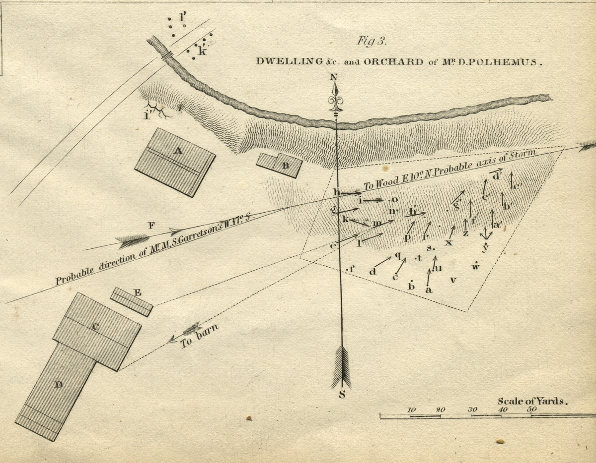
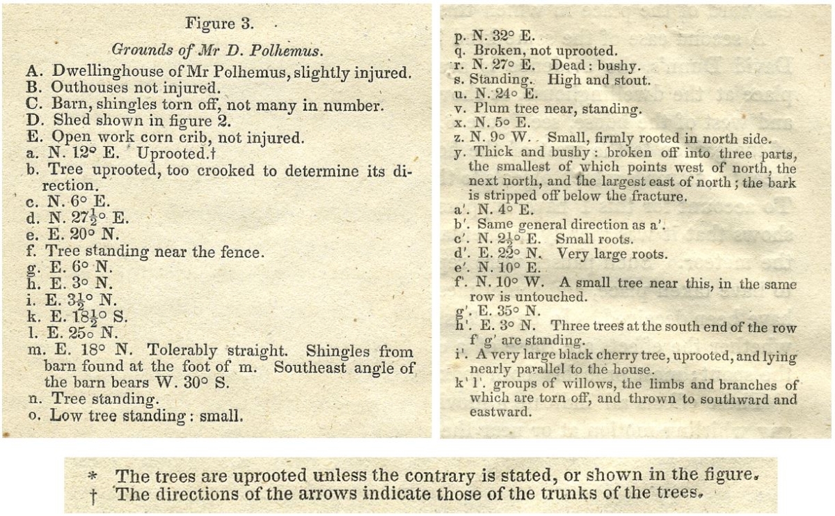
A destructive tornado ravaged the New Brunswick, New Jersey area in June 1835. The following month, the damage was surveyed by scientist and educator Alexander Dallas Bache – a great-grandson of Benjamin Franklin. Along with meteorologist James P. Espy, Bache surveyed the affected area on foot and published notes and diagrams of the damage to structures and agricultural spaces. Bache’s diagrams illustrate the track of the tornado, and the direction in which trees fell – indicated by arrows. A reference page describes locations of damaged trees and buildings. This simple record was an early method of mapping tornado activity and damage.
W.A. Glassford (active 19th cent.)
“Track of Tornado through Village of Wallingford, Conn., August 9th, 1878,” from Annual Report of the Chief Signal Officer to the Secretary of War for the Year 1878
Washington, D.C., 1878. Reproduction, 2017.
Courtesy Boston Public Library.
David French (fl. 1878)
Wallingford Tornado, Friday, Aug. 9, 1878
[West Meriden, CT, 1878-?]. Reproduction, 2017.
Boston Public Library, Print Department.
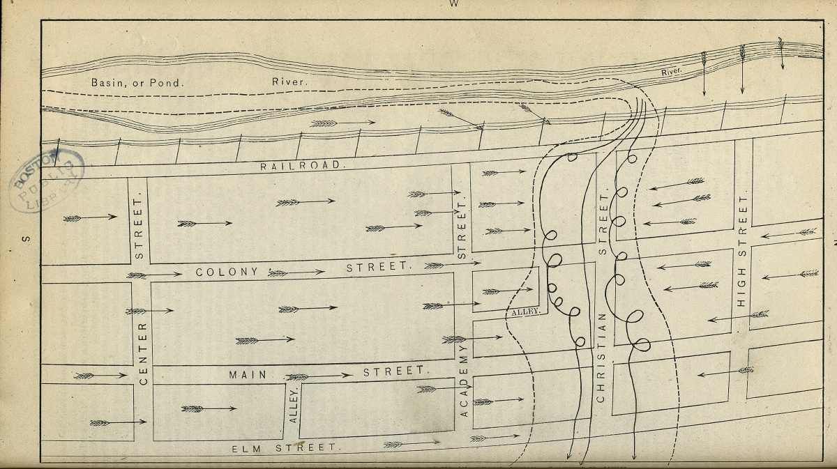
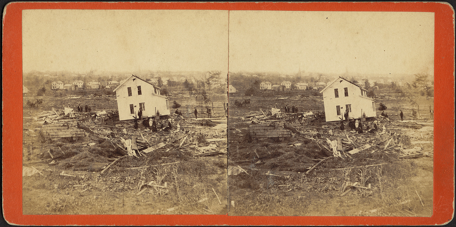
On the evening of August 9, 1878, a devastating tornado swept through the village of Wallingford, Connecticut, leveling dozens of buildings and taking over thirty lives. Although Americans had been concerned with storms for decades, the first attempts at predicting tornadoes would not be developed for another four years. The map displayed here simply illustrates the track of the Wallingford tornado and the area where the damage was greatest, using arrows to indicate wind direction. The photograph below vividly shows the true impact of the storm, as a home detached from its foundation is pictured along with townspeople.
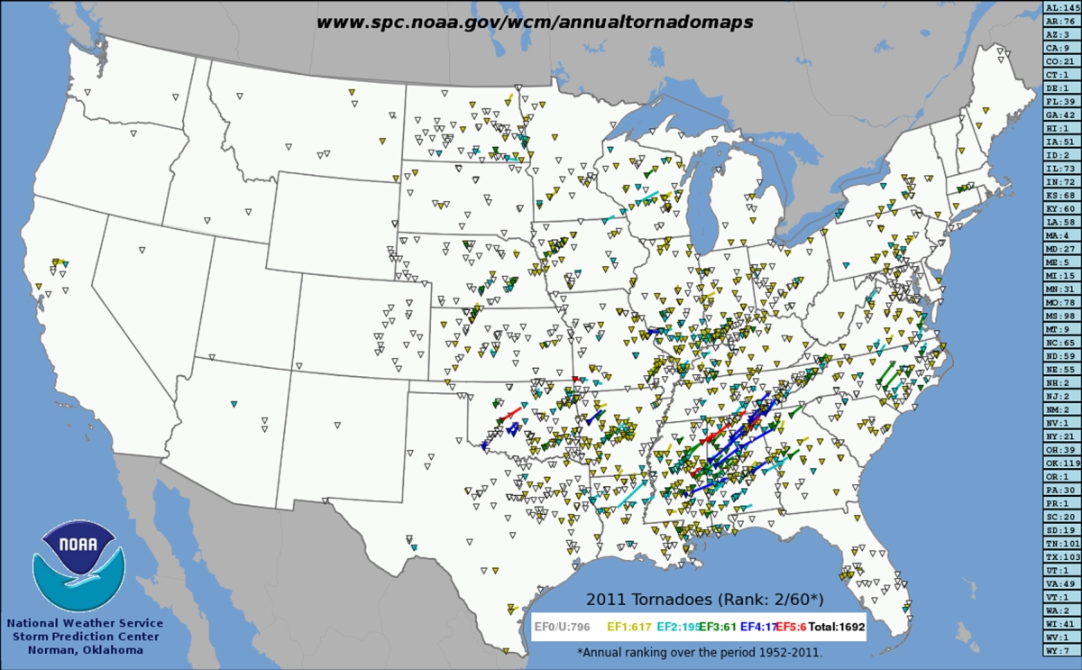
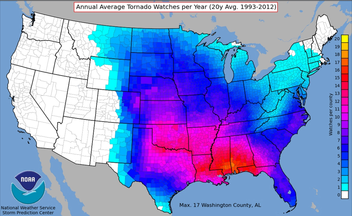
NOAA – National Weather Service, Storm Prediction Center
2011 Tornadoes (left) and Annual Average Tornado Watches per Year (20y Avg. 1993-2012) (right)
Norman, Oklahoma, [2011]. Reproductions, 2017.
Reproduction courtesy NOAA / National Weather Service, Storm Prediction Center.
In June of 1953, the first national tornado warning system became operational in the United States. By 1971, the Fujita or F-scale classification system was developed, which allowed meteorologists to classify tornadoes according to their wind speed and extent of damage caused. The maps displayed here, produced by the Storm Prediction Center of the National Weather Service, illustrate areas of the U.S. that are most affected by tornadoes. The left map shows the location, number and intensity of tornadoes in 2011, while the right map shows the twenty-year average of annual tornado watches by county.
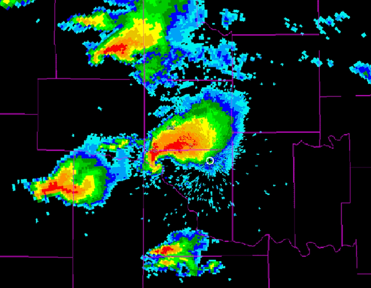
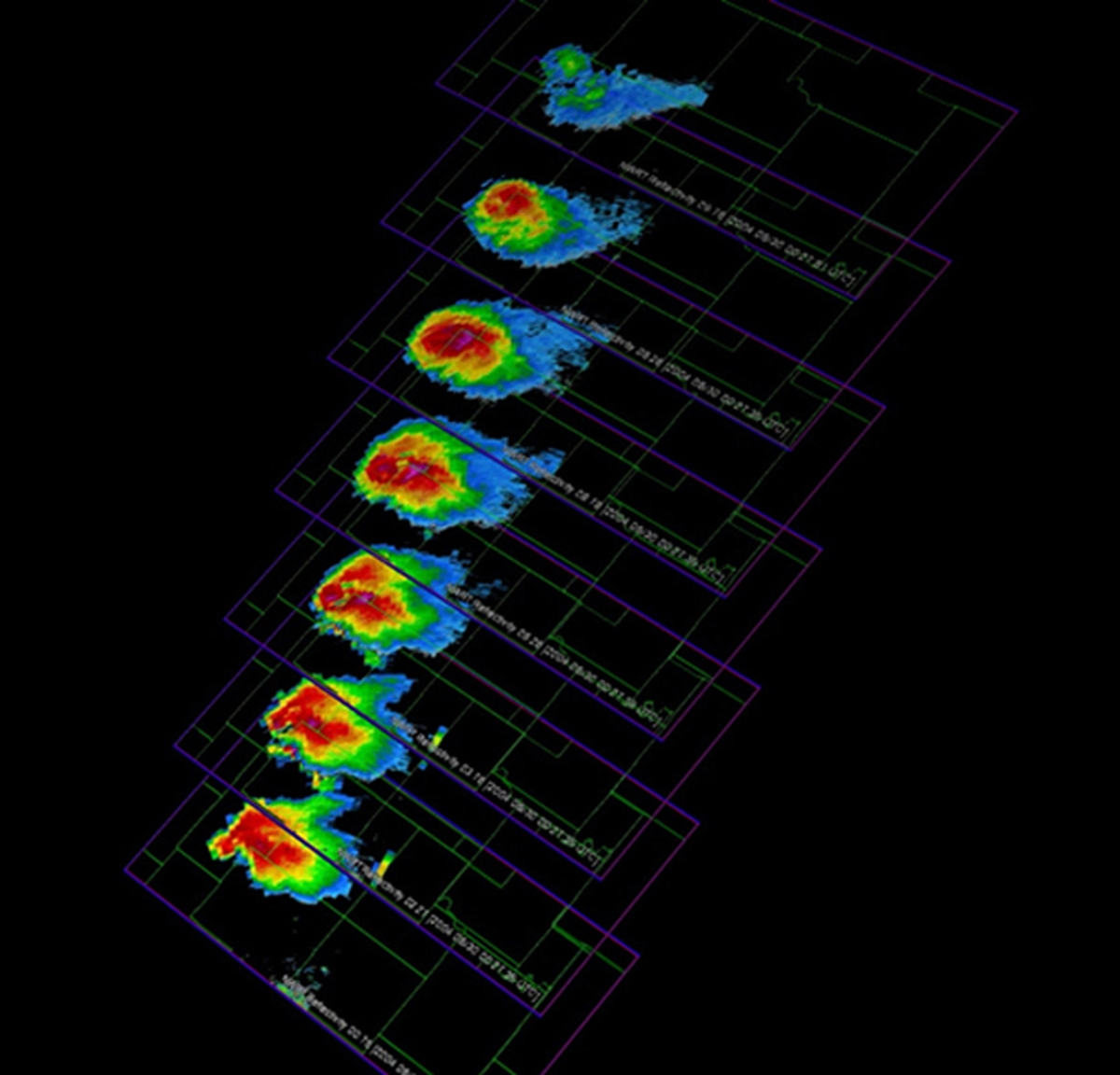
NOAA National Severe Storms Laboratory
[Hook Echo Radar Image] (left) and [MPAR Tornadic Scan Image] (right)
[Norman, Oklahoma, 2016]. Reproductions, 2017.
Reproduction courtesy NOAA National Severe Storms Laboratory.
Tornadoes occur more often in the United States than in any other location in the world. Therefore, researchers and scientists continue to work to understand and predict these storms to save lives. The two images of tornadoes here were produced by the National Severe Storms Laboratory in Norman, Oklahoma. The left image is a “hook echo,” which describes a shape in the radar image which looks like a hook extending from the rear-right part of the storm. The hook indicates favorable conditions for tornado formation. The right image shows “slices” of a tornadic storm at different levels through the atmosphere.
13. Looking to the Future
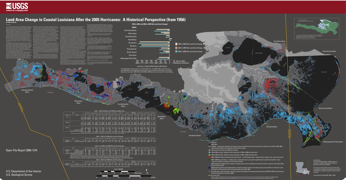
J. A. Barras
“Land Area Change in Coastal Louisiana after the 2005 Hurricanes: A Historical Perspective (from 1956),” from Land Area Change in Coastal Louisiana After the 2005 Hurricanes – A Series of Three Maps: U.S. Geological Survey Open-File Report 2006-1274
Reston, VA, 2006. Reproduction, 2017.
Courtesy U.S. Geological Survey.
New Orleans serves as a real-life example for Boston when the effects of severe hurricanes and other weather events on coastal cities are considered. New Orleans and other low-lying areas of Louisiana and Mississippi suffered greatly in the 2005 hurricane season, when Katrina (August 29) and Rita (September 24) made landfall. This map, prepared by John Barras of the U.S. Geological Survey, illustrates land area changes in coastal Louisiana after both hurricanes. As a result of the storms, water area in coastal Louisiana increased by 217 square miles, resulting in removal of wetlands and disruption to natural and man-made environments.
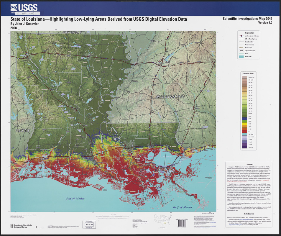
J.J. Kosovich
State of Louisiana—Highlighting Low-lying Areas Derived from USGS Digital Elevation Data: U.S. Geological Survey Scientific Investigations Map 3049, scale 1:700,000
Denver, CO, 2008.
Norman B. Leventhal Map Center at the Boston Public Library.
Hurricanes Katrina and Rita not only devastated the natural environment in Louisiana, they had a tremendous impact on the people of the region. 200,000 homes were destroyed and over 1,800 lives were lost in Hurricane Katrina alone. Low-lying coastal areas, such as those depicted in this 2008 map, must employ resiliency efforts to keep humans, structures and ecosystems safe. Resiliency strategies for New Orleans include restoring coastal wetlands, implementing flood risk reduction plans and storm water management systems, and providing monetary incentives to residents and business owners to retrofit their properties to be more resistant to storms.
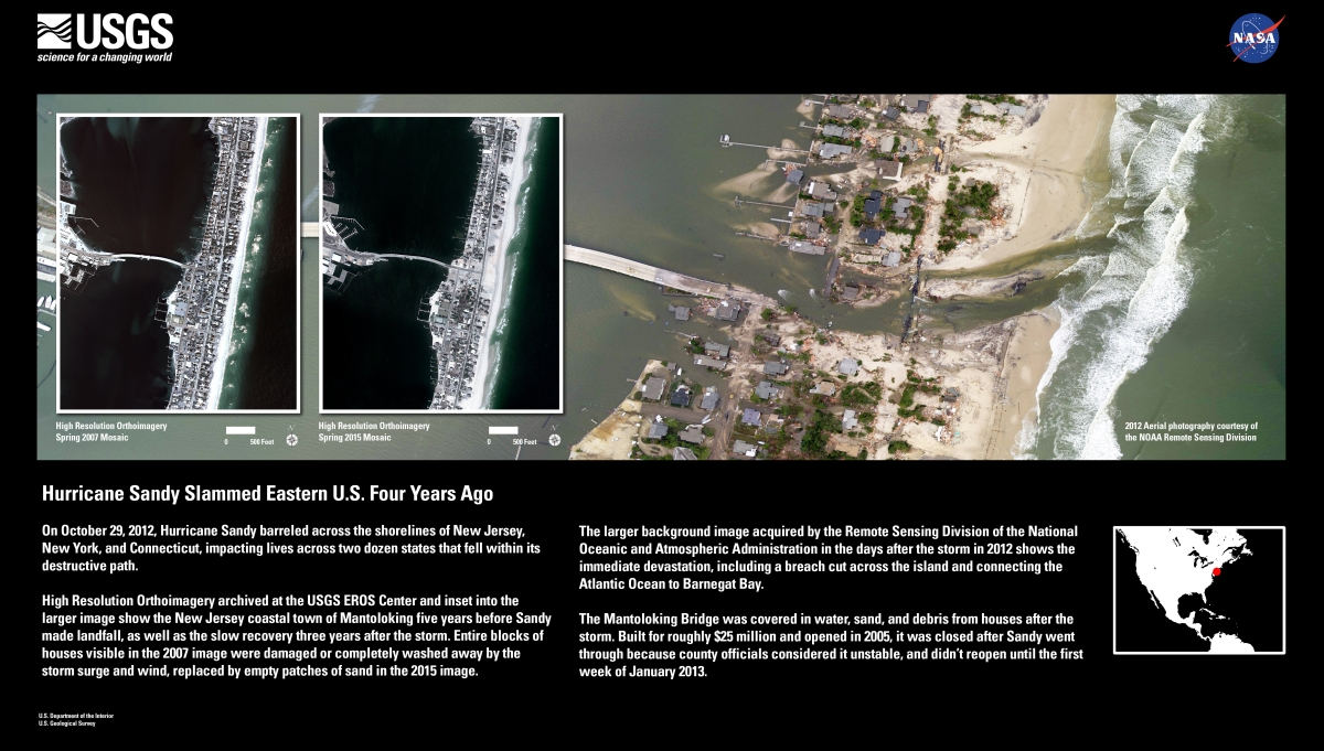
U.S. Geological Survey / NASA / NOAA Remote Sensing Division
Hurricane Sandy Slammed Eastern U.S. Four Years Ago
[Reston, VA], 2015. Reproduction, 2017.
Courtesy of the U.S. Geological Survey.
Hurricane Sandy formed in the Caribbean on October 22, 2012, making landfall on the New Jersey coast seven days later. It brought 115 mph winds and caused flood waters nearly nine feet above ground levels in certain areas. The hurricane took 145 lives and caused $50 billion in property damage in the United States alone. The poster here, created by the U.S. Geological Survey in 2015, illustrates the town of Mantoloking, NJ in spring 2007 and 2015, showing the land area before Sandy, and after rebuilding efforts. The large background image shows immediate damage to the town from the storm. In New York City, Sandy cut off power to 2 million residents and shut down the public transit system.
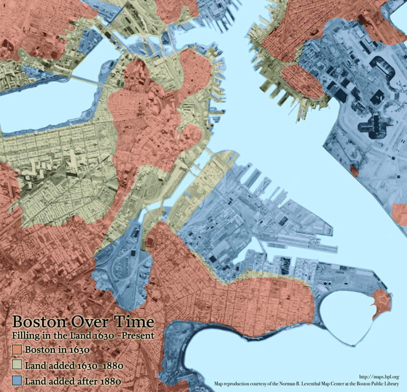
Chan Krieger NBBJ
Boston Over Time: Filling in the Land 1630 – Present
Boston, 2008.
Like New Orleans, the city of Boston is vulnerable to consequences of severe weather events. Boston was settled on a narrow strip of land in 1630 by Puritan settlers from England. Originally called “Shawmut” by the Native Americans of the area, the land was repeatedly “made” or “built” from the 17th century through the 20th century. This modern map illustrates how the land has been made since the founding of Boston. The Central Library is located on what was once water, and not land at all.
Alan M. Berger, Mike Wilson, Fadi Masoud, Matthew Spremulli, and
Kobi Ruthenberg, Norman B. Leventhal Center for Advanced Urbanism, MIT
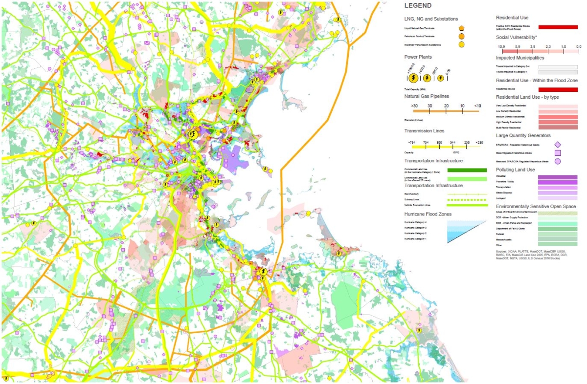
Boston and Vicinity Infrastructure Map
Courtesy Norman B. Leventhal Center for Advanced Urbanism, MIT
By combining the disciplines of landscape architecture, architecture, urban planning, and systems thinking and utilizing the most advanced analytical and representational tools, the Norman B. Leventhal Center for Advanced Urbanism (LCAU) aims to redefine the field of urban design to meet contemporary challenges. The LCAU is one organization featured in this section of the exhibition that is focused on resiliency efforts as they relate to Boston and its surroundings.
This map shows how the critical infrastructure of Boston and vicinity is vulnerable to flooding, as part of the LCAU’s “resilient district concept,” so that proactive steps can be taken to ensure the safety of these facilities. Electrical and gas utilities, as well as transportation and food storage networks are illustrated here. Light blue areas indicate flood zones resulting from hurricanes, while red sections indicate residential areas that would be impacted from flooding.
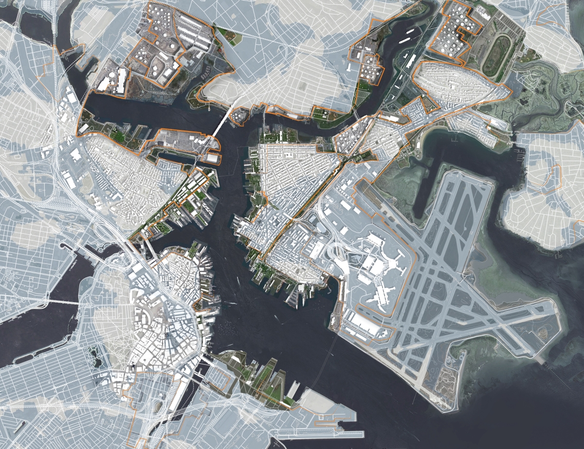
Overview Diagram:
Created by the Norman B. Leventhal Center for Advanced Urbanism at MIT, the map of downtown Boston displayed here illustrates areas (in grey) at risk for flooding during a category 2 hurricane, and thick lines of defense (orange) that would need to be constructed to ensure the safety of critical infrastructure and densely developed areas. These lines of defense could include walls, berms or other landscape features tied into existing ramps, buildings, and embankments.
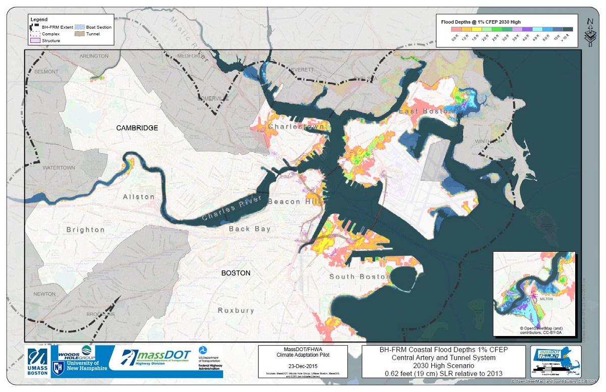
Massachusetts Department of Transportation; Federal Highway Administration
Mass DOT 2015 Boston Harbor Flood Map: 2030 CO2 Emissions Coastal Flood Depths 1 Percent
Boston, 2015. Reproduction, 2017.
Courtesy Mass DOT and the Federal Highway Administration.
The nonprofit organization Boston Harbor Now (formerly The Boston Harbor Association) was an early proponent of showing sea level rise on maps, and in 2010 created a series of maps assessing flood risk throughout Boston. This early analysis predicted that an extreme coastal storm coupled with sea level rise could incapacitate the Central Artery and Tunnel System – an above and belowground transportation network throughout Boston.
In 2013, following Superstorm Sandy, the science team involved in The Boston Harbor Association maps was hired by the Massachusetts Department of Transportation (Mass DOT) and the Federal Highway Administration (FHWA) to assess the Central Artery and Tunnel System for resiliency in the event of sea level rise and extreme weather events. Whereas the 2010 maps used a static “bathtub model,” the 2013 maps used a “hydrodynamic” flood model that calculated the likelihood of storm surges, extreme rainfall and high tides coinciding over time.
Maps derived from models created by teams at UMass Boston, Woods Hole Group, Inc., and the University of New Hampshire illustrate flood risk in both present and future climate conditions, and show how flooding would impact the transportation network.
Displayed here is the Boston Harbor Flood Risk Model for the year 2030. In this model, the sea level is predicted to be nearly seven and one-half inches higher than it was in 2013. The colors indicate the depth of saltwater during a 1% high water event, or an extreme coastal storm, for a particular location. For example, the Fort Point and Seaport District areas of Boston would see extensive flooding in this scenario, which would impact underground roadways in the neighborhood.
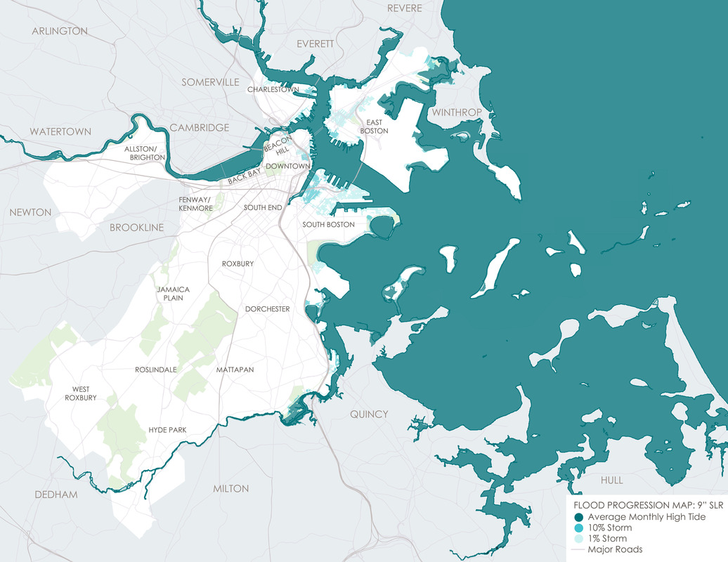
Climate Ready Boston
Flood Progression – Coastal & Riverine Flooding: 2030s-2050s
[Boston, 2016.] Reproduction, 2017.
Courtesy Climate Ready Boston.
“Climate risks are not new for Boston, but they will continue to increase as the global climate changes.” Published in Climate Ready Boston’s final report from December 2016, this statement speaks to the past and future efforts by the City to adapt to coastal conditions. Established in 2015, Climate Ready Boston is “an initiative to develop resilient solutions to prepare our City for climate change.” The initiative consists of four components, including updated climate projections, vulnerability assessment, focus areas (geographic locations), and climate resilience initiatives.
The following three maps, created by Climate Ready Boston, illustrate the impact of sea level rise throughout the City at different elevations and timeframes. Displayed here is the near-term (2030s-2050s) flood impact if sea levels rise nine inches. In this scenario, parts of South Boston, East Boston, Charlestown and Downtown would be under water during a major storm.
The 2016 Climate Ready Boston report was led by the City of Boston in partnership with the Green Ribbon Commission. The project team included the City of Boston, HR&A, Arcadis, Sasaki Associates, and the Boston Research Advisory Group at the University of Massachusetts Boston. Funding was provided by the Barr Foundation, the Massachusetts Coastal Zone Management Program, and the Sherry and Alan Leventhal Foundation.
Climate Ready Boston
Flood Progression – Coastal & Riverine Flooding: 2050s-2100
[Boston, 2016.] Reproduction, 2017.
Courtesy Climate Ready Boston.
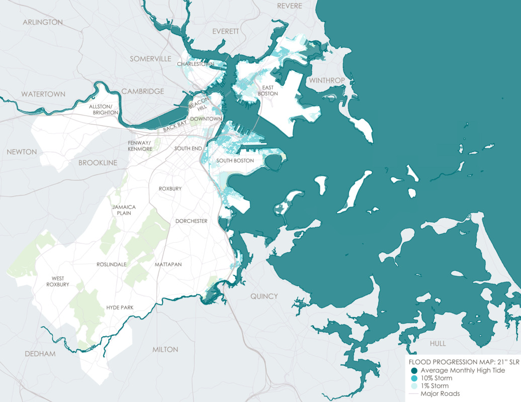
According to Climate Ready Boston, by the year 2050 sea levels are projected to be as much as eighteen inches higher than they were in the year 2000. This map illustrates the mid-term (2050s-2100s) flood progression if the sea level rises twenty-one inches. In this situation, waterfront neighborhoods situated on the coast or on rivers or riverbanks would see increased flood exposure, and the flood impact in the Dorchester neighborhood would be significant. Climate Ready Boston reports that by the 2050s, all of Morrissey Boulevard, an evacuation route, will be exposed to high probability flood events – events which have a ten percent chance of occurring each year.
Why does climate change cause sea level rise? When water is heated it expands, so as the ocean warms, the water volume increases and rises. Melting glacial ice, both from mountainous areas and from the continents of Greenland and Antarctica will also be major contributors to sea level rise. Boston is expected to experience more sea level rise than other regions due to its unique coastal location.
Climate Ready Boston
Flood Progression – Coastal & Riverine Flooding: 2070s Onward
[Boston, 2016.] Reproduction, 2017.
Courtesy Climate Ready Boston.
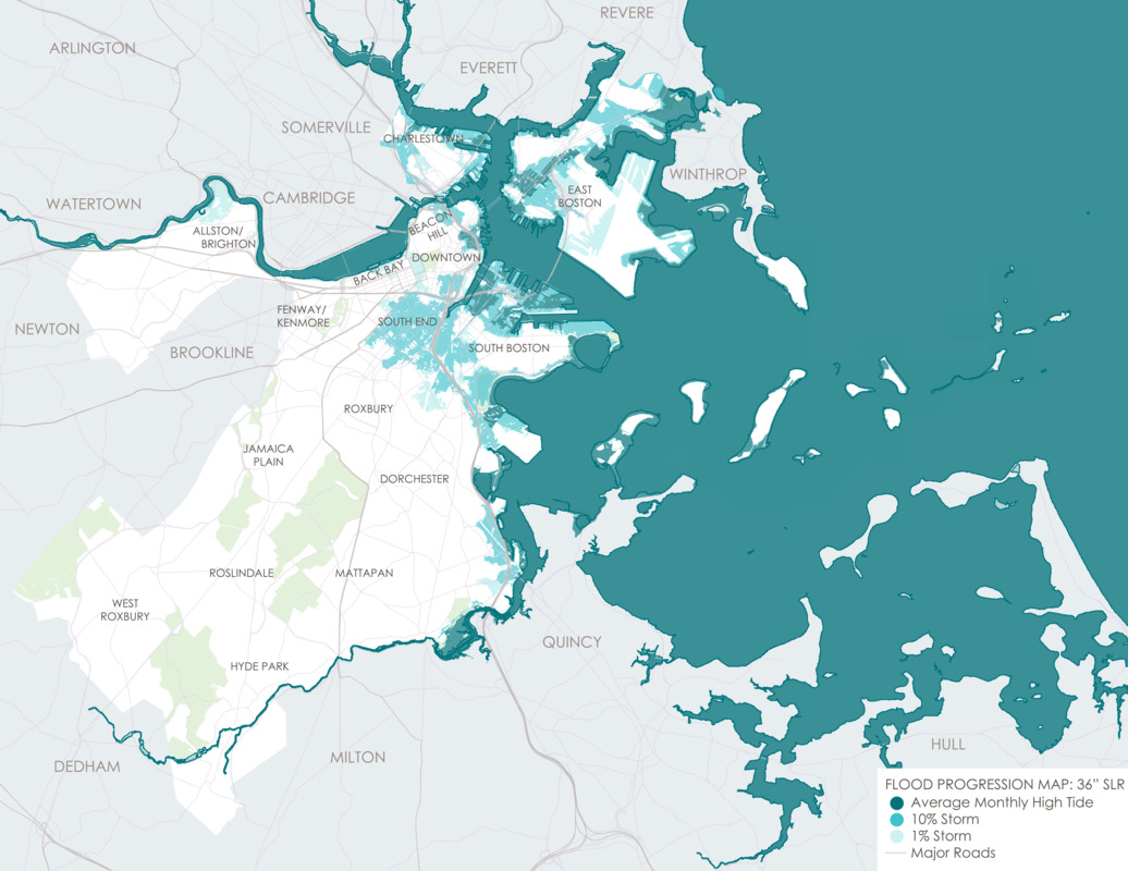
By the end of the 21st century, sea levels will rise at least thirty-six inches or more, according to this model by Climate Ready Boston. In this long-term outlook, from about 2070 onward, extensive areas of the city will be exposed to flooding, including inland neighborhoods such as the South End. Five percent of Boston’s total land area in the late century will be flooded at high tide at least once a month, even with clear weather. In this map, you can see the Shawmut peninsula is predicted to revert to the shape it was in 1630 in the Downtown region, indicated by white areas.
Climate Ready Boston
Downtown Flood Progression, 36 Inches Sea Level Rise
Boston, 2016. Reproduction, 2017.
Courtesy Climate Ready Boston.
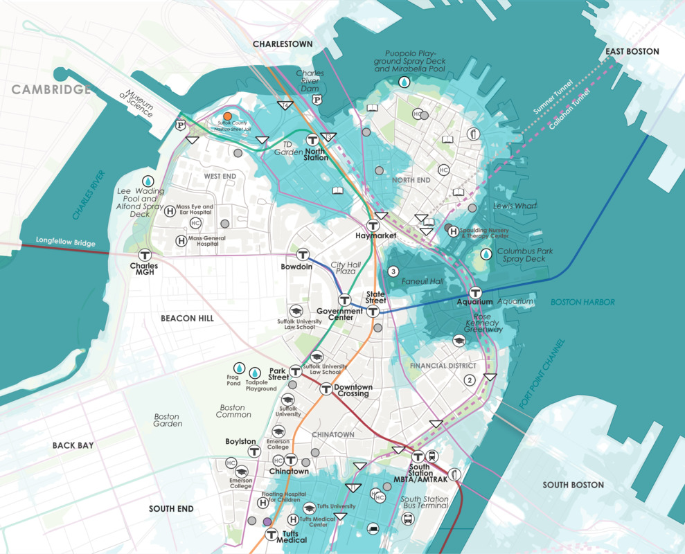
This map illustrates the flood impact on Boston’s downtown if the sea rises by thirty-six inches. Much of the “made” land in Boston is once again water in this image, and the remaining land mass echoes the look of the original Shawmut peninsula. In this scenario, North Station, Faneuil Hall, and the New England Aquarium are all vulnerable to flooding, because these parts of the City that were built on fill decades ago are low-lying. They will become more and more vulnerable to flooding as the level of Boston Harbor’s water rises.
Climate Ready Boston
Public Transportation Exposed to Flooding with 36 Inch Sea Level Rise
Boston, 2016. Reproduction, 2017.
Courtesy Climate Ready Boston.
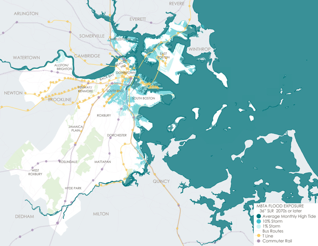
Thousands of people rely on public transportation each day in Boston. According to Climate Ready Boston, nearly a third of MBTA T stations could be exposed to flooding with increasing sea level rise by the year 2070. This map shows bus, T lines, and commuter rail lines that would be impacted with a thirty-six inch rise in sea level.
Climate Ready Boston
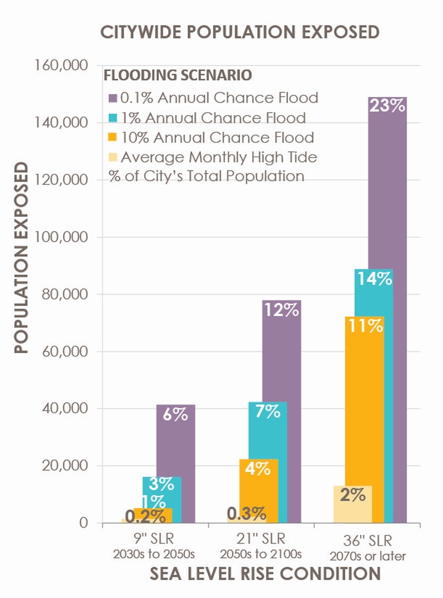
Citywide Population Exposed [bar graph]
Boston, 2016. Reproduction, 2017.
Courtesy Climate Ready Boston.
People throughout Boston will be affected by a rise in sea level, as stated by Climate Ready Boston. This graph illustrates how many people would be exposed to flooding in the near, mid and long term if the sea level rose by nine, twenty-one, or thirty-six inches. For example, in 2070 or later, 2% of Boston’s population would be exposed to flood conditions with each month’s high tide.
Climate Ready Boston
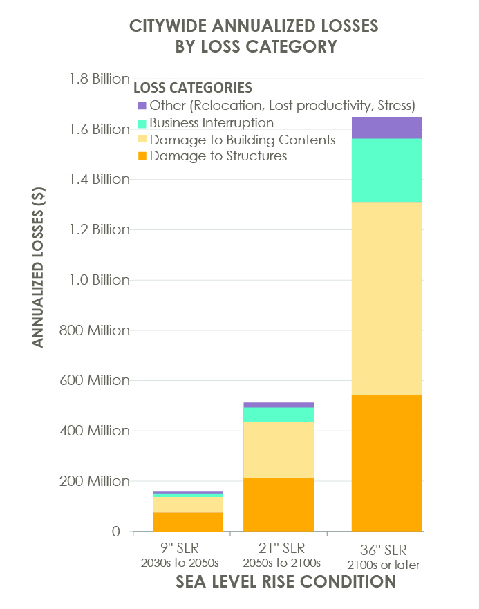
Citywide Annualized Losses by Loss Category [bar graph]
Boston, 2016. Reproduction, 2017.
Courtesy Climate Ready Boston.
Created by Climate Ready Boston, this bar graph reflects losses – to people, business and buildings – if the sea rose by nine, twenty-one, and thirty-six inches and a flood took place in Boston. With increased risk of flooding over time, expected annualized losses increase. In this scenario, nearly $1 billion dollars would be lost per year in physical damage to structures and businesses from flooding caused by storms that have a 10% chance of occurring in any given year.
Climate Ready Boston
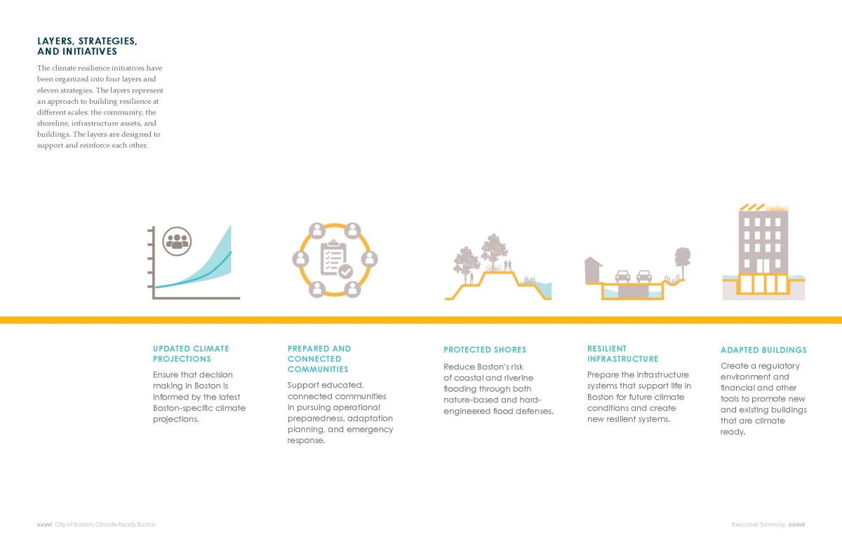
Layers, Strategies and Initiatives (graphic)
Boston, 2016. Reproduction, 2017.
Courtesy Climate Ready Boston.
Climate Ready Boston
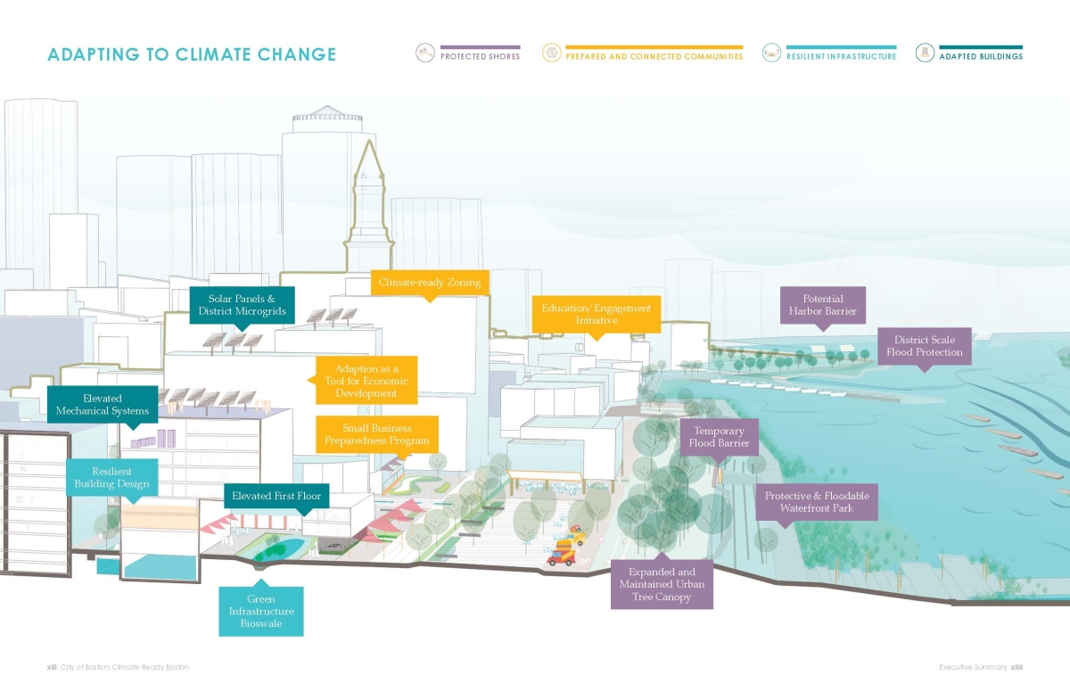
Adapting to Climate Change (graphic)
Boston, 2016. Reproduction, 2017.
Courtesy Climate Ready Boston.
Climate Ready Boston has established resilience initiatives to prepare Boston for climate change. The graphic (above) describes the multi-layered approach to this effort, and the rendering (below) illustrates how the strategies would be implemented.
Soundscape: "Of that slowly wheeling circle"
Beau Kenyon
“Of that slowly wheeling circle.”
2017.
Inspiration for this piece was drawn from the scientific and political dialogue around climate change. Created on the heels of the United States’ withdrawal from the Paris Agreement, I honed my research on the scientific support of mankind’s contribution to global warming and the specific role of carbon dioxide emissions. I also immersed myself in local, national, and global conversations (both for and against the issue). With several nods to Boston, “Of that slowly wheeling circle” intends to encapsulate the dire landscape of global warming while providing a glimmer of commitment, love, hope, and progress. Although there is much work to be done, I am heartened by the innovative work being done in Boston and by countless others throughout the globe.
Composer Beau Kenyon prioritizes projects that expand accessibility of new music through installations, site-specific work, multidisciplinary collaborations, and education outreach. His work has been featured in live performance installations throughout the city of Boston, often collaborating with and gaining inspiration from choreographers, authors, artists, and scientists. His music has also been performed in concert halls, breweries, and gatherings throughout the United States, South America, and Europe.
SOUND MATERIAL:
Collection of CO2 sounds [fire extinguishers, soda, etc.]
Pulsing light/electricity
Propeller Airplane
Metal Building Resonance
Ocean waves
Thunderstorm
“Moby Dick, Epilogue,” written by Herman Melville/read by Mary Oliver
Full Transcription of “Moby Dick, Epilogue”
The drama's done. Why then here does any one step forth? - Because one did survive the wreck.
It so chanced, that after the Parsee's disappearance, I was he whom the Fates ordained to take the place of Ahab's bowsman, when that bowsman assumed the vacant post; the same, who, when on the last day the three men were tossed from out the rocking boat, was dropped astern. So, floating on the margin of the ensuing scene, and in full sight of it, when the halfspent suction of the sunk ship reached me, I was then, but slowly, drawn towards the closing vortex. When I reached it, it had subsided to a creamy pool. Round and round, then, and ever contracting towards the button-like black bubble at the axis of that slowly wheeling circle, like another Ixion I did revolve. Till, gaining that vital centre, the black bubble upward burst; and now, liberated by reason of its cunning spring, and owing to its great buoyancy, rising with great force, the coffin-like buoy shot lengthwise from the sea, fell over, and floated by my side. Buoyed up by that coffin, for almost one whole day and night, I floated on a soft and dirgelike main. The unharming sharks, they glided by as if with padlocks on their mouths; the savage sea-hawks sailed with sheathed beaks. On the second day, a sail drew near, nearer, and picked me up at last. It was the devious-cruising Rachel, that in her retracing search after her missing children, only found another orphan.
“Moby Dick, Epilogue”
Read by Mary Oliver.
Recorded by John Braden, WOMR.
Edited and Mixed at dBs Music.
Recorded as part of the Moby-Dick Big Read: an online version of Melville’s magisterial tome: each of its 135 chapters read out aloud, by a mixture of the celebrated and the unknown, to be broadcast online in a sequence of 135 downloads, publicly and freely accessible. Copyright Peninsula Arts, Plymouth University. Used with permission from Peninsula Arts, Plymouth University.
Bibliography
Agricultural Research Service, U.S. Department of Agriculture. USDA Plant Hardiness Zone Map, 2012. http://planthardiness.ars.usda.gov/PHZMWeb/.
“Alaska—What it is Worth?” Lippincott’s Magazine of Literature, Science and Education 1 (1868): 185-191. [PER 7345.1]
American Experience. “Image: The Path of the Hurricane of ’38.” American Experience. Accessed November 14, 2016. http://www.pbs.org/wgbh/americanexperience/features/image/hurricane-path/.
“Archaeology.” National Park Service. Accessed January 17, 2017. http://www.nps.gov/mora/learn/historyculture/archaeology.htm.
Aristotle. “The Situations and Names of Winds (Ventorum Situs et Cognomina).” In Minor Works: With an English Translation by W. S. Hett, 451-457. Translated by W. S. Hett. Cambridge: Harvard Univ. Press, 1963. [PA3612 .A8A13 1963]
Bache, A. D. “Notes and Diagrams, Illustrative of the Directions of the Forces Acting at and near the Surface of the Earth, in Different Parts of the Brunswick Tornado of June 19th 1835.” Transactions of the American Philosophical Society 5 (1837): 407-419. http://www.jstor.org/stable/1004963.
Barras, John A. “Land Area Changes in Coastal Louisiana After Hurricanes Katrina and Rita.” In Science and the storms—the USGS response to the hurricanes of 2005: U.S. Geological Survey Circular 1306, ed. G.S. Farris, G.J. Smith, M.P. Crane, C.R. Demas, L.L. Robbins, and D.L. Lavoie, 98-113. https://pubs.usgs.gov/circ/1306/pdf/c1306_ch5_b.pdf.
Behringer, Wolfgang. A Cultural History of Climate. Translated by Patrick Camiller. Malden, MA: Polity Press, 2010. [304.25 B421]
Blake, Eric. Hurricane Sandy. National Hurricane Center, 2013. http://www.nhc.noaa.gov/outreach/presentations/Sandy2012.pdf.
Blake, Eric S. Hurricane Alex (AL012016): 12-15 January 2016. National Hurricane Center, 2016. http://www.nhc.noaa.gov/data/tcr/AL012016_Alex.pdf.
Blake, Eric S., Christopher W. Landsea and Ethan J. Gibney. The Deadliest, Costliest, and Most Intense United States Tropical Cyclones from 1851 to 2010 (and Other Frequently Requested Hurricane Facts). National Hurricane Center, 2011. http://www.nhc.noaa.gov/pdf/nws-nhc-6.pdf.
Blanchard, Wayne. Deadliest U.S. Disasters – Top Fifty. September 21, 2008 Update. http://training.fema.gov/hiedu/docs/deadliest%20u.s.%20disasters.doc.
Block, Debra. “New Orleans.” Norman B. Leventhal Map Center at the Boston Public Library. http://www.leventhalmap.org/orleans.
Bosma, Kirk, Ellen Douglas, Paul Kirshen, Katherin McArthur, Steven Miller and Chris Watson. MassDOT-FHWA Pilot Project Report: Climate Change and Extreme Weather Vulnerability Assessments and Adaptation Options for the Central Artery. 2015. https://www.massdot.state.ma.us/Portals/8/docs/environmental/SustainabilityEMS/Pilot_Project_Report_MassDOT_FHWA.pdf.
“Boston Harbor Sea Level Rise Maps.” The Boston Harbor Association. Accessed July 6, 2016. http://tbha.org/boston-harbor-sea-level-rise-maps.
Boston Rare Maps. “A Rare and Curious ‘Planisphere’.” Boston Rare Maps. http://bostonraremaps.com/inventory/a-rare-and-curious-planisphere.
Britannica Library, s.v. “Alexander von Humboldt,” accessed December 5, 2016, http://library.ebonline.com/levels/adults/article/41488.
Britannica Library, s.v. “Anemometer,” accessed December 20, 2016, http://library.ebonline.com/levels/adults/article/7525.
Britannica Library, s.v. “Aristotle,” accessed January 6, 2017, http://library.ebonline.com/levels/adults/article/108312.
Britannica Library, s.v. “Boreas,” accessed December 20, 2016, http://library.ebonline.com/levels/adults/article/80725.
Britannica Library, s.v. “Climate classification,” accessed December 20, 2016, http://library.ebonline.com/levels/adults/article/475322#284594.toc.
Britannica Library, s.v. “Edmond Halley,” accessed December 7, 2016, http://library.ebonline.com/levels/adults/article/38943.
Britannica Library, s.v. “Enlightenment,” accessed December 7, 2016, http://library.ebonline.com/levels/adults/article/32680.
Britannica Library, s.v. “Eos,” accessed December 20, 2016, http://library.ebonline.com/levels/adults/article/32746.
Britannica Library, s.v. “History of Europe,” accessed December 6, 2016, http://library.ebonline.com/levels/adults/article/106072#58403.toc.
Britannica Library, s.v. “Hora,” accessed December 7, 2016, http://library.ebonline.com/levels/adults/article/41042.
Britannica Library, s.v. “James Pollard Espy,” accessed January 25, 2017, http://library.ebonline.com/levels/adults/article/33035#.
Britannica Library, s.v. “Köppen climate classification,” accessed December 20, 2016, http://library.ebonline.com/levels/reference/article/475323#.
Britannica Library, s.v. “Matthew Fontaine Maury,” accessed December 5, 2016, http://library.ebonline.com/levels/adults/article/51517#.
Britannica Library, s.v. “Trade wind,” accessed January 12, 2017, http://library.ebonline.com/levels/adults/article/73139.
Britannica Library, s.v. “Wind rose,” accessed December 20, 2016, http://library.ebonline.com/levels/adults/article/77166#.
Britannica Library, s.v. “Wladimir Köppen,” accessed December 20, 2016, http://library.ebonline.com/levels/adults/article/46045.
Brown, Charles W. “Hurricanes and Shore-Line Changes in Rhode Island.” Geographical Review 29.3 (1939): 416-430. http://www.jstor.org/stable/209882.
Campbell, Tony. The Earliest Printed Maps: 1472-1500. Berkeley, CA: Univ. of California Press, 1987. [GA231 .C36 1987]
“Charles Grignion.” National Portrait Gallery. http://www.npg.org.uk/collections/search/person/mp94760/charles-grignion?role=art.
Chatham Historical Society. Chatham Nautical Chart Initiative. http://www.chathamhistoricalsociety.org/nauticalcharts/nauticalchartsintro.htm.
Chenoweth, Michael. “Daily Synoptic Weather Map Analysis of the New England Cold Wave and Snowstorms of 5 to 11 June 1816.” In Historical Climate Variability and Impacts in North America, edited by Lesley-Ann Dupigny-Giroux and Cary J. Mock, 107-121. New York: Springer, 2009. [QC982.8 .H57 2009]
Climate Ready Boston. Executive Summary. 2016. https://www.boston.gov/sites/default/files/02_20161206_executivesummary_digital.pdf.
Climate Ready Boston. Final Report. 2016. https://www.boston.gov/sites/default/files/20161207_climate_ready_boston_digital2.pdf.
City of New Orleans. Resilient New Orleans: Strategic Actions to Shape Our Future City. 2015. http://resilientnola.org/wp-content/uploads/2015/08/Resilient_New_Orleans_Strategy.pdf.
Colton, F. Barrows. “The Geography of a Hurricane: A Doughnut-shaped Storm Turned Back Time in New England to Candlelight Day, but Revealed Anew Yankee Courage and Ingenuity.” The National Geographic Magazine 75.4 (1939): 529-552.
Connecticut Humanities. “The Great Wallingford Tornado – Today in History: August 9.” ConnecticutHistory.org. Accessed December 20, 2016. http://connecticuthistory.org/the-great-wallingford-tornado/.
Crowley, John E. “Herman Moll’s The World Described (1720): Mapping Britain’s Global and Imperial Interests.” Imago Mundi 68.1 (2015): 16-34. doi:10.1080/03085694.2016.1107370.
Dainville, François de. Le Language des Géographes: Termes, Signes, Couleurs, Des Cartes Anciennes 1500-1800. Paris: Éditions A. et J. Picard E Cie., 1964.
Dekker, Elly. “The Phenomena: An Introduction to Globes and Spheres.” In Globes at Greenwich: A Catalogue of the Globes and Armillary Spheres in the National Maritime Museum, Greenwich. New York: Oxford University Press and the National Maritime Museum, 1999. [GA195.G7 D45 1999]
Depp, Ben and Thomas Beller. “The Drowning.” Smithsonian 47.2 (2016): 76-85.
A Dictionary of Greek and Roman Biography and Mythology, s.v. “Asclepius.” [2930.7]
A Dictionary of Greek and Roman Biography and Mythology, s.v. “Horae.” [2930.7]
A Dictionary of Greek and Roman Biography and Mythology, s.v. “Venti.” [2930.7]
Dow, Kristin and Thomas E. Downing. The Atlas of Climate Change: Mapping the World’s Greatest Challenge. Berkeley: Univ. of California Press, 2011. [QC903.D68 2011x]
Dunn, Gordon E. and Staff. “The Hurricane Season of 1959.” Monthly Weather Review 88.1 (1959): 441-450.
Edison, Evelyn. Mapping Time and Space: How Medieval Mapmakers Viewed Their World. London: The British Library, 1997. [GA221 .E37 1999]
Ehrenberg, Ralph E. The Earth Revealed: Aspects of Geologic Mapping. Washington: Geography and Map Division, Library of Congress, 1989.
Eisenstadt, Peter. “Almanacs and the Disenchantment of Early America.” Pennsylvania History: A Journal of Mid-Atlantic Studies 65.2 (1998): 143-169. http://www.jstor.org/stable/27774098.
Emanuel, Kerry. “Anatomy of a Meteorological Monster.” In Divine Wind: The History and Science of Hurricanes, 7-22. Oxford: Oxford University Press, 2005. [QC944 .E43 2005]
Emanuel, Kerry. “The Trade Winds.” In Divine Wind: The History and Science of Hurricanes, 41-48. Oxford: Oxford University Press, 2005. [QC944 .E43 2005]
Espy, James. The Philosophy of Storms. Boston: C.G. Little and J. Brown, 1841. [3961.8]
Espy, James. First Report on Meteorology, to the Surgeon General of the United States Army. Washington, 1843. [B.180.3]
Eustis, Henry L. “The Tornado of August 22d, 1851, in Waltham, West Cambridge, and Medford, Middlesex County, Mass.” Memoirs of the American Academy of Arts and Sciences, New Series 5.1 (1853): 169-178. http://www.jstor.org/stable/25058177.
The Facts on File Dictionary of Weather and Climate, rev. ed. Edited by Jacqueline Smith. New York: Facts on File, 2006. [QC854 .F33 2006]
Federal Emergency Management Agency. “Hurricane Katrina.” Fema.gov. https://www.fema.gov/hurricane-katrina.
Fitzroy, Robert. The Weather Book: A Manual of Practical Meteorology. London: Longman, Green, Longman, Roberts, & Green, 1863. https://archive.org/details/bub_gb_qNK7AAAAIAAJ.
Getis, Arthur, Judith Getis, and Jerome Fellmann. Introduction to Geography. Dubuque, Iowa: Wm. C. Brown, 1981. [G128 .G495 2002]
Golinski, Jan. British Weather and the Climate of Enlightenment. Chicago: University of Chicago Press, 2007. [QC989 .G69G66 2007]
Hambling, David. “Readers of the Storm.” New Scientist 224.3000/3001 (2014): 68-70.
Hellman, Gustav. Meteorologische Karten, vol. 8 of Neudrucke von Schriften und Karten über Meterologie und Erdmagnetismus. Berlin: A. Asher & Co., 1897.
Hicks, Paul Def., Jr. “Tracing the Origins of Wind Heads to Wind Gods.” Mercator’s World 2.1 (1997): 34-39.
Homer. The Odyssey. Translated by Samuel Butler. London: J. Cape, 1922. http://www.gutenberg.org/files/1727/1727-h/1727-h.htm#link2H_4_0005.
HowStuffWorks. “How does a Galileo thermometer work?” HowStuffWorks. June 21, 2001. Accessed January 24, 2017. http://science.howstuffworks.com/question663.htm.
Institute for Veterinary Public Health. “Original and Translated Papers as well as Comments on Papers by Wladimir Köppen.” World Maps of Köppen-Geiger Climate Classification. http://koeppen-geiger.vu-wien.ac.at/koeppen.htm.
Janeway, J. J., G.S. Webb, D. Fitz Randolph and Miles C. Smith. “Circular.” New York Spectator, July 2, 1835.
Journal of Commerce. “The New Brunswick Tornado.” New York Spectator, June 29, 1835.
Köppen, Wladimir. “The Thermal Zones of the Earth According to the Duration of Hot, Moderate and Cold Periods and to the Impact of Heat on the Organic World.” Meteorologische Zeitschrift 20.3 (2011): 351-360. doi:10.1127/0941-2948/2011/105.
Kottek, Markus, Jürgen Grieser, Christoph Beck, Bruno Rudolf and Franz Rubel. “World Map of the Köppen-Geiger Climate Classification Updated.” Meteorologische Zeitschrift 15.3 (2006): 259-263. doi:10.1127/0941-2948/2006/0130.
Krogt, Peter van der. Introduction to Sphaerae Mundi: Early Globes at the Stewart Museum, by Edward H. Dahl and Jean-François Gauvin, (11-23). Montreal: McGill-Queen’s University Press, 2000. [GA195.M66 D39 2000]
Lee, Laura. Blame It on the Rain: How the Weather has Changed History. New York: Harper, 2006. [QC981 .L43 2006]
Lovely, N. W. “Notes on New England Almanacs.” The New England Quarterly 8.2 (1935): 264-277. http://www.jstor.org/stable/360876.
Loyson, Peter. “Galilean Thermometer Not So Galilean.” Journal of Chemical Education 89.9 (2012): 1095-1096. doi:10.1021/ed200793g.
MacEachern, Alan. “The Birthday of the Year Without a Summer.” Network in Canadian History & Environment. June 6, 2016. http://niche-canada.org/2016/06/06/the-birthday-of-the-year-without-a-summer/.
MacEachern, Alan and Michael O’Hagan. “Canada’s Year Without a Summer.” Network in Canadian History & Environment. Accessed September 28, 2016. http://niche-canada.org/yearwithoutasummer/.
Massachusetts Department of Transportation. Sustainable Design and Climate Change Adaptation. 2014. http://www.massdot.state.ma.us/Portals/25/docs/DEIR/report/05-chapter5.pdf.
Massachusetts Department of Transportation and U.S. Department of Transportation, Federal Highway Administration. MassDOT-FHWA Climate Resilience Pilot Project: Modeling Overview and Frequently Asked Questions. Accessed February 21, 2017. https://www.massdot.state.ma.us/Portals/8/docs/environmental/SustainabilityEMS/climateResilience_faq.pdf.
Massachusetts Executive Office of Energy and Environmental Affairs. Massachusetts Climate Change Adaptation Report. September 2011. http://www.mass.gov/eea/docs/eea/energy/…/eea-climate-adaptation-report.pdf.
McConnell, Anita and Philip Collins. “Will the True Originator of the Storm Glass Please Own Up.” Ambix 53.1 (2006): 67-75. doi:10.1179/174582306X93200.
Meyer, William B. Americans and Their Weather. New York: Oxford University Press, 2000. [QC983 .M455 2000]
Middleton, W.E. Knowles. A History of the Thermometer and its uses in Meteorology. Baltimore: Johns Hopkins Univ. Press, 1966. [QC271 .M5]
Miller, C. William. “Franklin’s Poor Richard Almanacs: Their Printing and Publication.” Studies in Bibliography 14 (1961): 97-115. http://www.jstor.org/stable/40371300.
Mills, Allan. “The Chemical Weather Glass: Composition and Operation.” Weather 63.6 (2008): 161-163.
Monmonier, Mark. Air Apparent. Chicago: University of Chicago Press, 1999. [QC878.M59 1999]
Monmonier, Mark. Cartographies of Danger: Mapping Hazards in America. Chicago: University of Chicago Press, 1997. [GB5014 .M66 1997]
Monmonier, Mark. Coastlines: How Mapmakers Frame the World and Chart Environmental Change. Chicago: Univ. of Chicago Press, 2008. [GA108.7.M65 2008]
“Mt. Rainier, Washington.” NASA Earth Observatory. September 26, 2005. Accessed January 17, 2017. http://earthobservatory.nasa.gov/IOTD/view.php?id=5876.
National Audubon Society. Field Guide to North American Weather. New York: Alfred A. Knopf, 2005. [QC982.8 .L83 2000x]
National Geographic Society. Claiming British Columbia. Washington, D.C.: National Geographic Society, 2016.
National Park Service. “Mount Rainier National Park Glacier Mass Balance Monitoring Annual Report, Water Year 2011.” National Park Service. https://www.nps.gov/mora/learn/nature/upload/NCCN_MORA_Glacier_2011_AnnualReport_20150126-2.pdf.
National Oceanic and Atmospheric Administration. “Alexander Dallas Bache: Leader of American Science and Second Superintendent of the United States Coast Survey.” NOAA Celebrates 200 Years of Science, Service, and Stewardship. Accessed December 20, 2016. http://celebrating200years.noaa.gov/historymakers/bache/welcome.html.
National Oceanic and Atmospheric Administration. “U.S. Daily Weather Maps.” NOAA Central Library. https://www.lib.noaa.gov/collections/imgdocmaps/daily_weather_maps.html.
National Severe Storms Laboratory. Multi-function Phased Array Radar. 2015. http://www.nssl.noaa.gov/news/factsheets/MPAR_2015.March.16.pdf.
National Severe Storms Laboratory. “Research Tools: Multi-Function Phased Array Radar.” The National Severe Storms Laboratory. Accessed November 30, 2016. http://www.nssl.noaa.gov/tools/radar/mpar/.
National Severe Storms Laboratory. “Severe Weather 101: Thunderstorms.” The National Severe Storms Laboratory. Accessed December 20, 2016. http://www.nssl.noaa.gov/education/svrwx101/thunderstorms/.
National Severe Storms Laboratory. “Severe Weather 101: Tornadoes.” The National Severe Storms Laboratory. Accessed December 20, 2016. http://www.nssl.noaa.gov/education/svrwx101/tornadoes/.
National Weather Service. “The Great New England Hurricane of 1938.” National Weather Service. Accessed November 14, 2016. http://www.weather.gov/box/1938hurricane.
National Weather Service. Reanalysis of 1956 to 1960 Atlantic Hurricane Seasons Completed: 10 New Tropical Storms Discovered. July 20, 2016. http://www.nhc.noaa.gov/news/20160720_pa_1956to1960Reanalysis.pdf.
National Weather Service. “Weather Glossary for Storm Spotters.” National Weather Service. Accessed November 14, 2016. https://www.weather.gov/oun/spotterglossary#Glossary.
Nichols, Robert L. and Alwyn F. Marston. “Shoreline Changed in Rhode Island Produced by Hurricane of September 21, 1938.” Bulletin of the Geological Society of America 50.9 (1939): 1357-1370. [QE1.G2 v.50 pt.2 (1939)]
Osher Map Library. “Of Climates and Empire.” Osher Maps Library. Accessed July 6, 2016. http://www.oshermaps.org/exhibitions/american-treasures/vii-climates-and-empire.
Palaseanu-Lovejoy, Monica, Christine Kranenburg, John A. Barras, and John C. Brock. “Land Loss Due to Recent Hurricanes in Coastal Louisiana, U.S.A.” Journal of Coastal Research Special Issue 63 (2013): 97-109. doi:10.2112/SI63-009.1.
Pinsel, Marc I. “The Wind and Current Chart Series Produced by Matthew Fontaine Maury.” Navigation: Journal of the Institute of Navigation 28.2 (1981): 123-137. [VK1.N33 v.27 (1980-1981)]
Pletcher, Larry. “The Benchmark Winter Storm: Trapped by a Blizzard, 1888.” In Massachusetts Disasters: True Stories of Tragedy and Survival. Guilford, Connecticut: Morris Book Publishing, LLC, 2016. [GB5010 .P54 2006]
Reinhartz, Dennis. “New Information on Herman Moll, Geographer.” Imago Mundi 40 (1988): 113-114. http://www.jstor.org/stable/1151021.
Robinson, Arthur H. Early Thematic Mapping in the History of Cartography. Chicago: Univ. of Chicago Press, 1982. [GA201.R63 1982]
Rodgers, Alan and Angela Streluk. Wind and Air Pressure. Chicago: Heinemann Library, 2003. [J551.5]
Rubel, Franz and Markus Kottek. “Comments on: ‘The Thermal Zones of the Earth’ by Wladimir Köppen (1884).” Meteorologische Zeitschrift 20.3 (2011): 361-365. doi:10.1127/0941-2948/2011/0258.
Samenow, Jason. “Alex Becomes First Atlantic Hurricane to Form in January Since 1938.” The Washington Post. January 14, 2016. https://www.washingtonpost.com/news/capital-weather-gang/wp/2016/01/13/its-january-and-a-tropical-storm-has-formed-in-the-atlantic-ocean/?utm_term=.e8a53181953b.
Schiller, Frederich. The Project Gutenberg Works of Frederich Schiller in English. 2007. http://www.gutenberg.org/cache/epub/6800/pg6800.html.
Schott, Timothy, Chris Landsea, Gene Hafele, Jeffrey Lorens, Arthur Taylor, Harvey Thurm, Bill Ward, Mark Willis, and Walt Zaleski. The Saffir-Simpson Hurricane Wind Scale. www.nhc.noaa.gov/pdf/sshws.pdf.
Schubert, Christopher E., Ronald Busciolano, Paul P. Hearn, Jr., Ami N. Rahav, Riley Behrens, Jason Finkelstein, Jack Monti, Jr., and Amy E. Simonson. Analysis of Storm-Tide Impacts from Hurricane Sandy in New York. Reston, Virginia: U.S. Geological Survey, 2015. https://pubs.er.usgs.gov/publication/sir20155036.
Schulten, Susan. Mapping the Nation: History and Cartography in Nineteenth-Century America. Chicago: Univ. of Chicago Press, 2012. [GA405.5 .S38 2012]
Seasholes, Nancy S. Gaining Ground: A History of Landmaking in Boston. Cambridge, Mass.: MIT Press, 2003. [F73.3 .S46 2003]
Semuels, Alana. “The Village that Will be Swept Away.” The Atlantic. August 30, 2015. http://www.theatlantic.com/business/archive/2015/08/alaska-village-climate-change/402604.
Sharp, David. “2 Almanacs Celebrate Milestone Anniversaries.” Sunday Telegram, August 28, 2016.
Shirley, Rodney W. “255 Willem J. Blaeu.” In The Mapping of the World: Early Printed World Maps, 1472-1700, 270-271. London: Holland Press, 1983. [Z6028 .S48 1983]
Shirley, Rodney W. “270 Franz Ritter.” In The Mapping of the World: Early Printed World Maps, 1472-1700, 290-291. London: Holland Press, 1983. [Z6028 .S48 1983]
Shirley, Rodney W. “438 Pieter Goos.” In The Mapping of the World: Early Printed World Maps, 1472-1700, 456. London: Holland Press, 1983. [Z6028 .S48 1983]
Special Dispatch to the New-York Times. “Furious Northern Storms.” New York Times, August 10, 1878.
“Special Meeting. First Session, 26th May, 1843, 10 O’Clock, A. M.” Proceedings of the American Philosophical Society 3.27 (1843): 37-56. http://www.jstor.org/stable/982014.
Storm Prediction Center. “Storm Prediction Center WCM Page.” NOAA’s National Weather Service Storm Prediction Center. Accessed December 1, 2016. http://www.spc.noaa.gov/wcm/.
Talbert, Richard J. A., ed. Ancient Perspectives: Maps and Their Place in Mesopotamia, Egypt, Greece and Rome. Chicago: Univ. of Chicago Press, 2012. [GA205 .A64 2012]
Taylor, E. G. R. “The ‘De Ventis’ of Matthew Paris.” Imago Mundi 2 (1937): 23-26. [GA1 .I6 1937 v.2]
“Three Hundred and Fifty-Fifth Meeting. January 6th, 1852, Monthly Meeting.” Proceedings of the American Academy of Arts and Sciences 2 (1848-1852): 288-297. http://www.jstor.org/stable/20021119.
Tomlin, T. J. “Astrology’s from Heaven not from Hell: The Religious Significance of Early American Almanacs.” Early American Studies 8.2 (2010): 288-321. http://www.jstor.org/stable/23546648.
Tomlinson, Charles. “An Experimental Examination of the So-Called Storm-Glass.” Philosophical Magazine 26.173 (1863): 93-109.
Trckova-Flamee, Alena. “Gods of the Winds.” Encyclopedia Mythica. Accessed January 19, 2017. http://www.pantheon.org/articles/g/gods_of_the_winds.html.
Tuthill, Samantha-Rae. “Winter Tales and Myths: Where Did Old Man Winter, Jack Frost Come From?” AccuWeather. http://www.accuweather.com/en/weather-news/winter-jack-frost-myth/21183076.
United States Army Signal Corps. Annual Report of the Chief Signal-Officer to the Secretary of War for the Year 1878. Washington: Government Printing Office, 1878.
United States Geological Survey. “Hurricane Sandy Slammed Eastern U.S. Four Years Ago.” Land Remote Sensing Program. 2016. https://remotesensing.usgs.gov/gallery/gallery.php?cat=3#554.
United States Weather Bureau. Hurricane Gracie, Sept. 22 – Oct. 1, 1959: Preliminary Report with Advisories and Bulletins Issued. 1959. http://docs.lib.noaa.gov/rescue/hurricanes/Qc9452g74h81959.pdf.
Vann, Barry A. Forces of Nature: Our Quest to Conquer the Planet. New York: Prometheus Books, 2012. [GF41 .V36 2012]
Wood, Gillen D’Arcy. “This End of the World Weather.” In Tambora: The Eruption that Changed the World. Princeton: Princeton University Press, 2014. [QC981.8.V65 W66 2014]
Credits
Curator
Stephanie Cyr
Norman B. Leventhal Map Center Staff
Lauren Chen, Senior Cataloger
Connie Chin, President
Alison Cody, Development Manager
Stephanie Cyr, Assistant Curator of Maps
Ronald Grim, Curator of Maps
Dory Klein, Education Assistant
Michelle LeBlanc, Director of Education
Evan Thornberry, Reference and
Geospatial Librarian
Catherine Wood, Office Manager
Education materials created by:
Michelle LeBlanc, Director of Education
Dory Klein, Education Assistant
Lauren Chen, Senior Cataloger
Interactive maps created by:
Evan Thornberry, Reference and
Geospatial Librarian
Abigail Llona, Cartographic Project Assistant
Framing and Matting
Andrew Leonard
Boston Public Library Staff
Communications Dept.
Facilities Dept.
IT Dept.
Graphic Design and Production
Neva Corbo-Hudak Graphic Design
Lenders
Blue Hill Observatory Science Center Inc.
Boston Public Library, Rare Books and Manuscripts Dept.
Special Thanks
John A. Barras, U.S. Geological Survey, SPCMSC Baton Rouge Colocation Office
Alan Berger, Norman B. and Muriel Leventhal Professor of Advanced Urbanism, Co-Director, Center for Advanced Urbanism, MIT
Cecilia Borries-Strigle, Observer, Blue Hill Observatory Science Center Inc.
John Cloud, NOAA Historian of the Coast and Geodetic Survey, NOAA Central Library
Jill Allen Dixon, Associate, Sasaki Design
Beau Kenyon, Composer-in-Residence, Boston Public Library
Don McCasland, Program Director, Blue Hill Observatory Science Center Inc.
Theresa M. O’Neil, Planning + Urban Design, Sasaki Design
Beth Prindle, Head, Special Collections, Boston Public Library
Bud Ris, Green Ribbon Commission
Meghan Weeks, Exhibitions & Outreach Associate, Boston Public Library
Mike Wilson, Norman B. Leventhal Center for Advanced Urbanism, MIT
Julie Wormser, VP for Policy and Planning, Boston Harbor Now
Press
BPL Exhibit Explores 500 Years Of Mapping Weather
CBS Boston, May 30, 2017
Boston Public Library Map Center Adds Virtual Tour
Boston Globe, March 21, 2017
