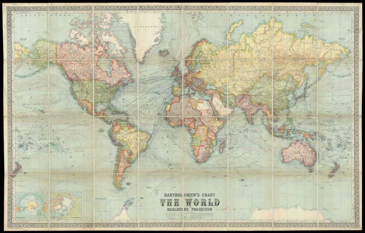
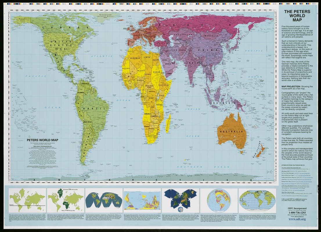
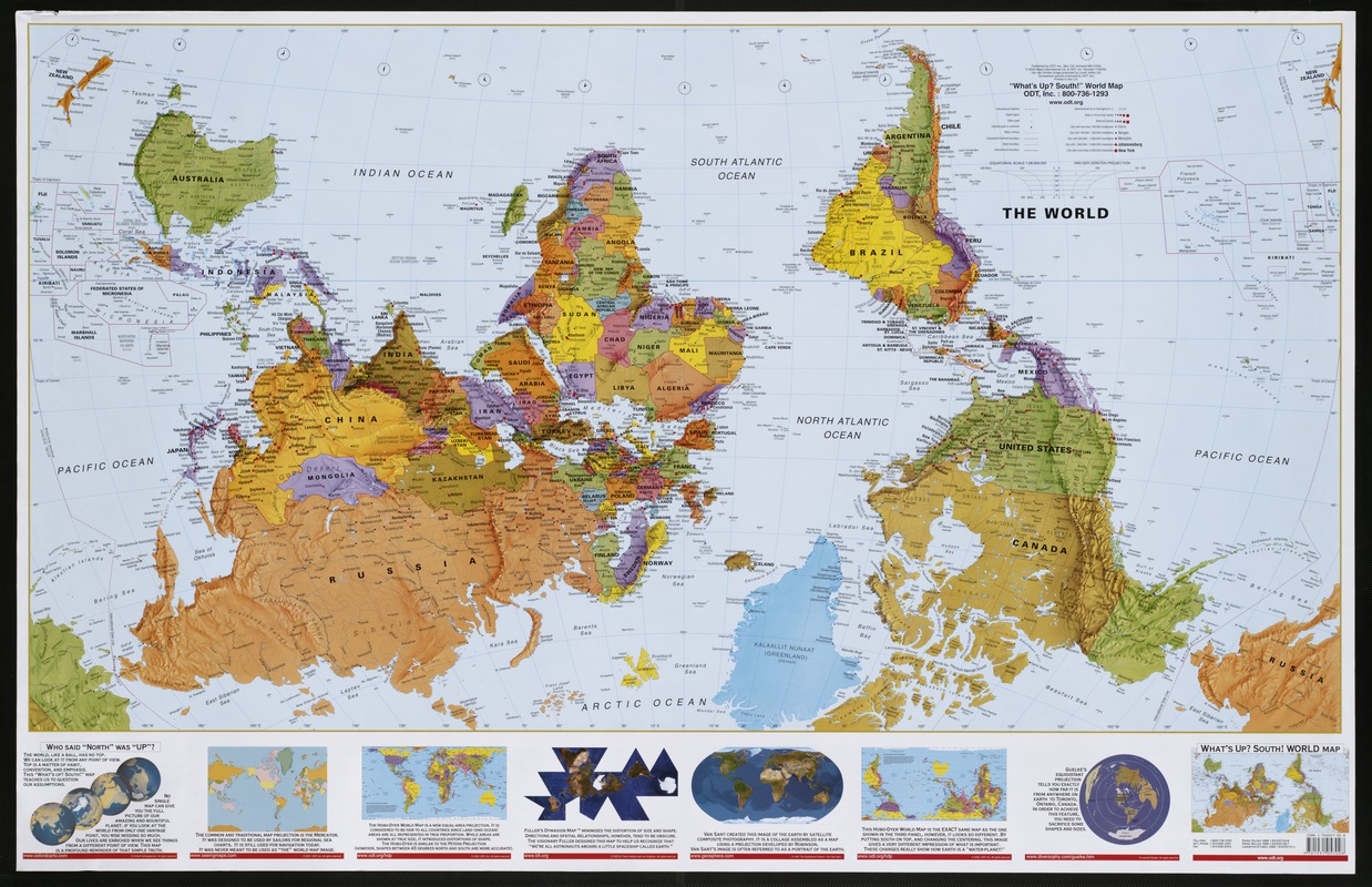
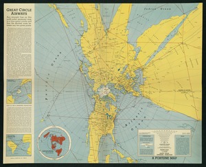
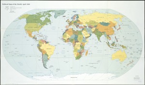
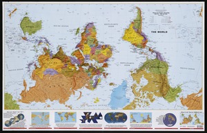
This map set is part of a lesson about map projections connected to the exhibition Bending Lines: Maps and Data from Distortion to Deception. You can find the rest of this lesson in the Education Activities section there.
Click on the image here to open the projection comparison worksheet that goes with these maps. You can also get a sheet you can copy and edit here.
Work in a group or on your own to compare the maps.
Once you have completed the activity:
What did you notice about the size of land masses/continents across the maps?
Is there one map you thought did a fairly good job of maintaining all of the qualities (Shape, Size, Direction & Distance)?
Now that you have compared them all, look up the actual area (size) of each of these land masses/continents? Which one is actually the largest? Which one is the smallest?
Now, let’s imagine what you might want to use these projections for:
Which one would you pick if you were trying to show someone how they might sail around the world in a ship?
Which one would you pick to show how airplanes might fly around the world?
Which one do you think is the most accurate to teach someone about the size and shape of the continents?


